Finance & Fintech Cart Abandonment Email Template
“Important pre-contractual information 📄”
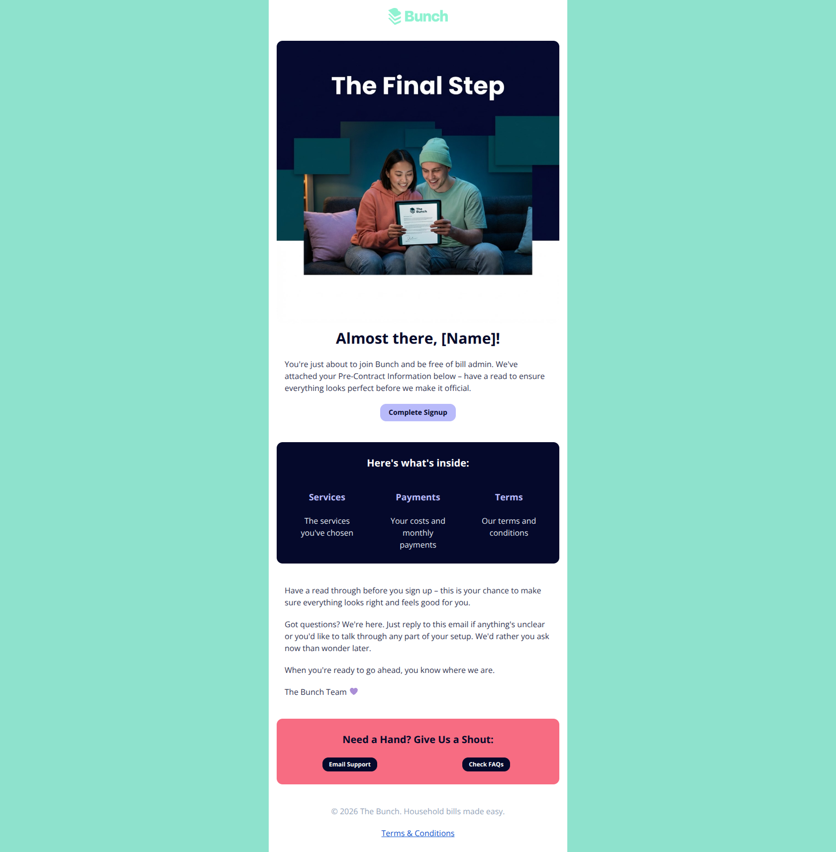
Design Score
82/100This is a visually polished, on-brand email that clearly communicates the user's progress. Its biggest strength is the clean, high-contrast design that makes readability excellent. The primary weakness is the visual weight of the 'Support' section at the bottom; the bright mint background dominates the visual hierarchy, potentially distracting users from the primary conversion goal of completing the signup.
Create Your Own
Generate professional email designs like this one in seconds with Kopi AI.
Email Details
- Subject Line
- Important pre-contractual information 📄
- Brand
- The Bunch
- Industry
- Finance & Fintech
- Email Type
- Cart Abandonment
- Created
- February 18, 2026
Brand Colors
Email Copy
Almost there, [Name]!
You're just about to join Bunch and be free of bill admin. We've attached your Pre-Contract Information below – have a read to ensure everything looks perfect before we make it official.
→ Complete Signup
Here's what's inside:
Services
The services you've chosen
Payments
Your costs and monthly payments
Terms
Our terms and conditions
Have a read through before you sign up – this is your chance to make sure everything looks right and feels good for you.
Got questions? We're here. Just reply to this email if anything's unclear or you'd like to talk through any part of your setup. We'd rather you ask now than wonder later.
When you're ready to go ahead, you know where we are.
The Bunch Team 💜
Need a Hand? Give Us a Shout:
→ Email Support
→ Check FAQs
© 2026 The Bunch. Household bills made easy.
Terms & Conditions
Why This Email Works
This is a visually polished, on-brand email that clearly communicates the user's progress. Its biggest strength is the clean, high-contrast design that makes readability excellent. The primary weakness is the visual weight of the 'Support' section at the bottom; the bright mint background dominates the visual hierarchy, potentially distracting users from the primary conversion goal of completing the signup.
Hero (top/initial part) Impact
85/100- High-quality, context-relevant imagery (couple looking at a device) that helps the user visualize the 'admin' task being easy.
- Clear personalization in the headline.
Content Structure & Flow
80/100- The 'Here's what's inside' section acts as excellent 'trust content,' breaking down the scary concept of a contract into manageable pieces (Services, Payments, Terms).
Visual Hierarchy & Layout
75/100- Dark mode style card for 'Here's what's inside' creates a nice visual break and draws attention to the details.
Call-to-Action Strength
82/100- The button design (pill shape) is distinct and looks clickable.
- Color contrast of the button text (#05092B on #B8BAFA) is accessible.
Message Clarity & Tone
85/100- Consistent brand voice that feels like a helpful partner rather than a utility company.
- Short, punchy sentences that respect the reader's time.
Readability & Scannability
90/100- Excellent use of whitespace and typography hierarchy.
- The three-column grid for the contract summary effectively chunks information.
Offer & Value Proposition
80/100- Clearly connects the action (signing up) to the emotional result (freedom from admin).
Personalization & Audience Fit
80/100- Visual aesthetic matches the 'digital native' target audience.
Quick Wins
- Change the background color of the 'Need a Hand?' section to white to stop it from competing with the main CTA.
- Update the body copy 'attached... below' to 'click below to review' to avoid confusion about missing file attachments.
- Change the CTA label from 'Complete Signup' to 'Review & Complete Signup' to align with the instruction to read the contract.
- Add a small 'secure' lock icon or reassurance text near the CTA to boost trust.
Create Professional Email Designs
Generate beautiful, on-brand email designs in seconds. Just enter your brand URL and let AI do the rest.