Fitness Promotional Email Template
“GYMSHARK66: Spots Limited”
Design Score
88/100This Gymshark 66 Challenge promotional email excels in brand alignment, visual intensity, and consistent CTAs, creating a high-urgency conversion funnel that resonates with the 'Industrial Athlete' audience. Hero grabs attention immediately, sections build value progressively with social proof, and red CTAs pop against monochrome backgrounds. Minor flaws include repetitive section structure risking scan fatigue and vague offer details (no cost/access specifics), but no critical failures. Strong above-average execution leaves little money on the table.
Create Your Own
Generate professional email designs like this one in seconds with Kopi AI.
Email Details
- Subject Line
- GYMSHARK66: Spots Limited
- Brand
- Gymshark
- Industry
- Fitness
- Email Type
- Promotional
- Created
- March 16, 2026
Brand Colors
Email Copy
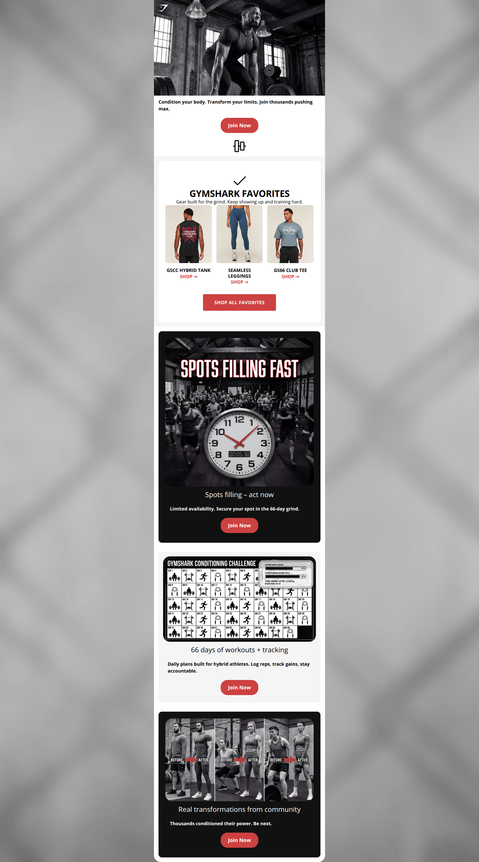
Condition your body. Transform your limits. Join thousands pushing max.
→ Join Now
Spots filling – act now
Limited availability. Secure your spot in the 66-day grind.
→ Join Now
66 days of workouts + tracking
Daily plans built for hybrid athletes. Log reps, track gains, stay accountable.
→ Join Now
Real transformations from community
Thousands conditioned their power. Be next.
→ Join Now
Why This Email Works
This Gymshark 66 Challenge promotional email excels in brand alignment, visual intensity, and consistent CTAs, creating a high-urgency conversion funnel that resonates with the 'Industrial Athlete' audience. Hero grabs attention immediately, sections build value progressively with social proof, and red CTAs pop against monochrome backgrounds. Minor flaws include repetitive section structure risking scan fatigue and vague offer details (no cost/access specifics), but no critical failures. Strong above-average execution leaves little money on the table.
Hero (top/initial part) Impact
95/100- High-impact monochrome image with veins/sweat evokes grit and performance.
- Direct link from image to CTA creates zero-friction path.
- Aligns perfectly with brand's commanding, aspirational voice.
Content Structure & Flow
85/100- Progressive build: scarcity → features → proof → action.
- Every section self-contained yet cumulative toward join decision.
- Tight 4-card flow respects short attention spans.
Visual Hierarchy & Layout
90/100- Card backgrounds differentiate sections visually, guiding vertical skim.
- Images hyper-relevant (clock urgency, calendar, transformations).
- Clean whitespace in paddings/margins prevents overwhelm.
Call-to-Action Strength
95/100- Repetition builds habit-click response without confusion.
- High contrast pops against all backgrounds.
- Action-oriented copy matches brand's commanding tone.
Message Clarity & Tone
92/100- Phrases like 'Spots filling – act now' evoke raw commitment.
- No fluff; every line pushes toward action.
- Community angle ('thousands', 'be next') builds belonging.
Readability & Scannability
90/100- Short lines/text blocks perfect for mobile skim.
- Iconic images + labels (clock, calendar) convey info pre-read.
- Consistent typography hierarchy.
Offer & Value Proposition
80/100- Hybrid athlete focus targets core audience pains.
- Visual infographics reduce explanation load.
- Ties to Seamless gear indirectly via images.
Personalization & Audience Fit
85/100- Before/afters evoke audience aspirations directly.
- Urgency/scarcity taps discipline-driven buyer psychology.
- Seamless tech nods in alts reinforce proprietary edge.
Quick Wins
- Add offer specifics (e.g., 'Free access') under first CTA to slash hesitation.
- Bullet-ify workout section text for 20% faster scan.
- Test 'Secure Spot' CTA variant on urgency card.
- Bold 2-3 outcome phrases across sections.


Create Professional Email Designs
Generate beautiful, on-brand email designs in seconds. Just enter your brand URL and let AI do the rest.