Fitness Promotional Email Template
“GYMSHARK66: Spots Filling Fast”
Design Score
90/100This Gymshark66 challenge promotional email is a strong performer, nailing the brand's stark, motivational aesthetic with high-contrast visuals, urgent messaging, and a clear scan path to multiple 'Join Now' CTAs. It effectively builds desire through benefits, social proof, and scarcity, driving clicks to the challenge page. Hero grabs attention immediately, sections flow logically from urgency to proof, and CTAs dominate visually. Scores reflect top-tier execution with room for CTA variation and explicit offer pricing to push past 90. No critical failures; high click potential for fitness enthusiasts.
Create Your Own
Generate professional email designs like this one in seconds with Kopi AI.
Email Details
- Subject Line
- GYMSHARK66: Spots Filling Fast
- Brand
- Gymshark
- Industry
- Fitness
- Email Type
- Promotional
- Created
- March 14, 2026
Brand Colors
Email Copy
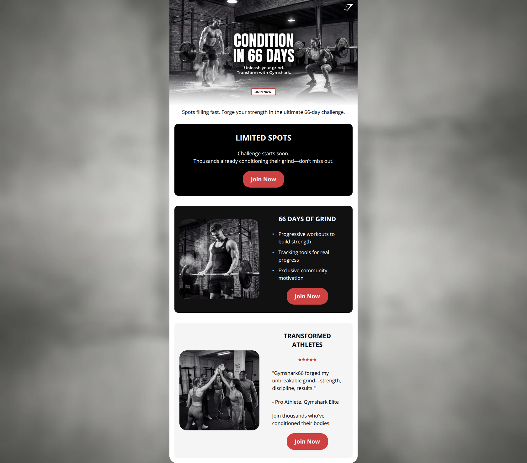
Spots filling fast. Forge your strength in the ultimate 66-day challenge.
LIMITED SPOTS
Challenge starts soon. Thousands already conditioning their grind—don't miss out.
→ Join Now
66 DAYS OF GRIND
- Progressive workouts to build strength
- Tracking tools for real progress
- Exclusive community motivation
→ Join Now
TRANSFORMED ATHLETES
★★★★★
"Gymshark66 forged my unbreakable grind—strength, discipline, results."
- Pro Athlete, Gymshark Elite
Join thousands who've conditioned their bodies.
→ Join Now
Why This Email Works
This Gymshark66 challenge promotional email is a strong performer, nailing the brand's stark, motivational aesthetic with high-contrast visuals, urgent messaging, and a clear scan path to multiple 'Join Now' CTAs. It effectively builds desire through benefits, social proof, and scarcity, driving clicks to the challenge page. Hero grabs attention immediately, sections flow logically from urgency to proof, and CTAs dominate visually. Scores reflect top-tier execution with room for CTA variation and explicit offer pricing to push past 90. No critical failures; high click potential for fitness enthusiasts.
Hero (top/initial part) Impact
94/100- Visually dominant, brand-authentic imagery funnels eyes to CTA overlay.
- Urgency text below hero reinforces scarcity without delaying action.
Content Structure & Flow
90/100- Progressive value build: awareness (hero) → desire (benefits/community) → action (CTAs).
- Consistent margins/borders guide eye downward seamlessly.
Visual Hierarchy & Layout
92/100- Images left/text right enables Z-pattern scan ending on CTAs.
- High-contrast cards pop against body background, prioritizing content blocks.
Call-to-Action Strength
87/100- Buttons are full-width-ish, centered, and unmissable in every section.
- Urgent phrasing aligns with brand's commanding tone.
Message Clarity & Tone
96/100- You-centric benefits like 'build strength', 'real progress' connect to audience pains/dreams.
- Short, punchy sentences reduce cognitive load.
Readability & Scannability
94/100- High-contrast monochrome + red accents aid quick reading.
- Structured lists and quotes form obvious scan path.
Offer & Value Proposition
88/100- Community/motivation differentiates from solo workouts.
- Testimonial provides outcome proof.
Personalization & Audience Fit
85/100- Visuals/voice mirror 'Industrial Athlete' dreams/pains exactly.
- Community focus resonates with social, achievement-driven audience.
Quick Wins
- Vary CTA copy across sections (e.g., 'Claim Your Spot', 'Start 66-Day Grind') to reduce repetition and boost curiosity clicks.
- Add explicit 'Free' or pricing to value prop bullet for zero cognitive math.
- Upsize hero subtext 10-20% for instant readability on mobile skim.


Create Professional Email Designs
Generate beautiful, on-brand email designs in seconds. Just enter your brand URL and let AI do the rest.