Other Promotional Email Template
“Got 2 mins? Custom Stanleys inside!”
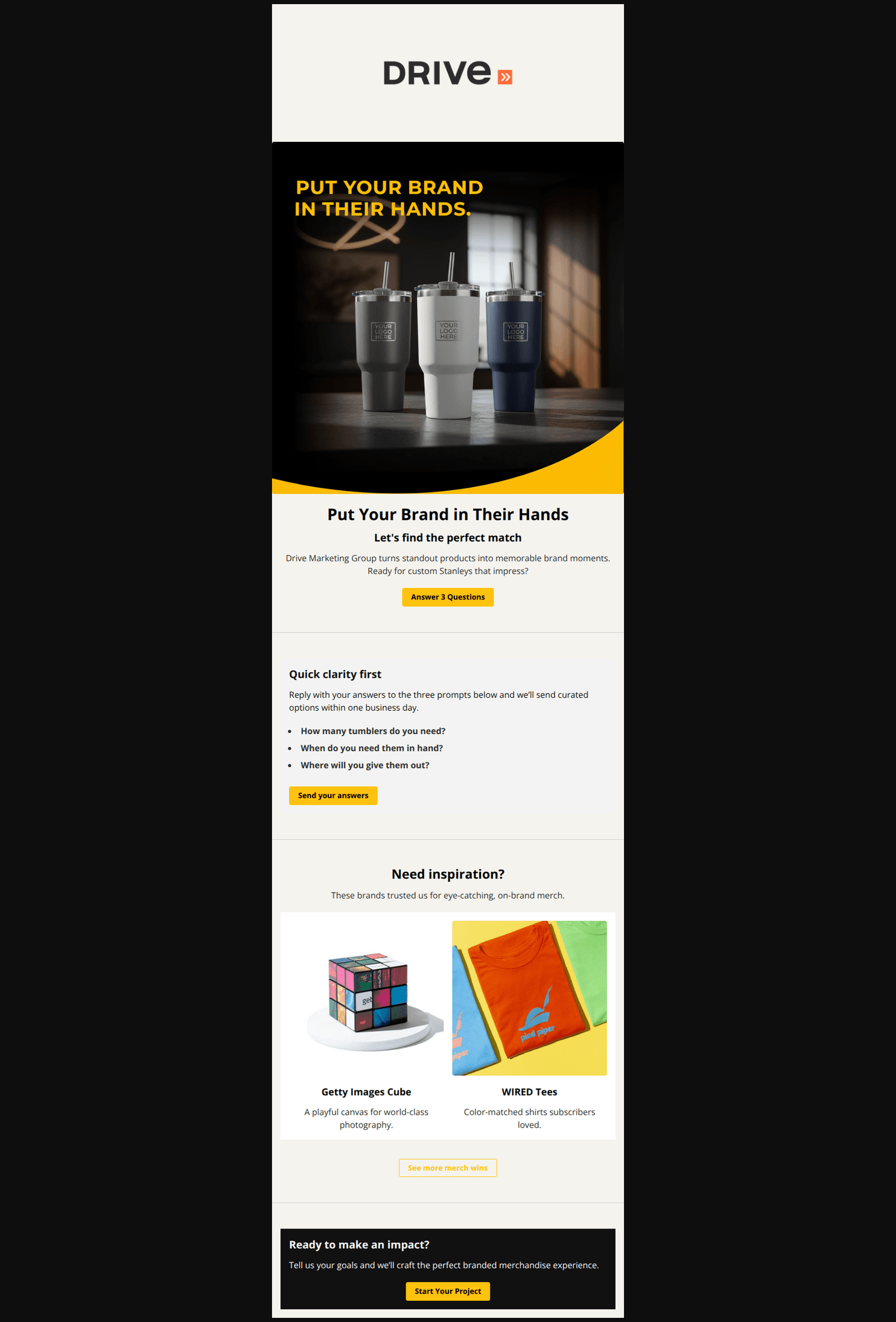
Design Score
77/100Polished, on-brand email with strong imagery and clear sections. Biggest gains will come from clarifying the offer/outcome, unifying the conversion path, and sharpening CTAs to promise a tangible result (pricing/options within 1 business day). Add light social proof near the top and small tweaks to reduce redundancy and friction.
Create Your Own
Generate professional email designs like this one in seconds with Kopi AI.
Email Details
- Subject Line
- Got 2 mins? Custom Stanleys inside!
- Brand
- Drive Marketing Group
- Industry
- Other
- Email Type
- Promotional
- Created
- November 18, 2025
Brand Colors
Email Copy
Put Your Brand in Their Hands
Let's find the perfect match
Drive Marketing Group turns standout products into memorable brand moments. Ready for custom Stanleys that impress?
→ Answer 3 Questions
Quick clarity first
Reply with your answers to the three prompts below and we’ll send curated options within one business day.
- How many tumblers do you need?
- When do you need them in hand?
- Where will you give them out?
→ Send your answers
Need inspiration?
These brands trusted us for eye-catching, on-brand merch.
Getty Images Cube
A playful canvas for world-class photography.
WIRED Tees
Color-matched shirts subscribers loved.
→ See more merch wins
Ready to make an impact?
Tell us your goals and we’ll craft the perfect branded merchandise experience.
→ Start Your Project
Why This Email Works
Polished, on-brand email with strong imagery and clear sections. Biggest gains will come from clarifying the offer/outcome, unifying the conversion path, and sharpening CTAs to promise a tangible result (pricing/options within 1 business day). Add light social proof near the top and small tweaks to reduce redundancy and friction.
Hero (top/initial part) Impact
82/100- Product-forward hero aligns with the email’s intent.
- Clean brand presentation and high-contrast colors draw attention to the primary CTA.
Content Structure & Flow
78/100- Clear sections with concise copy and a strong midpoint explainer (“Quick clarity first”).
- Social proof examples are placed before the final CTA, reinforcing credibility.
Visual Hierarchy & Layout
86/100- Consistent color system (gold/black/white) and strong contrast in the closing section.
- Images and captions are balanced and easy to scan.
Call-to-Action Strength
70/100- Buttons are prominent and consistently styled.
- The closing CTA reiterates the ask with strong contrast.
Message Clarity & Tone
80/100- Clear, jargon-free copy that focuses on outcomes.
- Simple explanation of what to send back makes it easy to respond.
Readability & Scannability
90/100- Bulleted “Quick clarity first” list reduces cognitive load.
- Clear typographic hierarchy with adequate breathing room.
Offer & Value Proposition
68/100- Clear, simple intake process lowers the barrier to starting.
- Social proof implies quality and creativity without heavy copy.
Personalization & Audience Fit
55/100- Broad appeal to corporate gifting and event use cases.
- Neutral tone works for prospects at various stages.
Quick Wins
- Change the hero H1 to include the outcome: “Custom Stanley tumblers—curated options in 1 business day.”
- Rename primary CTA to “Get options & pricing” and add microcopy “In 1 business day.”
- Add a fourth prompt in the bullet list for Budget range to accelerate scoping.
- Add UTMs to all buttons/links for clean attribution.
- Insert a one-line trust cue under the hero CTA: “Trusted by WIRED, Getty Images, Warby Parker.”

Create Professional Email Designs
Generate beautiful, on-brand email designs in seconds. Just enter your brand URL and let AI do the rest.