Fitness Product Launch Email Template
“FORM just dropped. Feel nothing, lift everything.”
Design Score
86/100This is a highly effective product launch email that perfectly captures the Gymshark brand aesthetic. It leverages a strong, minimalist visual hierarchy and punchy, benefit-driven copy to communicate a clear value proposition: distraction-free workout gear. The inverted pyramid structure seamlessly guides the reader from the high-impact hero image down to the specific products, with excellent repetition of the primary call-to-action. To push this from an 86 to a 90+, the copy in the final section should introduce a new functional benefit rather than restating the hero's premise, and the product images could benefit from slightly tighter cropping to highlight the technical details mentioned in the copy.
Create Your Own
Generate professional email designs like this one in seconds with Kopi AI.
Email Details
- Subject Line
- FORM just dropped. Feel nothing, lift everything.
- Brand
- Gymshark
- Industry
- Fitness
- Email Type
- Product Launch
- Created
- May 5, 2026
Brand Colors
Email Copy
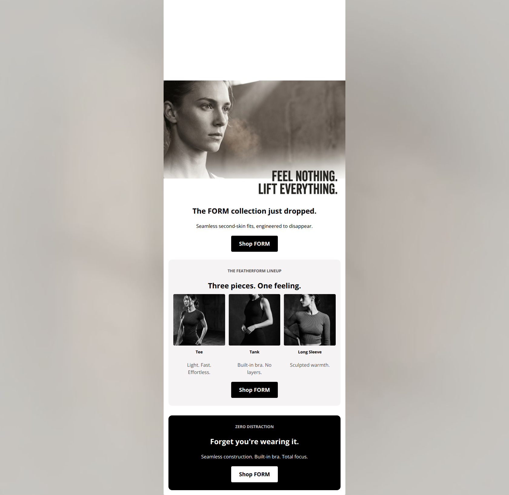
The FORM collection just dropped.
Seamless second-skin fits, engineered to disappear.
→ Shop FORM
THE FEATHERFORM LINEUP
Three pieces. One feeling.
Tee
Light. Fast. Effortless.
Tank
Built-in bra. No layers.
Long Sleeve
Sculpted warmth.
→ Shop FORM
ZERO DISTRACTION
Forget you're wearing it.
Seamless construction. Built-in bra. Total focus.
→ Shop FORM
Why This Email Works
This is a highly effective product launch email that perfectly captures the Gymshark brand aesthetic. It leverages a strong, minimalist visual hierarchy and punchy, benefit-driven copy to communicate a clear value proposition: distraction-free workout gear. The inverted pyramid structure seamlessly guides the reader from the high-impact hero image down to the specific products, with excellent repetition of the primary call-to-action. To push this from an 86 to a 90+, the copy in the final section should introduce a new functional benefit rather than restating the hero's premise, and the product images could benefit from slightly tighter cropping to highlight the technical details mentioned in the copy.
Hero Impact
88/100- High-quality, aspirational imagery that immediately signals the premium nature of the new collection.
- Clear, punchy headline that answers 'what is this about?' within a second of opening.
- Excellent use of negative space in the image to make the text pop.
Content Structure & Flow
85/100- Logical progression from brand-level storytelling to specific product shopping options.
- The three-column layout in the middle section breaks up the vertical scrolling and encourages scanning.
- The stark color contrast in the final section effectively re-engages the user's eye before the end of the email.
Visual Hierarchy & Layout
82/100- Strong use of padding and margins creates a clean, uncluttered reading experience.
- Distinct visual blocks (white, light grey, black) clearly delineate different sections of the message.
- Typography is scaled appropriately, with H2s clearly commanding attention over body text.
Call-to-Action Strength
95/100- Perfect consistency in CTA destination and intent across the entire email.
- The inversion of button colors (Black on White/Grey vs. White on Black) maintains high visibility regardless of the background block.
- Repetition of the CTA reinforces the primary goal without feeling overwhelming.
Message Clarity & Tone
88/100- Tone is highly authentic to the motivational, driven Gymshark brand voice.
- The overarching message ('Feel Nothing. Lift Everything.') addresses a core customer pain point directly.
- Absence of marketing fluff; the copy feels mature and product-focused.
Readability & Scannability
92/100- Excellent use of succinct bullet-style descriptions under the product images.
- Generous line spacing and avoidance of long paragraphs prevent visual fatigue.
- Headings do the heavy lifting, allowing the reader to get the gist without reading the body copy.
Offer & Value Proposition
85/100- The benefit to the user is explicitly clear: zero distractions while lifting.
- The email successfully builds perceived value through high-end art direction rather than relying on promotional levers.
Personalization & Audience Fit
86/100- The visual style directly appeals to the audience's desire for modern, sleek athletic wear.
- The language respects the audience's intelligence by avoiding over-explaining the concept of seamless gear.
Copy Conciseness & Word Economy
85/100- No throat-clearing openers or filler adjectives.
- The copy relies on strong verbs and nouns rather than flowery descriptions.
Quick Wins
- Slightly increase the font size of the descriptive text under the three product images to improve legibility.
- Ensure all images, especially the hero, are hyperlinked to the primary destination URL to capture incidental taps.


Create Professional Email Designs
Generate beautiful, on-brand email designs in seconds. Just enter your brand URL and let AI do the rest.