SaaS & Software Promotional Email Template
“Fix your money-flow problem”
Design Score
88/100This email is a highly effective, conversion-focused asset that uses a compelling paradigm shift ('money-flow problem') and excellent visual scannability to drive action. Its biggest strength is the highly readable 5-pillar breakdown that proves value immediately, while its main weakness is minor friction in CTA alignment and hero text formatting.
Create Your Own
Generate professional email designs like this one in seconds with Kopi AI.
Email Details
- Subject Line
- Fix your money-flow problem
- Brand
- Income Stream Pro
- Industry
- SaaS & Software
- Email Type
- Promotional
- Created
- March 13, 2026
Brand Colors
Email Copy
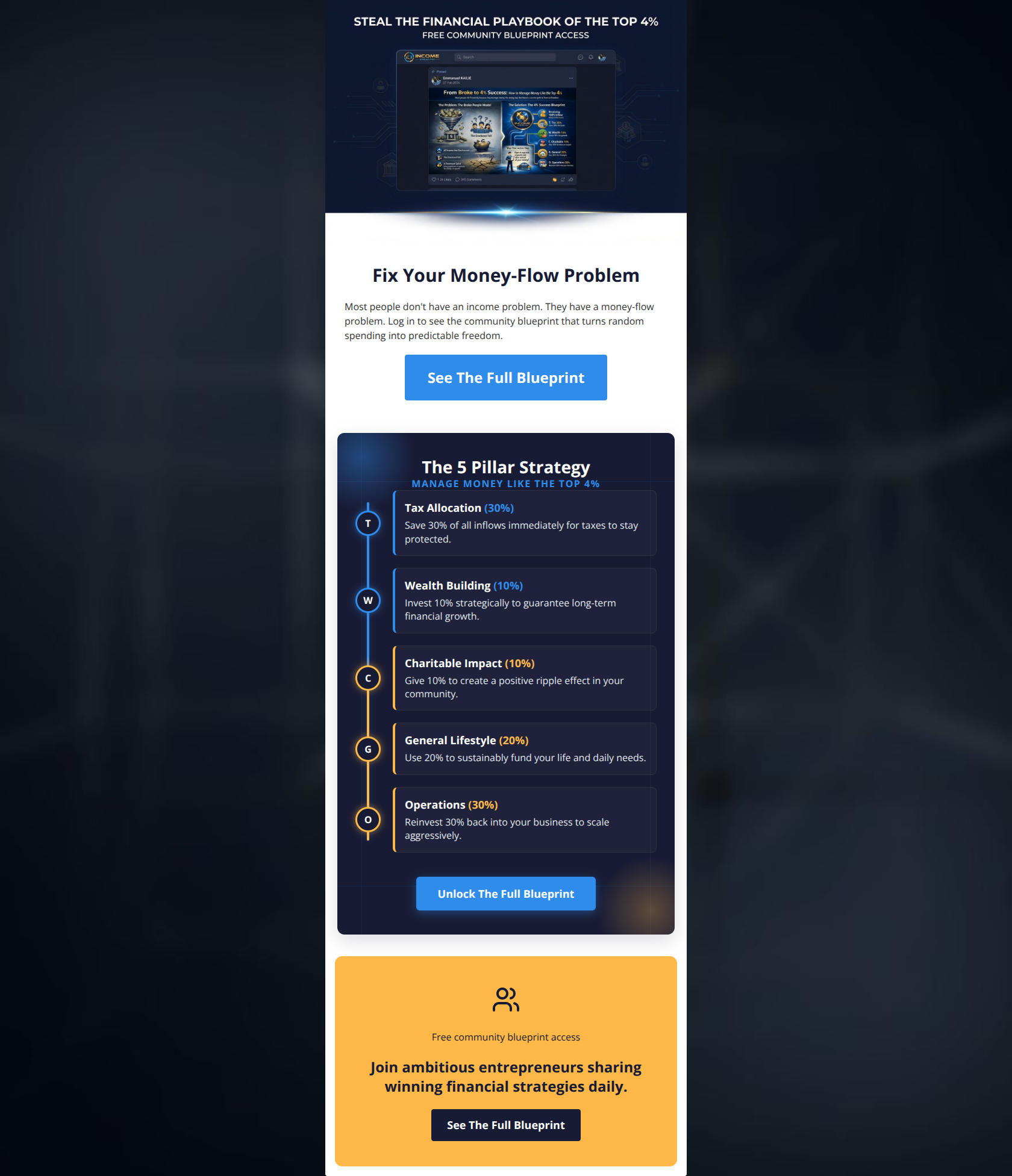
Fix Your Money-Flow Problem
Most people don't have an income problem. They have a money-flow problem. Log in to see the community blueprint that turns random spending into predictable freedom.
→ See The Full Blueprint
Free community blueprint access
Join ambitious entrepreneurs sharing winning financial strategies daily.
→ See The Full Blueprint
Why This Email Works
This email is a highly effective, conversion-focused asset that uses a compelling paradigm shift ('money-flow problem') and excellent visual scannability to drive action. Its biggest strength is the highly readable 5-pillar breakdown that proves value immediately, while its main weakness is minor friction in CTA alignment and hero text formatting.
Hero Impact
85/100- Punchy, benefit-driven headline ('Fix Your Money-Flow Problem') that challenges the reader's assumptions.
- Clear inverted pyramid structure funneling the reader directly to the primary CTA.
Content Structure & Flow
90/100- Zero fluff; every section directly serves the conversion goal of getting the user to view the blueprint.
- Excellent pacing, moving from high-level problem identification to specific tactical pillars.
Visual Hierarchy & Layout
88/100- Strategic use of the brand's color palette (White -> Navy -> Orange) to create distinct visual zones.
- The central 5-pillar section is visually arresting and breaks up the layout perfectly without being overwhelming.
Call-to-Action Strength
82/100- Excellent visual contrast on all buttons, ensuring they pop against their respective backgrounds.
- Use of strong, value-driven verbs ('See', 'Unlock') instead of generic terms like 'Click Here'.
Message Clarity & Tone
92/100- The 'income vs. money-flow' paradigm shift is a brilliant hook that immediately positions the brand as an authority.
- Copy is concise and punchy, matching the high-energy entrepreneurial brand identity.
Readability & Scannability
95/100- The 5-pillar layout uses distinct icons and bolded percentages, allowing the reader to grasp the core concept without reading every word.
- Absence of 'walls of text'; paragraph lengths are perfectly optimized for skimming.
Offer & Value Proposition
88/100- Giving away a portion of the strategy (the 5 pillars) proves value and builds trust before asking for the click.
- The value proposition is explicitly tied to a desirable outcome ('predictable freedom').
Personalization & Audience Fit
85/100- Use of phrases like 'scale aggressively' and 'top 4%' perfectly mirrors the aspirational mindset of the target audience.
Quick Wins
- Left-align the paragraph text in the hero section to improve reading speed.
- Change 'Log in to see...' to 'Get access to...' to remove the implication that the user must already have an account.
- Update the final CTA text in the orange block to 'Join The Community' to match the surrounding context.


Create Professional Email Designs
Generate beautiful, on-brand email designs in seconds. Just enter your brand URL and let AI do the rest.