Other Promotional Email Template
“First aid, ready for the new term”
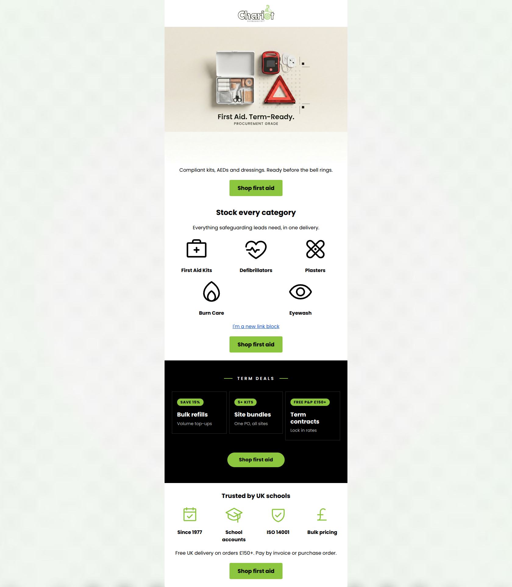
Design Score
89/100This is an exceptionally strong, highly targeted B2B email. It knows exactly who its audience is (school procurement/safeguarding leads) and speaks directly to their needs: compliance, efficiency, and specific payment terms (POs/invoicing). The structure follows a logical inverted pyramid, and the relentless repetition of a single, clear primary Call-to-Action ('Shop first aid') perfectly adheres to conversion best practices. The visual hierarchy is tight, utilizing the brand's apple green exclusively to drive action. To push this into the 90+ range, minor adjustments to heading copy to focus on benefits over commands, and pulling critical payment terms higher up the page, would make the conversion path even smoother.
Create Your Own
Generate professional email designs like this one in seconds with Kopi AI.
Email Details
- Subject Line
- First aid, ready for the new term
- Brand
- Chariot Office Supplies
- Industry
- Other
- Email Type
- Promotional
- Created
- June 2, 2026
Brand Colors
Email Copy
Preview text: Restock compliant kits, AEDs and dressings before the bell rings.
Compliant kits, AEDs and dressings. Ready before the bell rings.
→ Shop first aid
Stock every category
Everything safeguarding leads need, in one delivery.
First Aid Kits
Defibrillators
Plasters
Burn Care
Eyewash
→ Shop first aid
Trusted by UK schools
Since 1977
School accounts
ISO 14001
Bulk pricing
Free UK delivery on orders £50+. Pay by invoice or purchase order.
→ Shop first aid
Why This Email Works
This is an exceptionally strong, highly targeted B2B email. It knows exactly who its audience is (school procurement/safeguarding leads) and speaks directly to their needs: compliance, efficiency, and specific payment terms (POs/invoicing). The structure follows a logical inverted pyramid, and the relentless repetition of a single, clear primary Call-to-Action ('Shop first aid') perfectly adheres to conversion best practices. The visual hierarchy is tight, utilizing the brand's apple green exclusively to drive action. To push this into the 90+ range, minor adjustments to heading copy to focus on benefits over commands, and pulling critical payment terms higher up the page, would make the conversion path even smoother.
Hero (top/initial part) Impact
85/100- Hero image clearly depicts the product categories being promoted.
- Embedded copy ('Term-Ready') sets an immediate, relevant deadline/context for the buyer.
- Subcopy ('Ready before the bell rings') cleverly reinforces the school targeting.
Content Structure & Flow
92/100- Logical progression from broad need to specific categories to commercial offers.
- Distinct visual separation between sections prevents the content from feeling like a wall of text.
- The placement of the final CTA immediately after the trust/shipping terms is a perfect closing hook.
Visual Hierarchy & Layout
88/100- Masterful use of brand color to strictly highlight conversion elements.
- The inverted black block for 'Term Deals' acts as a powerful scroll-stopper.
- Generous whitespace around elements prevents cognitive overload.
Call-to-Action Strength
98/100- Relentless repetition of a single, clear goal.
- High-contrast button styling makes the CTAs impossible to miss.
- Action-oriented verb ('Shop') sets clear expectations for the destination.
Message Clarity & Tone
88/100- Highly specific, jargon-appropriate vocabulary for the education procurement sector.
- No fluffy marketing speak; gets straight to the point.
- Strong focus on compliance and readiness, which are key emotional drivers for this persona.
Readability & Scannability
90/100- Excellent use of icons to replace text and speed up comprehension.
- Short, single-line text blocks prevent reading fatigue.
- Clear visual hierarchy guides the eye down the page.
Offer & Value Proposition
88/100- Clearly communicates B2B-specific benefits (PO acceptance, bulk pricing).
- The offer is framed around a specific, timely event (the start of a school term).
- Trust signals are prominent and highly relevant (ISO 14001 indicates reliable operations).
Personalization & Audience Fit
94/100- Imagery, copy, and offers are all laser-focused on a distinct buyer persona.
- Highlights the exact payment methods (Invoice/PO) this audience requires.
- Understands that compliance is as important as price for this audience.
Copy Conciseness & Word Economy
95/100- Zero filler words; highly distilled messaging.
- Subcopy consistently adds context rather than just repeating the headline.
- Bullet-point style delivery respects the user's limited time.
Quick Wins
- Rewrite the H2 'Stock every category' to be benefit-driven: 'Consolidate your first aid ordering'.
- Add a bold HTML H1 immediately below the hero image (e.g., 'Procurement-Grade First Aid') to ensure the core message is readable outside of the image asset.
- Balance the 5 category icons into a visually symmetrical grid (e.g., 2 rows of 2, or 2 rows of 3) to improve layout flow.



Create Professional Email Designs
Generate beautiful, on-brand email designs in seconds. Just enter your brand URL and let AI do the rest.