Health & Wellness Promotional Email Template
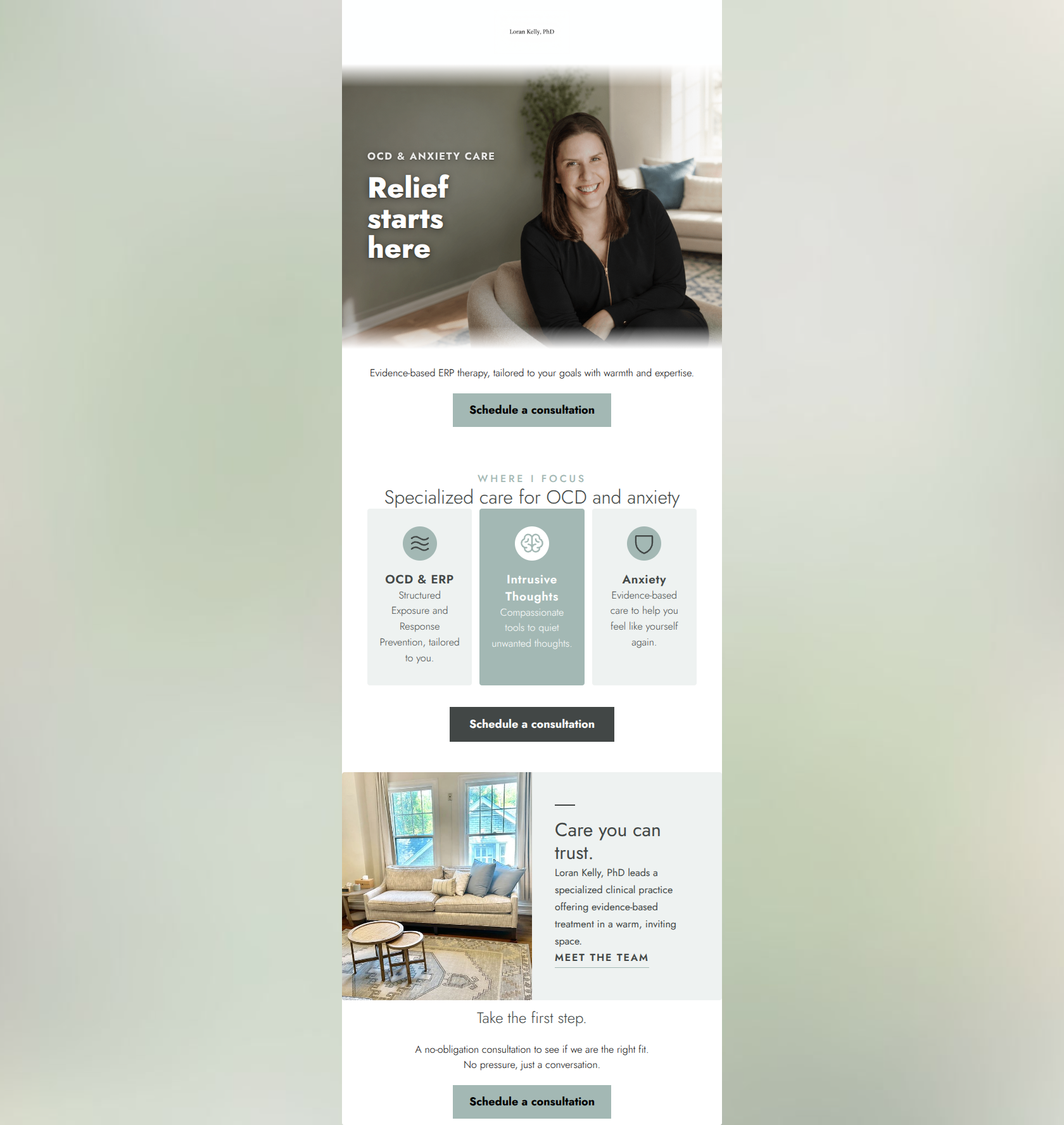
“Specialized care for OCD and anxiety”
Design Score
88/100This is a highly effective, beautifully restrained email that perfectly captures the brand's 'quiet sanctuary' aesthetic and professional-yet-empathetic tone. The messaging is tight, focusing on evidence-based relief without resorting to generic mental health platitudes. The structure logically guides the reader from emotional hook to specific services to building trust. The main areas for improvement are purely visual: unifying the CTA button styling to increase their prominence and addressing a minor contrast issue in the service cards.
Create Your Own
Generate professional email designs like this one in seconds with Kopi AI.
Email Details
- Subject Line
- Specialized care for OCD and anxiety
- Brand
- Loran Kelly, PhD
- Industry
- Health & Wellness
- Email Type
- Promotional
- Created
- July 17, 2026
Brand Colors
Email Copy
Evidence-based ERP therapy, tailored to your goals with warmth and expertise.
→ Schedule a consultation
Take the first step.
A no-obligation consultation to see if we are the right fit. No pressure, just a conversation.
→ Schedule a consultation
Why This Email Works
This is a highly effective, beautifully restrained email that perfectly captures the brand's 'quiet sanctuary' aesthetic and professional-yet-empathetic tone. The messaging is tight, focusing on evidence-based relief without resorting to generic mental health platitudes. The structure logically guides the reader from emotional hook to specific services to building trust. The main areas for improvement are purely visual: unifying the CTA button styling to increase their prominence and addressing a minor contrast issue in the service cards.
Hero (top/initial part) Impact
85/100- Excellent use of professional, warm photography that humanizes the practice.
- Headline ('Relief starts here') speaks directly to the core desire of the target audience.
- Kicker ('OCD & ANXIETY CARE') immediately clarifies the specialization.
Content Structure & Flow
92/100- Logical progression from emotional hook to rational service details.
- Generous spacing between sections allows the content to breathe, aligning with the brand's minimalist, calming aesthetic.
- Clear delineation between different content blocks.
Visual Hierarchy & Layout
75/100- Effective use of a 3-column layout (triptych) to break down complex services into digestible chunks.
- Beautiful use of a 50/50 image/text split in the 'Care you can trust' block.
- The subtle accent lines add a touch of sophistication.
Call-to-Action Strength
88/100- Consistent primary CTA copy that clearly sets expectations for what happens next.
- Appropriate repetition of the primary CTA throughout the email.
- Excellent use of a muted, secondary text link ('Meet the team') that provides an alternative path without competing with the primary buttons.
Message Clarity & Tone
95/100- Avoids generic therapy jargon in favor of clear, empathetic language.
- Balances clinical authority (ERP, evidence-based) with warmth.
- Directly addresses specific pain points (intrusive thoughts, anxiety) without being alarmist.
Readability & Scannability
92/100- Short, easily digestible paragraphs.
- Excellent use of typography scale to guide the eye from headers to body copy.
- Icons serve as visual anchors, reducing cognitive load.
Offer & Value Proposition
88/100- The value proposition is immediately clear in the hero and reinforced throughout.
- The final section frames the consultation as a 'no-obligation' step, significantly lowering the barrier to entry.
Personalization & Audience Fit
95/100- Aesthetic perfectly matches the 'urban/suburban professional' demographic.
- The messaging respects the reader's intelligence by using precise terms (ERP, Intrusive Thoughts) rather than talking down to them.
- The imagery evokes the 'quiet, stable joy' and 'grounded resilience' the audience desires.
Copy Conciseness & Word Economy
94/100- The triptych copy is distilled to its absolute essence.
- The introductory text ('Evidence-based ERP therapy...') packs a tremendous amount of value into a single sentence.
- Zero repetition of information; each block introduces a new, relevant point.
Quick Wins
- Unify the primary CTA buttons to all use the higher-contrast charcoal background (#424746) with white text.
- Change the text color on the center 'Intrusive Thoughts' card from white to charcoal (#424746) to improve readability against the sage green.

Create Professional Email Designs
Generate beautiful, on-brand email designs in seconds. Just enter your brand URL and let AI do the rest.