Food & Beverage Promotional Email Template
“Sidste chance: sommerens hvidvinskasse lukker snart 🍷”
Design Score
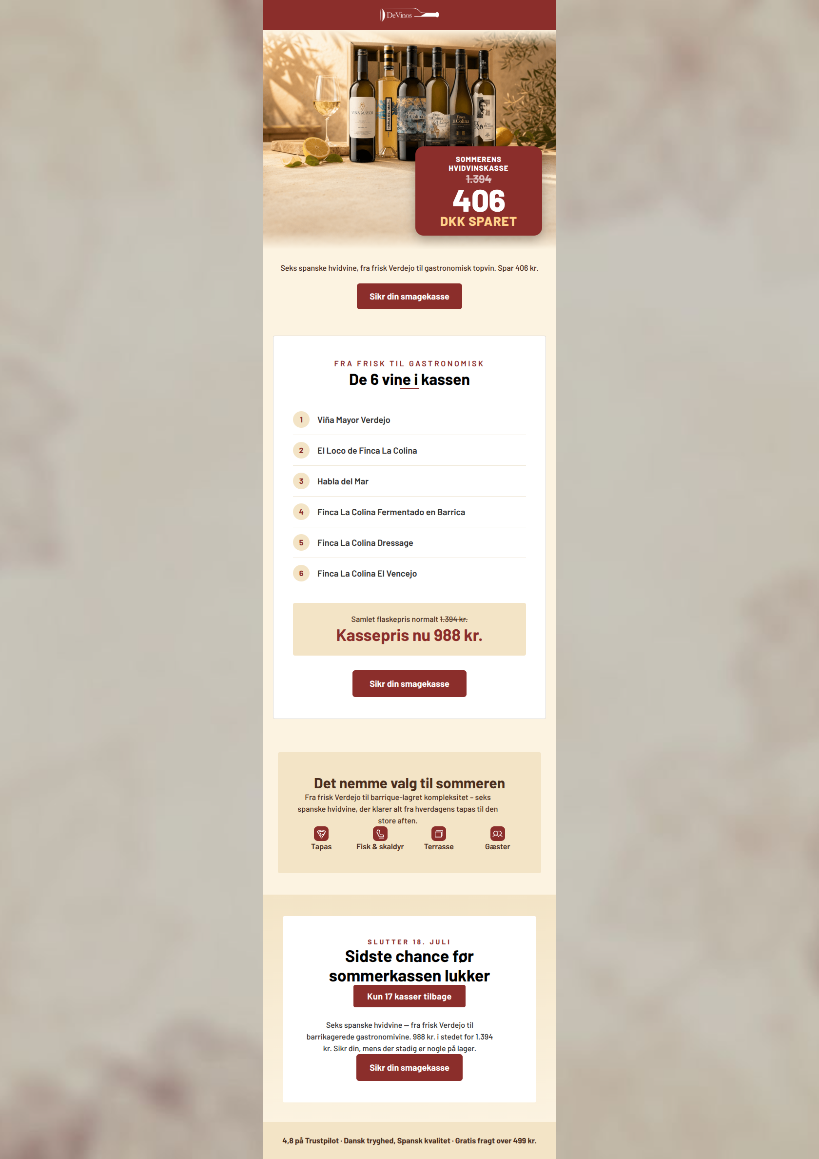
86/100This is a highly effective, conversion-focused campaign that excels in structure, scannability, and communicating value. The layout logically funnels the reader from a strong hero discount down to a detailed product list, culminating in a compelling, scarcity-driven final CTA. The email's primary weakness is word economy; the same descriptive phrasing is repeated unnecessarily across three different sections, which dilutes the impact of the copy.
Create Your Own
Generate professional email designs like this one in seconds with Kopi AI.
Email Details
- Subject Line
- Sidste chance: sommerens hvidvinskasse lukker snart 🍷
- Brand
- DeVinos
- Industry
- Food & Beverage
- Email Type
- Promotional
- Created
- July 16, 2026
Brand Colors
Email Copy
Seks spanske hvidvine, fra frisk Verdejo til gastronomisk topvin. Spar 406 kr.
→ Sikr din smagekasse
4,8 på Trustpilot · Dansk tryghed, Spansk kvalitet · Gratis fragt over 499 kr.
Why This Email Works
This is a highly effective, conversion-focused campaign that excels in structure, scannability, and communicating value. The layout logically funnels the reader from a strong hero discount down to a detailed product list, culminating in a compelling, scarcity-driven final CTA. The email's primary weakness is word economy; the same descriptive phrasing is repeated unnecessarily across three different sections, which dilutes the impact of the copy.
Hero (top/initial part) Impact
88/100- Excellent use of a localized, high-contrast text overlay to immediately communicate the discount.
- The product (the wine box and bottles) is beautifully staged and immediately recognizable.
Content Structure & Flow
88/100- Logical, sequential storytelling that anticipates the buyer's thought process.
- Clear demarcation between sections using cards and background color shifts.
Visual Hierarchy & Layout
84/100- Excellent use of the #8B2E2B brand color to guide the eye directly to prices and action buttons.
- The white cards on the cream background create an elegant, uncluttered reading experience.
Call-to-Action Strength
95/100- Perfect repetition of the primary destination and intent.
- Buttons are visually dominant, utilizing high-contrast white text on the primary wine-red background.
- The language 'Sikr din' (Secure yours) implies ownership and scarcity, which converts better than a generic 'Køb nu'.
Message Clarity & Tone
85/100- Approachable yet premium brand voice.
- Clear framing of the product as a solution to summer hosting needs.
Readability & Scannability
92/100- Flawless use of numbered lists and bolding to guide the eye.
- High contrast typography (dark brown/black on light backgrounds) ensures excellent legibility.
Offer & Value Proposition
94/100- Hard numbers used over vague percentages (406 DKK SPARET).
- The pricing block visually crosses out the old price, anchoring the reader on the higher value.
Personalization & Audience Fit
78/100- Strong cultural resonance with the target audience's seasonal behavior.
- Bottom trust signals ('Dansk tryghed, Spansk kvalitet') directly address common e-commerce hesitations in Denmark.
Copy Conciseness & Word Economy
72/100- Headings are punchy and waste no words.
- The bulleted features are tight and scannable.
Quick Wins
- Delete the repetitive paragraph ('Seks spanske hvidvine — fra frisk Verdejo...') in the final CTA card to reduce cognitive load and focus attention entirely on the urgency and the button.
- Format the bottom trust signals (Trustpilot, tryghed, fragt) into a distinct visual bar with three columns and small icons, rather than a single bolded sentence, to make them instantly scannable.


Create Professional Email Designs
Generate beautiful, on-brand email designs in seconds. Just enter your brand URL and let AI do the rest.