Fashion & Apparel Promotional Email Template
“Discover Curated Gems for Style & Home”
Design Score
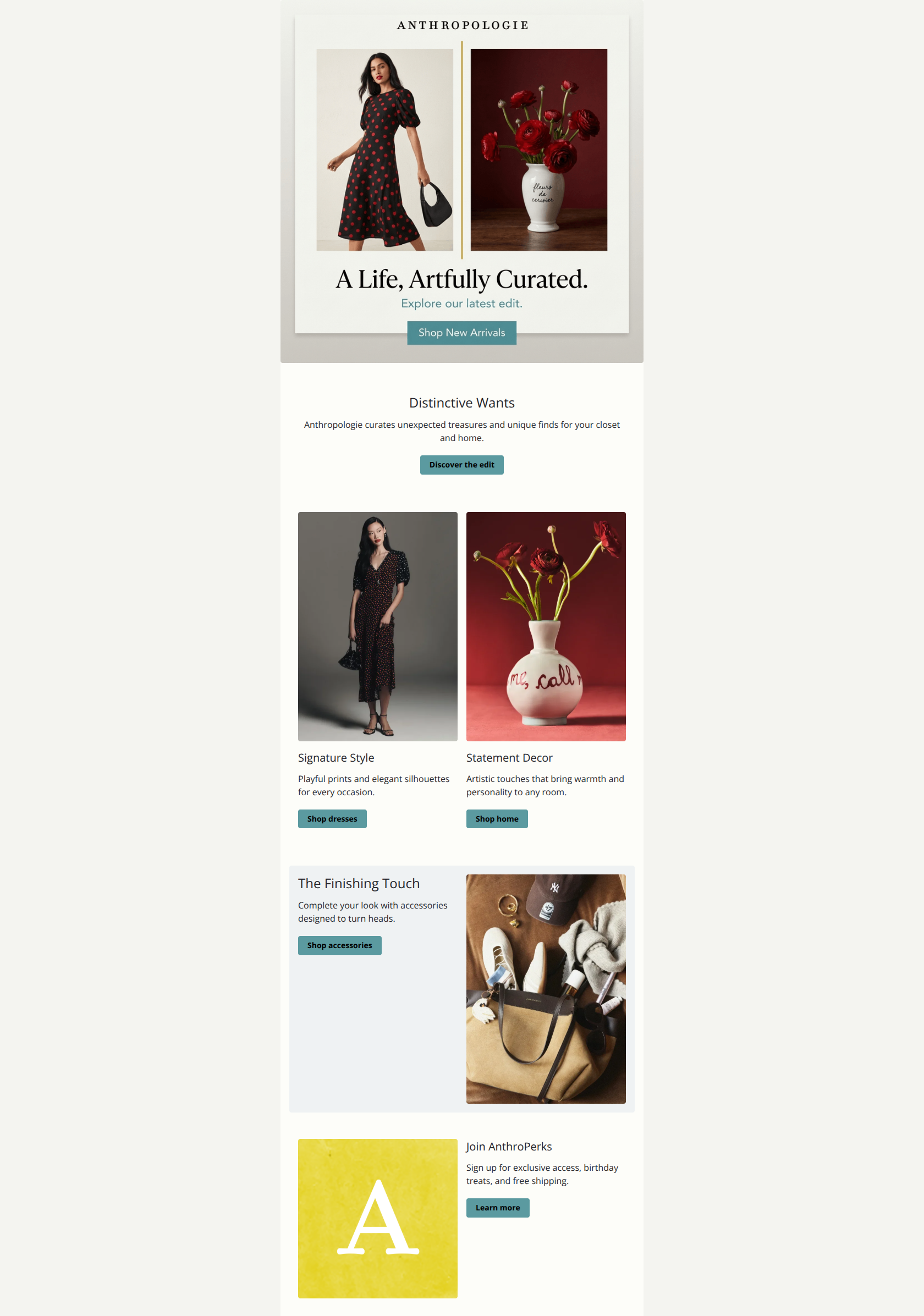
78/100This email succeeds in conveying the sophisticated, curated aesthetic of the Anthropologie brand, utilizing excellent typography and a clean layout that makes scanning easy. However, it suffers from significant redundancy in the top half, asking the user to take the exact same action twice in rapid succession, and utilizes low-contrast CTAs that prioritize aesthetics over click-through rate.
Create Your Own
Generate professional email designs like this one in seconds with Kopi AI.
Email Details
- Subject Line
- Discover Curated Gems for Style & Home
- Brand
- Anthropologie
- Industry
- Fashion & Apparel
- Email Type
- Promotional
- Created
- January 3, 2026
Brand Colors
Email Copy
Distinctive Wants
Anthropologie curates unexpected treasures and unique finds for your closet and home.
→ Discover the edit
Signature Style
Playful prints and elegant silhouettes for every occasion.
→ Shop dresses
Statement Decor
Artistic touches that bring warmth and personality to any room.
→ Shop home
The Finishing Touch
Complete your look with accessories designed to turn heads.
→ Shop accessories
Join AnthroPerks
Sign up for exclusive access, birthday treats, and free shipping.
→ Learn more
Why This Email Works
This email succeeds in conveying the sophisticated, curated aesthetic of the Anthropologie brand, utilizing excellent typography and a clean layout that makes scanning easy. However, it suffers from significant redundancy in the top half, asking the user to take the exact same action twice in rapid succession, and utilizes low-contrast CTAs that prioritize aesthetics over click-through rate.
Hero Impact
78/100- Split-image composition effectively communicates the dual value prop (closet + home) instantly.
- Typography style is elegant and instantly recognizable as brand-authentic.
Content Structure & Flow
75/100- Logical progression from broad brand statement to specific categories (Dresses, Home, Accessories).
- The 'Finishing Touch' section breaks the grid layout effectively, drawing the eye back to the center.
Visual Hierarchy & Layout
85/100- Excellent use of the #eff2f3 gray background on the Accessories card to differentiate it from the white/cream sections.
- Clear Z-pattern or side-by-side structures prevent scanning fatigue.
Call-to-Action Strength
70/100- Buttons are consistently placed and distinct from body text.
- Secondary links (like the text link in the hero) provide alternative click paths.
Message Clarity & Tone
90/100- Copy like 'Unexpected treasures' and 'Playful prints' reinforces the specific brand niche perfectly.
- Headlines are short and punchy.
Readability & Scannability
90/100- Short paragraphs (1-2 lines maximum) make skimming effortless.
- High contrast text (dark grey on cream) is accessible and easy to read.
Offer & Value Proposition
65/100- Ideally positions the brand as a 'curator', adding value beyond just selling products.
Personalization & Audience Fit
50/100- The mix of Home and Apparel correctly addresses the core 'lifestyle' shopper who buys across categories.
Quick Wins
- Delete the text-only 'Distinctive Wants' section; it is redundant and pushes products further down the page.
- Rename the 'Discover the edit' CTA to 'Shop New Arrivals' for immediate clarity.
- Darken the CTA button color to #333332 (Charcoal) or a deeper teal to increase visual pop against the cream background.

Create Professional Email Designs
Generate beautiful, on-brand email designs in seconds. Just enter your brand URL and let AI do the rest.