Automotive Cart Abandonment Email Template
“Did you forget something? 😉”
Design Score
84/100This is a high-performing abandoned cart email that effectively uses brand imagery and a clear financial incentive to drive action. The structure is logical and easy to scan. However, reliance on text-embedded images in the hero and low-contrast product cards limits its potential perfection.
Create Your Own
Generate professional email designs like this one in seconds with Kopi AI.
Email Details
- Subject Line
- Did you forget something? 😉
- Brand
- Rivian
- Industry
- Automotive
- Email Type
- Cart Abandonment
- Created
- December 26, 2025
Brand Colors
Email Copy
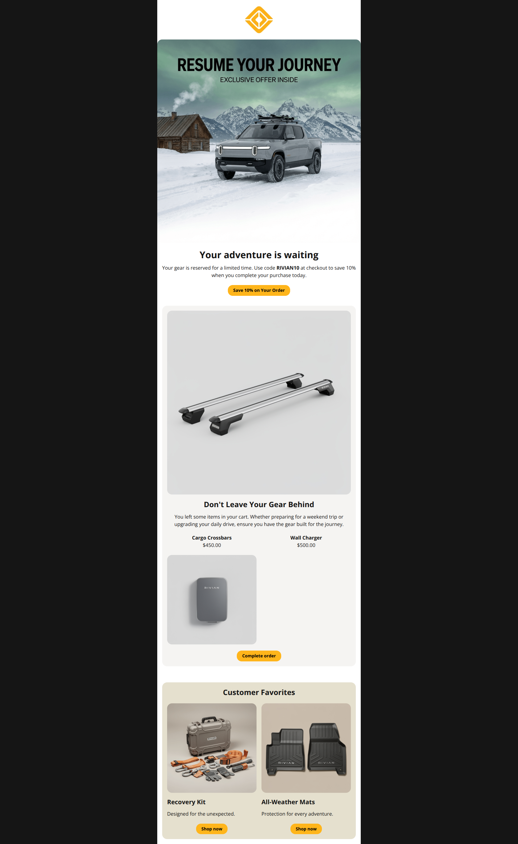
Your adventure is waiting
Your gear is reserved for a limited time. Use code RIVIAN10 at checkout to save 10% when you complete your purchase today.
→ Save 10% on Your Order
Don't Leave Your Gear Behind\
→ Complete order
Customer Favorites
Recovery Kit
Designed for the unexpected.
→ Shop now
All-Weather Mats
Protection for every adventure.
→ Shop now
Why This Email Works
This is a high-performing abandoned cart email that effectively uses brand imagery and a clear financial incentive to drive action. The structure is logical and easy to scan. However, reliance on text-embedded images in the hero and low-contrast product cards limits its potential perfection.
Hero (top/initial part) Impact
80/100- High-quality lifestyle photography aligns perfectly with the 'adventure' brand promise.
- The 'Save 10% on Your Order' CTA button is specific and benefit-oriented.
Content Structure & Flow
90/100- Clear separation of the 'Cart' section and the 'Recommendations' section using background colors.
- The hierarchy of 'Finish what you started' followed by 'Add more' is logically sound for increasing AOV.
Visual Hierarchy & Layout
82/100- Distinct background colors (White -> Gray -> Beige) clearly delineate different content blocks.
- Primary CTA button color (#FFB51B) stands out vividly against the white background.
Call-to-Action Strength
85/100- Primary CTA uses value-based copy ('Save 10%') rather than generic 'Shop'.
- Button design (pill shape, high contrast) makes them clickable and obvious.
Message Clarity & Tone
88/100- The discount code 'RIVIAN10' is bolded and easy to find.
- Short, punchy sentences respect the reader's time.
Readability & Scannability
90/100- Generous whitespace around headlines prevents clutter.
- Font sizes for product names and prices are well-balanced.
Offer & Value Proposition
85/100- Offering a discount on an abandoned cart is a proven high-conversion tactic.
- The offer is immediately actionable with a clear code.
Personalization & Audience Fit
90/100- Dynamic insertion of cart products makes the email highly relevant.
- Imagery of the R1T in snow aligns with the 'Winter awaits' campaign context.
Quick Wins
- Change the background color of the first product card from Light Gray (#f5f4f2) to White to stop the gray product images from blending in.
- Rewrite the secondary CTAs from 'Shop now' to 'View Details' or 'Add to Cart'.
- Move the text 'RESUME YOUR JOURNEY' from the image file into a live text header above the H1.
- Bold the expiration logic (e.g., 'limited time') to increase urgency.
Create Professional Email Designs
Generate beautiful, on-brand email designs in seconds. Just enter your brand URL and let AI do the rest.