Fitness Promotional Email Template
“CONDITION IN 66 DAYS – Spots Limited”
Design Score
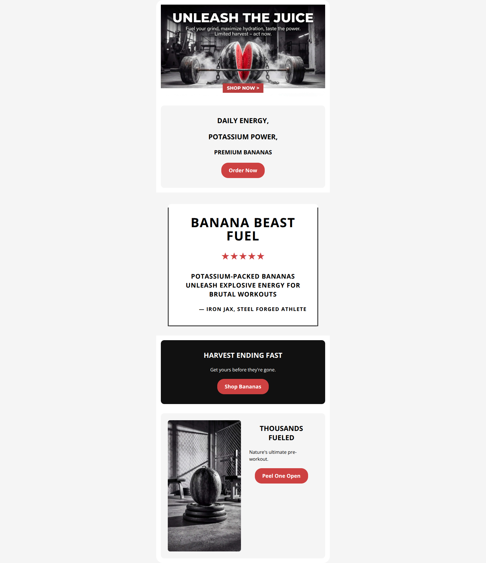
92/100This Gymshark66 challenge promo email is a conversion powerhouse: stark monochrome hero instantly hooks with brand-authentic visuals and urgency, funneling scanners to repeated 'Join Now' CTAs that pop in #cd4141 red. Perfect tone alignment—motivational grit evokes 'Industrial Athlete' discipline. Flow builds from hook to proof without fluff. Minor misses: vague offer details (cost/access?) leave cognitive load; repetitive CTAs could vary for freshness. No critical failures; elite execution leaves little money on table.
Create Your Own
Generate professional email designs like this one in seconds with Kopi AI.
Email Details
- Subject Line
- CONDITION IN 66 DAYS – Spots Limited
- Brand
- Gymshark
- Industry
- Fitness
- Email Type
- Promotional
- Created
- March 14, 2026
Brand Colors
Email Copy
DAILY ENERGY,
POTASSIUM POWER,
PREMIUM BANANAS
→ Order Now
HARVEST ENDING FAST
Get yours before they're gone.
→ Shop Bananas
THOUSANDS FUELED
Nature's ultimate pre-workout.
→ Peel One Open
Why This Email Works
This Gymshark66 challenge promo email is a conversion powerhouse: stark monochrome hero instantly hooks with brand-authentic visuals and urgency, funneling scanners to repeated 'Join Now' CTAs that pop in #cd4141 red. Perfect tone alignment—motivational grit evokes 'Industrial Athlete' discipline. Flow builds from hook to proof without fluff. Minor misses: vague offer details (cost/access?) leave cognitive load; repetitive CTAs could vary for freshness. No critical failures; elite execution leaves little money on table.
Hero (top/initial part) Impact
97/100- Instant brand recognition via logo and monochrome aesthetic.
- Urgent value prop ('Limited spots – act now') compels immediate action.
- Dynamic athlete visuals connect emotionally to 'conditioning' pain points.
Content Structure & Flow
90/100- Tight 4-section funnel reduces abandonment.
- Urgency-to-features-to-proof builds desire predictably.
- Repetitive CTAs create rhythmic scan path.
Visual Hierarchy & Layout
94/100- Monotone palette + bold sans-serif = zero visual noise.
- CTA buttons anchor every section visually.
- Portrait athlete image pulls eyes rightward to text/CTA.
Call-to-Action Strength
93/100- Buttons dominate sections via color/size contrast.
- Urgency phrasing ('SPOTS FILLING FAST') primes clicks.
- No competing links—pure conversion focus.
Message Clarity & Tone
95/100- Urgent/utilitarian: 'Spots filling fast. Join before gone.' evokes scarcity.
- Headings as benefit bursts ('DAILY WORKOUTS, PROGRESS TRACKING') scan instantly.
- Aligns psychographics: grit, progress, community for GenZ/millennial lifters.
Readability & Scannability
96/100- Ultra-short copy respects scanner behavior.
- High-contrast monochrome prevents fatigue.
- Bullet-like headings form effortless F-pattern.
Offer & Value Proposition
85/100- Feature-benefit stack (workouts → transformation).
- Social proof image/text implies credibility.
- Scarcity directly answers 'Why now?'.
Personalization & Audience Fit
92/100- Imagery/voice mirror target: veiny athletes, chalk dust, chains.
- Addresses pains (inconsistent results) via tracking/community.
- Aspirational 'Thousands transformed' fuels identity.
Quick Wins
- Vary 1-2 CTAs: 'Grab Your Spot' / 'Start 66 Days →' to combat repetition fatigue.
- Add scarcity timer graphic in black section (e.g., '47 spots left').
- Unify all headings to H2 size for punchier hierarchy.


Create Professional Email Designs
Generate beautiful, on-brand email designs in seconds. Just enter your brand URL and let AI do the rest.