Automotive Newsletter Email Template
“Clear coat still soft the next morning?”
Design Score
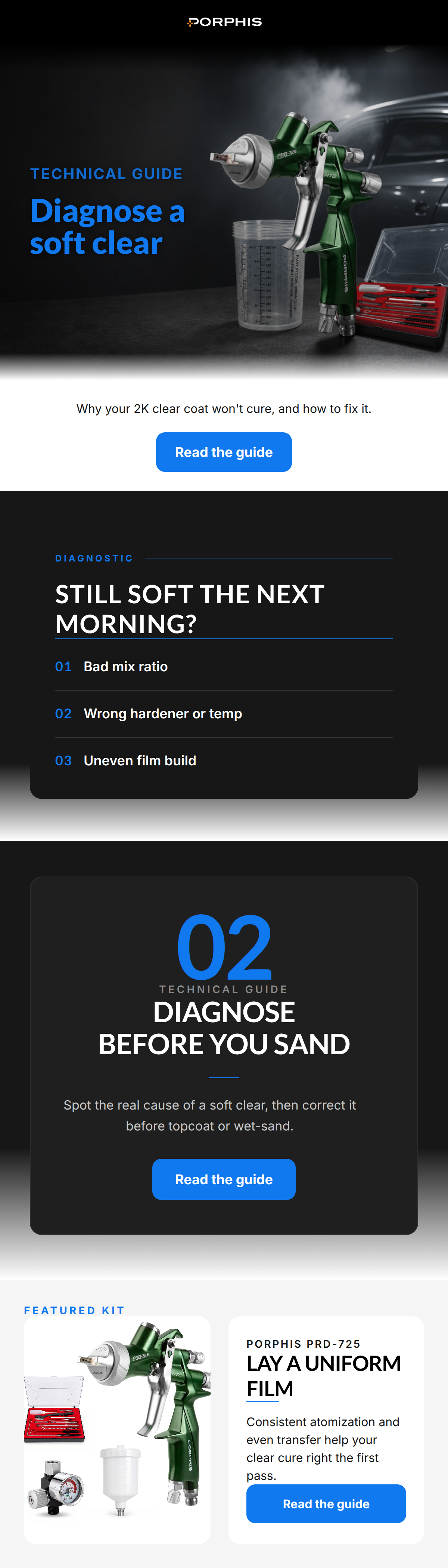
82/100This is a strong, highly targeted educational email that perfectly captures the technical, authoritative voice of the PORPHIS brand. The focus on a real, frustrating pain point ('soft clear coat') immediately hooks the professional audience. The visual execution is generally premium and 'pro-grade', though it suffers from some structural disjointedness and a confusing use of oversized numerals. The consistent use of the 'Read the guide' CTA is a best practice, though the copy surrounding the final CTA could better bridge the gap between the educational content and the featured product.
Create Your Own
Generate professional email designs like this one in seconds with Kopi AI.
Email Details
- Subject Line
- Clear coat still soft the next morning?
- Brand
- PORPHIS
- Industry
- Automotive
- Email Type
- Newsletter
- Created
- August 5, 2026
Brand Colors
Email Copy
Preview text: Diagnose a 2K clear that will not cure before you sand, topcoat, or wait too long.
Why your 2K clear coat won't cure, and how to fix it.
→ Read the guide
Why This Email Works
This is a strong, highly targeted educational email that perfectly captures the technical, authoritative voice of the PORPHIS brand. The focus on a real, frustrating pain point ('soft clear coat') immediately hooks the professional audience. The visual execution is generally premium and 'pro-grade', though it suffers from some structural disjointedness and a confusing use of oversized numerals. The consistent use of the 'Read the guide' CTA is a best practice, though the copy surrounding the final CTA could better bridge the gap between the educational content and the featured product.
Hero Impact
80/100- Bold, highly relevant headline that speaks directly to a customer pain point.
- Excellent use of the 'TECHNICAL GUIDE' kicker to set expectations.
- High-quality, moody product photography fits the brand identity perfectly.
Content Structure & Flow
75/100- Clear progression from education to product.
- The diagnostic list (01, 02, 03) breaks down complex information into digestible chunks.
Visual Hierarchy & Layout
72/100- Strong use of the primary blue (#1179EF) to draw the eye to key numbers, rules, and CTAs.
- The product layout at the bottom uses a clean, two-column split that highlights the kit well.
Call-to-Action Strength
88/100- Flawless repetition of the primary CTA destination and copy.
- High-contrast blue buttons stand out clearly against both dark and light backgrounds.
Message Clarity & Tone
90/100- Highly authoritative, objective tone devoid of marketing fluff.
- Uses precise terminology that builds trust with professional painters.
- Directly addresses a deeply frustrating workshop scenario.
Readability & Scannability
82/100- Excellent contrast for the text in the dark sections.
- Short, punchy sentences cater to a scanning reader.
Offer & Value Proposition
78/100- The educational offer provides immediate, free value to the reader.
- Connects a technical product feature ('lay a uniform film') to a desired outcome (curing right on the first pass).
Personalization & Audience Fit
88/100- Zero lifestyle fluff; purely focused on professional utility.
- Demonstrates deep empathy for the daily struggles of a pro auto body painter.
Copy Conciseness & Word Economy
85/100- The diagnostic bullet points are impressively concise (e.g., 'Bad mix ratio').
- Avoids throat-clearing openers and gets straight to the point.
Quick Wins
- Move the subheadline ('Why your 2K clear coat won't cure...') into the hero image area to unify the message.
- Remove the confusing '02' graphic from the secondary dark block.
- Unify the background colors of the top three sections to eliminate the jarring white band between the hero and diagnostic card.
Create Professional Email Designs
Generate beautiful, on-brand email designs in seconds. Just enter your brand URL and let AI do the rest.