Automotive Newsletter Email Template
“Clear coat still soft the next morning?”
Design Score
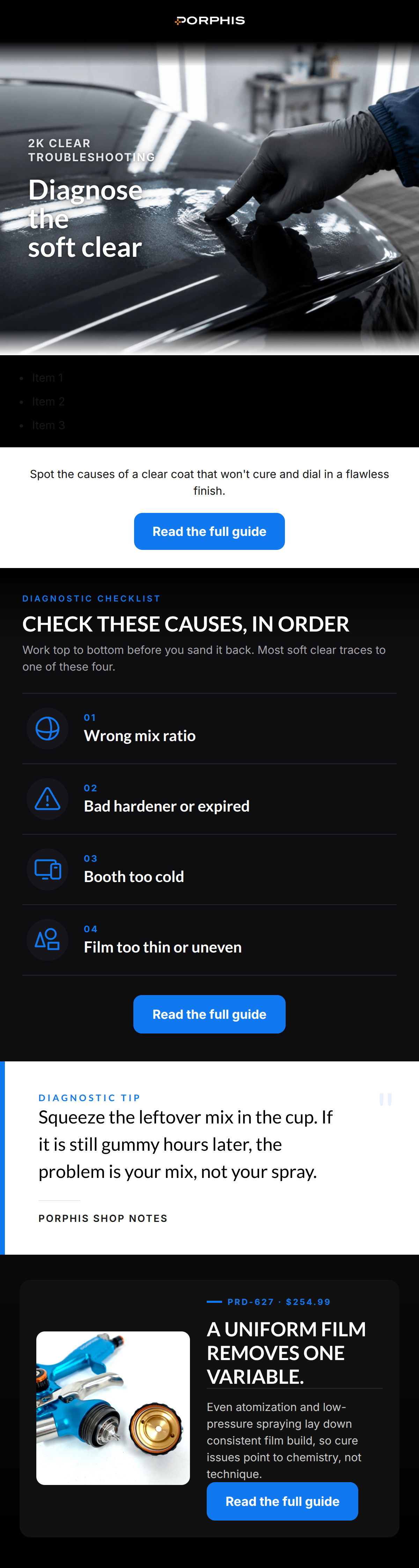
87/100This is a highly effective, education-led email that perfectly nails the brand's 'shop foreman' tone. By addressing a specific, painful technical problem (soft clear coat), it builds immediate authority and trust with a demanding, professional audience. The copy is exceptionally tight, empathetic, and utilizes the correct industry terminology without feeling forced. The strict adherence to a single primary call-to-action ('Read the full guide') provides a clear, unified focus. The primary area for improvement is the visual flow—the alternating dark and light full-width sections create a slightly disjointed 'zebra stripe' effect that interrupts the otherwise immersive, pro-grade aesthetic.
Create Your Own
Generate professional email designs like this one in seconds with Kopi AI.
Email Details
- Subject Line
- Clear coat still soft the next morning?
- Brand
- PORPHIS
- Industry
- Automotive
- Email Type
- Newsletter
- Created
- August 5, 2026
Brand Colors
Email Copy
Preview text: Before you sand or spray over it, diagnose the real cause in the right order.
Spot the causes of a clear coat that won't cure and dial in a flawless finish.
→ Read the full guide
Why This Email Works
This is a highly effective, education-led email that perfectly nails the brand's 'shop foreman' tone. By addressing a specific, painful technical problem (soft clear coat), it builds immediate authority and trust with a demanding, professional audience. The copy is exceptionally tight, empathetic, and utilizes the correct industry terminology without feeling forced. The strict adherence to a single primary call-to-action ('Read the full guide') provides a clear, unified focus. The primary area for improvement is the visual flow—the alternating dark and light full-width sections create a slightly disjointed 'zebra stripe' effect that interrupts the otherwise immersive, pro-grade aesthetic.
1. Hero (top/initial part) Impact
85/100- Moody, high-contrast imagery instantly establishes the 'pro-grade' industrial vibe.
- The kicker '2K CLEAR TROUBLESHOOTING' immediately qualifies the audience and sets expectations.
2. Content Structure & Flow
82/100- The 'inverted pyramid' approach is used well, starting with the broad problem and funneling down to specific diagnostic steps.
- The 'Diagnostic checklist' clearly outlines a step-by-step process, which appeals to a methodical, technical audience.
3. Visual Hierarchy & Layout
75/100- Excellent typographic hierarchy within the checklist; numbers, headings, and supporting text are easily distinguishable.
- The electric blue accent color (#1179EF) is used effectively to draw the eye to key elements and CTAs.
4. Call-to-Action Strength
90/100- Flawless repetition of the primary CTA ('Read the full guide'), providing a clear and singular conversion path.
- Buttons feature high color contrast against both dark and light backgrounds, making them impossible to miss.
5. Message Clarity & Tone
95/100- The phrase 'Work top to bottom before you sand it back' shows deep empathy for the physical labor and frustration of the target audience.
- The pull quote provides a highly practical, actionable piece of advice ('Squeeze the leftover mix...') that proves brand expertise.
6. Readability & Scannability
86/100- The numbered list format allows the reader to quickly digest the four main causes of the problem.
- Text line lengths are kept relatively short, preventing eye fatigue.
7. Offer & Value Proposition
88/100- Providing a solution to a specific, costly, and frustrating workshop problem establishes PORPHIS as a highly valuable resource.
- Positioning the product as a way to 'remove one variable' from a complex process is a brilliant angle for a technical audience.
8. Personalization & Audience Fit
96/100- Accurate use of industry vernacular ('2K clear', 'film build', 'atomization') without over-explaining, respecting the reader's intelligence.
- Directly addresses the financial and emotional pain point of a ruined project ('before you sand it back').
9. Copy Conciseness & Word Economy
98/100- Checklist items are punchy and definitive ('Wrong mix ratio', 'Booth too cold').
- Absence of throat-clearing intro paragraphs; the copy gets straight to the point.
Quick Wins
- Swap the abstract checklist icons for literal representations (mixing cup, thermometer, etc.) to improve scanning speed.
- Remove the '$254.99' price text from the final block to eliminate cognitive dissonance with the 'Read the full guide' CTA.
- Change the background of the first text block (under the hero) from white to a dark gray (#111111) to smooth the visual transition.
Create Professional Email Designs
Generate beautiful, on-brand email designs in seconds. Just enter your brand URL and let AI do the rest.