Fitness Product Launch Email Template
“Built for the work.”
Design Score
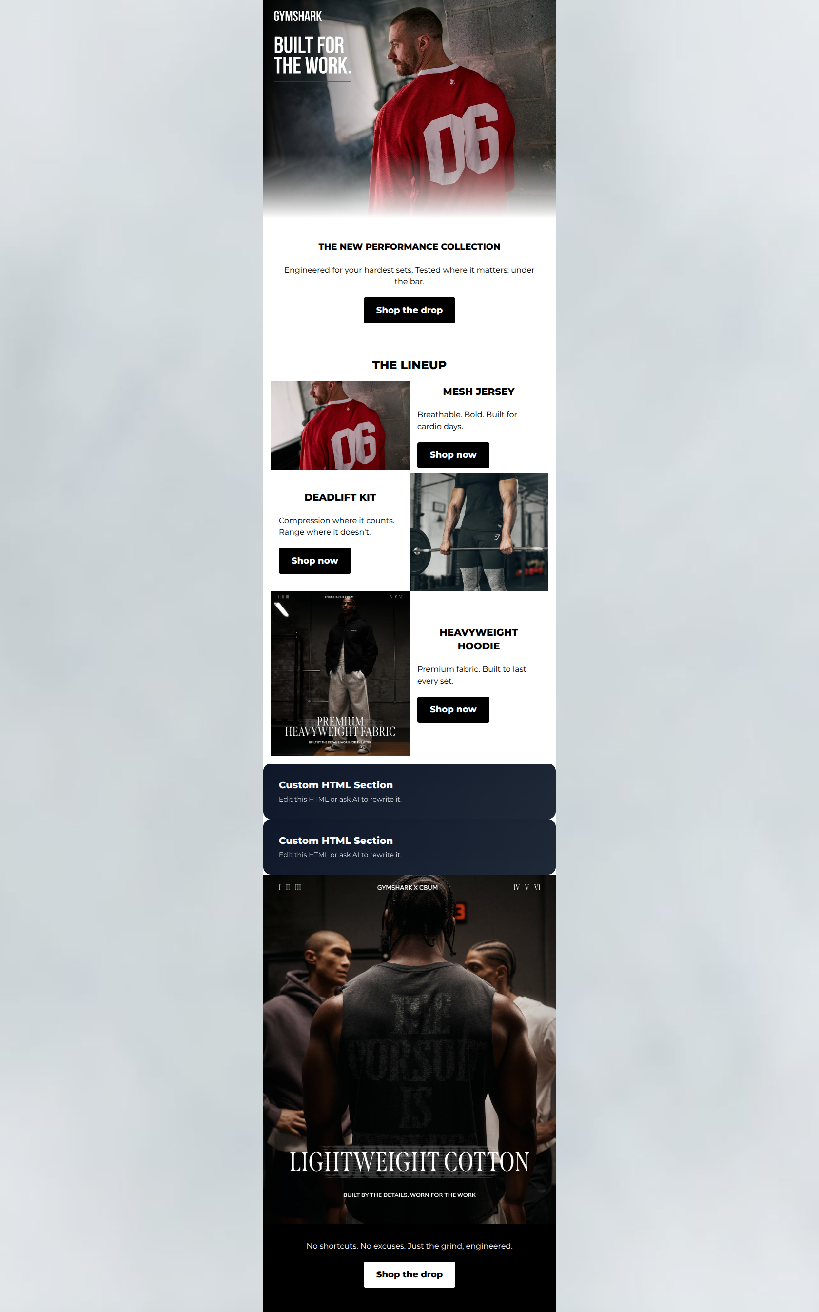
82/100This is a strong, highly brand-aligned email that successfully captures Gymshark's gritty, authoritative tone. The structural flow from hero to product highlights to a final closing hook is logical and drives the user downward. The CTA strategy is textbook: a single, unified conversion goal repeated effectively without confusing the user with competing actions. However, the email's reliance on text baked directly into the imagery creates a cluttered visual hierarchy, competing with the HTML copy and burying the specific functional benefits of the new collection.
Create Your Own
Generate professional email designs like this one in seconds with Kopi AI.
Email Details
- Subject Line
- Built for the work.
- Brand
- Gymshark
- Industry
- Fitness
- Email Type
- Product Launch
- Created
- May 8, 2026
Brand Colors
Email Copy
THE NEW PERFORMANCE COLLECTION
Engineered for your hardest sets. Tested where it matters: under the bar.
→ Shop the drop
THE LINEUP
MESH JERSEY
Breathable. Bold. Built for cardio days.
→ Shop now
DEADLIFT KIT
Compression where it counts. Range where it doesn't.
→ Shop now
HEAVYWEIGHT HOODIE
Premium fabric. Built to last every set.
→ Shop now
No shortcuts. No excuses. Just the grind, engineered.
→ Shop the drop
Why This Email Works
This is a strong, highly brand-aligned email that successfully captures Gymshark's gritty, authoritative tone. The structural flow from hero to product highlights to a final closing hook is logical and drives the user downward. The CTA strategy is textbook: a single, unified conversion goal repeated effectively without confusing the user with competing actions. However, the email's reliance on text baked directly into the imagery creates a cluttered visual hierarchy, competing with the HTML copy and burying the specific functional benefits of the new collection.
Hero (top/initial part) Impact
82/100- Strong, on-brand visual aesthetic that immediately commands attention.
- Clear, punchy subcopy ('Engineered for your hardest sets') that speaks directly to the audience's goals.
- High-contrast, prominent primary CTA right at the top.
Content Structure & Flow
88/100- Excellent use of the Z-pattern to break up the monotony of stacked products.
- Logical narrative flow: introduce the collection -> show the pieces -> reiterate the ethos -> final push.
- Generous whitespace around text blocks prevents the layout from feeling cramped.
Visual Hierarchy & Layout
72/100- Stark black-and-white color palette creates a premium, serious, and athletic mood.
- Excellent use of high-contrast CTA buttons (black on white, white on black) that 'pop' instantly.
- HTML typography is bold and legible.
Call-to-Action Strength
96/100- Uncompromising focus on a single destination URL across all buttons.
- High repetition (5 buttons) maximizes the opportunity for a click at any point in the scroll.
- Excellent contrast ensures the buttons are the most prominent elements in their respective sections.
Message Clarity & Tone
85/100- Highly motivating, 'no excuses' tone perfectly matches the brand psychographics.
- Uses vocabulary intrinsic to the culture ('sets', 'under the bar', 'grind').
- Confident, declarative sentences project authority.
Readability & Scannability
75/100- Short, fragmented sentences ('Breathable. Bold.') are perfectly tailored for quick skimming.
- High contrast between the HTML text and the #FFFFFF background.
- Clear hierarchy between H2, H3, and body text.
Offer & Value Proposition
72/100- Clearly communicates the primary benefit: getting through difficult workouts.
- Positions the clothing as equipment ('engineered', 'built for') rather than just fashion.
Personalization & Audience Fit
88/100- Deep understanding of the target audience's core motivations and pain points.
- Visuals and copy work together to flatter the reader's self-image as a dedicated athlete.
- Avoids generic fitness cliches in favor of specific lifting terminology.
Copy Conciseness & Word Economy
92/100- No filler phrases or wasted space.
- Masterful use of short, punchy fragments to drive pacing.
- Leaves the talking to the product photography.
Quick Wins
- Remove all baked-in promotional text from the photography to clean up the visual hierarchy.
- Replace the baked-in 'BUILT FOR THE WORK' text in the hero image with a prominent HTML headline, moving 'The New Performance Collection' to a smaller subhead.
- Swap out the repetitive use of 'Built' in the product descriptions for synonyms like 'Constructed' or 'Designed' to keep the copy fresh.


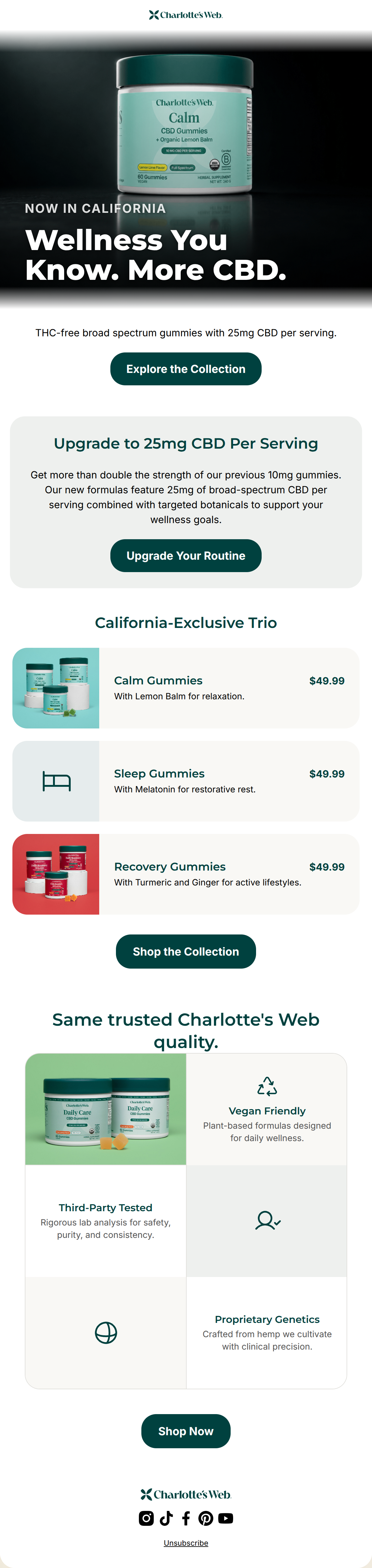
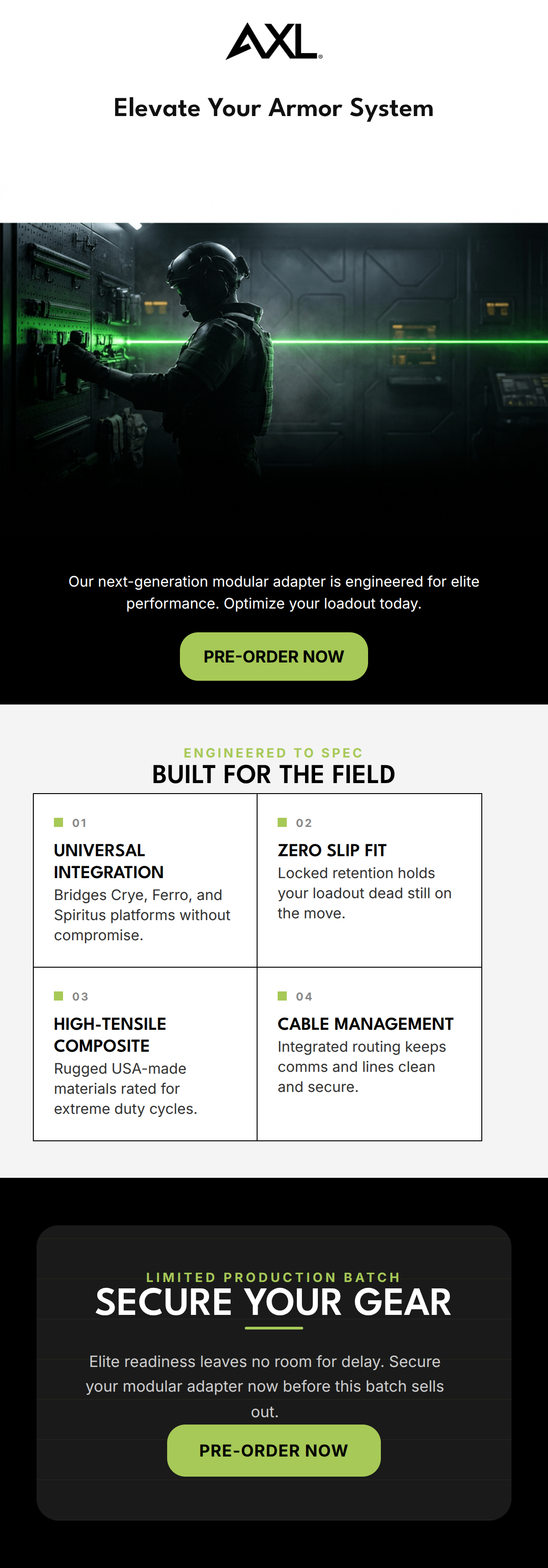
Create Professional Email Designs
Generate beautiful, on-brand email designs in seconds. Just enter your brand URL and let AI do the rest.