Fashion & Apparel Cart Abandonment Email Template
“Abandoned - Email 1”
Design Score
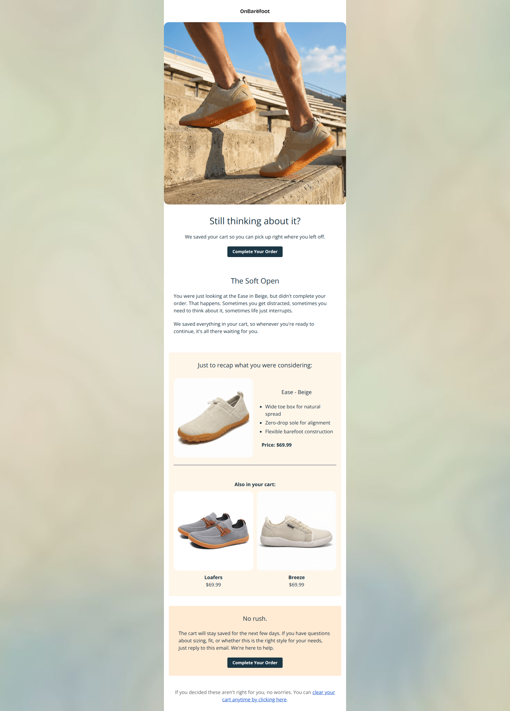
79/100This is a visually clean, on-brand cart recovery email that executes the fundamentals of personalization and layout well. However, it stumbles significantly on copywriting strategy: the headline "The Soft Open" is confusing (likely an internal placeholder), and the "No rush" section actively dampens urgency, potentially lowering conversion rates in an attempt to be polite.
Create Your Own
Generate professional email designs like this one in seconds with Kopi AI.
Email Details
- Subject Line
- Abandoned - Email 1
- Brand
- OnBarefoot
- Industry
- Fashion & Apparel
- Email Type
- Cart Abandonment
- Created
- January 31, 2026
Brand Colors
Email Copy
Still thinking about it?
We saved your cart so you can pick up right where you left off.
→ Complete Your Order
The Soft Open
You were just looking at the Ease in Beige, but didn't complete your order. That happens. Sometimes you get distracted, sometimes you need to think about it, sometimes life just interrupts.
We saved everything in your cart, so whenever you're ready to continue, it's all there waiting for you.
Just to recap what you were considering:
Ease - Beige
- Wide toe box for natural spread
- Zero-drop sole for alignment
- Flexible barefoot construction
Price: $69.99
Also in your cart:
Loafers $69.99
Breeze $69.99
No rush.
The cart will stay saved for the next few days. If you have questions about sizing, fit, or whether this is the right style for your needs, just reply to this email. We're here to help.
→ Complete Your Order
If you decided these aren't right for you, no worries. You can clear your cart anytime by clicking here.
Why This Email Works
This is a visually clean, on-brand cart recovery email that executes the fundamentals of personalization and layout well. However, it stumbles significantly on copywriting strategy: the headline "The Soft Open" is confusing (likely an internal placeholder), and the "No rush" section actively dampens urgency, potentially lowering conversion rates in an attempt to be polite.
Hero (top/initial part) Impact
75/100- High-quality lifestyle imagery that immediately sets the 'outdoor/active' context.
- Primary CTA is immediately visible without scrolling.
Content Structure & Flow
80/100- Excellent separation of primary abandoned item vs. secondary items in the cart.
- Clear demarcation between the 'reminder' section and the 'support' section using background colors.
Visual Hierarchy & Layout
85/100- Great use of color blocking (#FFF6EA and #FFEAD3) to organize distinct information blocks.
- Product imagery is large and clear, effectively showcasing the item texture.
Call-to-Action Strength
80/100- High contrast buttons (#1B3644 on light backgrounds) are very easy to spot.
- Repeated CTA at the bottom saves the user from scrolling back up.
Message Clarity & Tone
65/100- The body copy explaining *why* the cart was saved ("Sometimes life just interrupts") is empathetic and human.
- Product specs (Wide toe box, Zero-drop) clearly communicate the technical value.
Readability & Scannability
90/100- Use of bullet points for product features allows users to instantly recall why they added the item to the cart.
- Short, punchy paragraphs prevent wall-of-text fatigue.
Offer & Value Proposition
80/100- Explicitly listing the product features (Wide toe box, etc.) next to the image serves as a mini sales pitch, not just a receipt.
- Clear pricing display.
Personalization & Audience Fit
85/100- Accurate reflection of the user's specific cart contents.
- Copy ("You were just looking at...") feels personal and direct.
Quick Wins
- Rename the confusing "The Soft Open" header to "Did life get in the way?" or "Your cart is waiting."
- Change the "No rush" header to "Questions about fit?" to maintain friendliness without killing urgency.
- Remove the "clear your cart" link at the bottom; do not offer an easy path to abandon the purchase.
- Change the primary CTA copy to "Secure Your Size" to imply scarcity.

Create Professional Email Designs
Generate beautiful, on-brand email designs in seconds. Just enter your brand URL and let AI do the rest.