Fashion & Apparel Cart Abandonment Email Template
“You left this behind”
Design Score
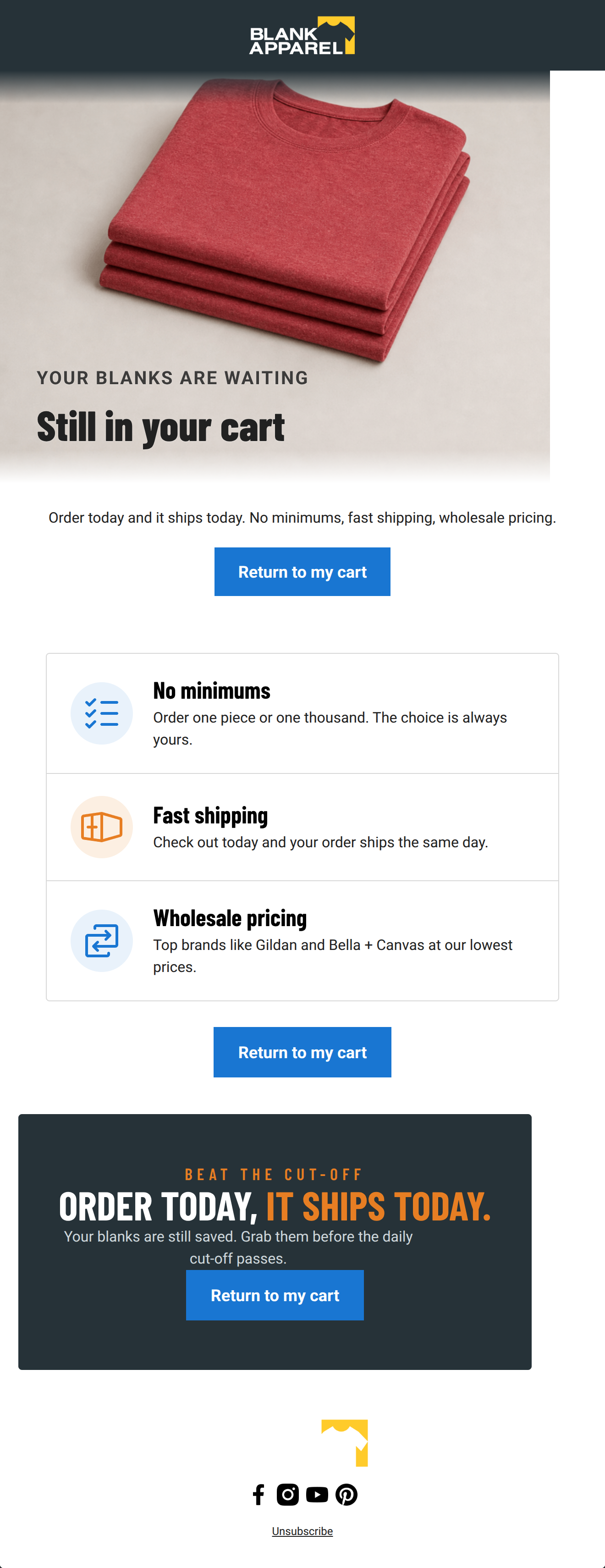
86/100This is a highly effective, strictly utilitarian cart abandonment email that perfectly captures Blank Apparel's brand voice. The layout is clean, highly scannable, and utilizes an excellent inverted pyramid structure that funnels attention directly to the strategically repeated call-to-action. By focusing on core value propositions—no minimums, fast shipping, and wholesale pricing—it speaks directly to the pragmatic needs of its target audience. The primary area for improvement lies in replacing generic imagery with dynamic product blocks to increase personalization and eliminating slight redundancies in the copy.
Create Your Own
Generate professional email designs like this one in seconds with Kopi AI.
Email Details
- Subject Line
- You left this behind
- Brand
- Blank Apparel
- Industry
- Fashion & Apparel
- Email Type
- Cart Abandonment
- Created
- September 29, 2026
Brand Colors
Email Copy
Order today and it ships today. No minimums, fast shipping, wholesale pricing.
→ Return to my cart
Unsubscribe
Why This Email Works
This is a highly effective, strictly utilitarian cart abandonment email that perfectly captures Blank Apparel's brand voice. The layout is clean, highly scannable, and utilizes an excellent inverted pyramid structure that funnels attention directly to the strategically repeated call-to-action. By focusing on core value propositions—no minimums, fast shipping, and wholesale pricing—it speaks directly to the pragmatic needs of its target audience. The primary area for improvement lies in replacing generic imagery with dynamic product blocks to increase personalization and eliminating slight redundancies in the copy.
Hero (top/initial part) Impact
85/100- Immediate clarity of purpose.
- Strong, brand-aligned typography (Barlow Condensed) that feels industrial and robust.
- High-contrast, professional product photography.
Content Structure & Flow
88/100- Excellent pacing with well-defined sections.
- The three-card layout for benefits breaks up information perfectly.
- The dark urgency block creates a strong visual anchor at the bottom of the email.
Visual Hierarchy & Layout
92/100- Stark, highly effective contrast between the white background and the dark slate urgency block.
- Consistent and effective use of the brand's secondary colors (blue and orange) to draw the eye to icons and important text.
- Clean, grid-like structure that reinforces the 'efficiency' brand trait.
Call-to-Action Strength
95/100- Flawless repetition of the primary action.
- High-contrast blue buttons (#1976D2) that 'pop' against both white and dark backgrounds.
- Clear, unambiguous button copy that tells the user exactly what to expect.
Message Clarity & Tone
85/100- Direct and authoritative tone.
- Focuses entirely on tangible benefits rather than emotional fluff.
- Language matches the 'expert facilitator' brand persona.
Readability & Scannability
90/100- Excellent typographic hierarchy (large bold headers, clear body text).
- Iconography provides instant visual cues for the text content.
- Line lengths are kept relatively short, aiding readability.
Offer & Value Proposition
88/100- Clearly articulates the brand's unique selling propositions.
- Uses urgency ('Beat the cut-off') effectively to prompt immediate action.
- Explains features as benefits ('Order one piece or one thousand. The choice is always yours').
Personalization & Audience Fit
70/100- Value propositions are highly tailored to the specific pain points of the target demographic (minimums and shipping speed).
Copy Conciseness & Word Economy
78/100- No throat-clearing or wasted introductory sentences.
- Benefit descriptions are distilled into single, impactful sentences.
Quick Wins
- Delete the text block ('Order today and it ships today. No minimums, fast shipping, wholesale pricing.') located immediately above the first CTA button to tighten the layout and reduce redundancy.
- Wrap the main hero image in an 'href' pointing to the cart.

Create Professional Email Designs
Generate beautiful, on-brand email designs in seconds. Just enter your brand URL and let AI do the rest.