Home & Garden Promotional Email Template
“A Bold New Look for Autumn 🍂”
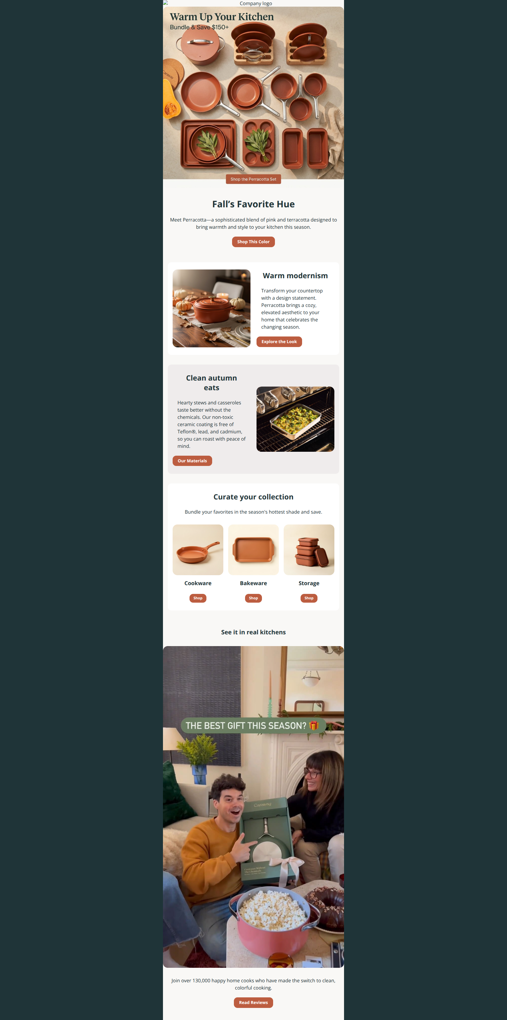
Design Score
82/100This is a visually stunning execution that perfectly captures the brand's aesthetic appeal, utilizing high-quality photography and a clean layout. However, it leaves conversion revenue on the table by burying the financial value proposition inside an image and diverting users to educational pages instead of product pages in key content blocks.
Create Your Own
Generate professional email designs like this one in seconds with Kopi AI.
Email Details
- Subject Line
- A Bold New Look for Autumn 🍂
- Brand
- Caraway Home
- Industry
- Home & Garden
- Email Type
- Promotional
- Created
- January 17, 2026
Brand Colors
Email Copy
Fall’s Favorite Hue
Meet Perracotta—a sophisticated blend of pink and terracotta designed to bring warmth and style to your kitchen this season.
→ Shop This Color
Warm modernism
Transform your countertop with a design statement. Perracotta brings a cozy, elevated aesthetic to your home that celebrates the changing season.
→ Explore the Look
Clean autumn eats
Hearty stews and casseroles taste better without the chemicals. Our non-toxic ceramic coating is free of Teflon®, lead, and cadmium, so you can roast with peace of mind.
→ Our Materials
Curate your collection
Bundle your favorites in the season's hottest shade and save.
Cookware
→ Shop
Bakeware
→ Shop
Storage
→ Shop
See it in real kitchens
Join over 130,000 happy home cooks who have made the switch to clean, colorful cooking.
→ Read Reviews
Why This Email Works
This is a visually stunning execution that perfectly captures the brand's aesthetic appeal, utilizing high-quality photography and a clean layout. However, it leaves conversion revenue on the table by burying the financial value proposition inside an image and diverting users to educational pages instead of product pages in key content blocks.
Hero (top/initial part) Impact
90/100- High-quality product photography that instantly communicates quality and scale.
- Color theming is consistent between the product and the UI elements (buttons).
Content Structure & Flow
85/100- Zig-zag layout maintains visual interest and scanning rhythm.
- Clear demarcation between the 'Story' section and the 'Shop' grid.
Visual Hierarchy & Layout
88/100- Excellent use of whitespace on the #F9F8F6 background.
- Headings stands out clearly in the dark brand green (#1F3438).
Call-to-Action Strength
75/100- Buttons use a consistent brand color (#BC5D40) that stands out well against the cream background.
- Every section has a clear button.
Message Clarity & Tone
85/100- Consistent aspirational voice.
- Good connection between product attributes (non-toxic) and user benefits (peace of mind).
Readability & Scannability
90/100- High contrast text (#1F3438) on light background (#F9F8F6) passes accessibility standards easily.
- Font sizes are generous and easy to read on mobile.
Offer & Value Proposition
70/100- The implicit value of 'non-toxic' and 'health' is communicated clearly.
Personalization & Audience Fit
60/100- The content is highly relevant to the target demographic (health-conscious, design-focused home cooks).
Quick Wins
- Change the 'Our Materials' button in the middle section to a commerce-focused CTA like 'Shop Non-Toxic Sets' to prevent funnel drop-off.
- Add the text 'Save over $150 on bundles' immediately under the 'Fall's Favorite Hue' headline to make the offer searchable and visible if images are off.
- Rename the small 'Shop' buttons in the product grid to specific categories like 'Shop Cookware' or simply make them wider 'Shop Now' buttons.




Create Professional Email Designs
Generate beautiful, on-brand email designs in seconds. Just enter your brand URL and let AI do the rest.