Fitness Product Launch Email Template
“24 hours. Then it's gone.”
Design Score
88/100This is a highly effective, hype-driven product launch email that perfectly executes the streetwear 'drop' aesthetic. It leans heavily into scarcity and exclusivity, utilizing stark typography, brutalist design elements, and exceptionally tight copy to drive urgency. The email successfully creates a strong emotional reaction (FOMO) tailored to Gymshark's young, trend-conscious demographic. The primary area for improvement lies in balancing this intense vibe with actual product clarity; the apparel itself is somewhat lost in the darkness, and adding benefit-driven copy to the features would strengthen the desire to click.
Create Your Own
Generate professional email designs like this one in seconds with Kopi AI.
Email Details
- Subject Line
- 24 hours. Then it's gone.
- Brand
- Gymshark
- Industry
- Fitness
- Email Type
- Product Launch
- Created
- May 5, 2026
Brand Colors
Email Copy
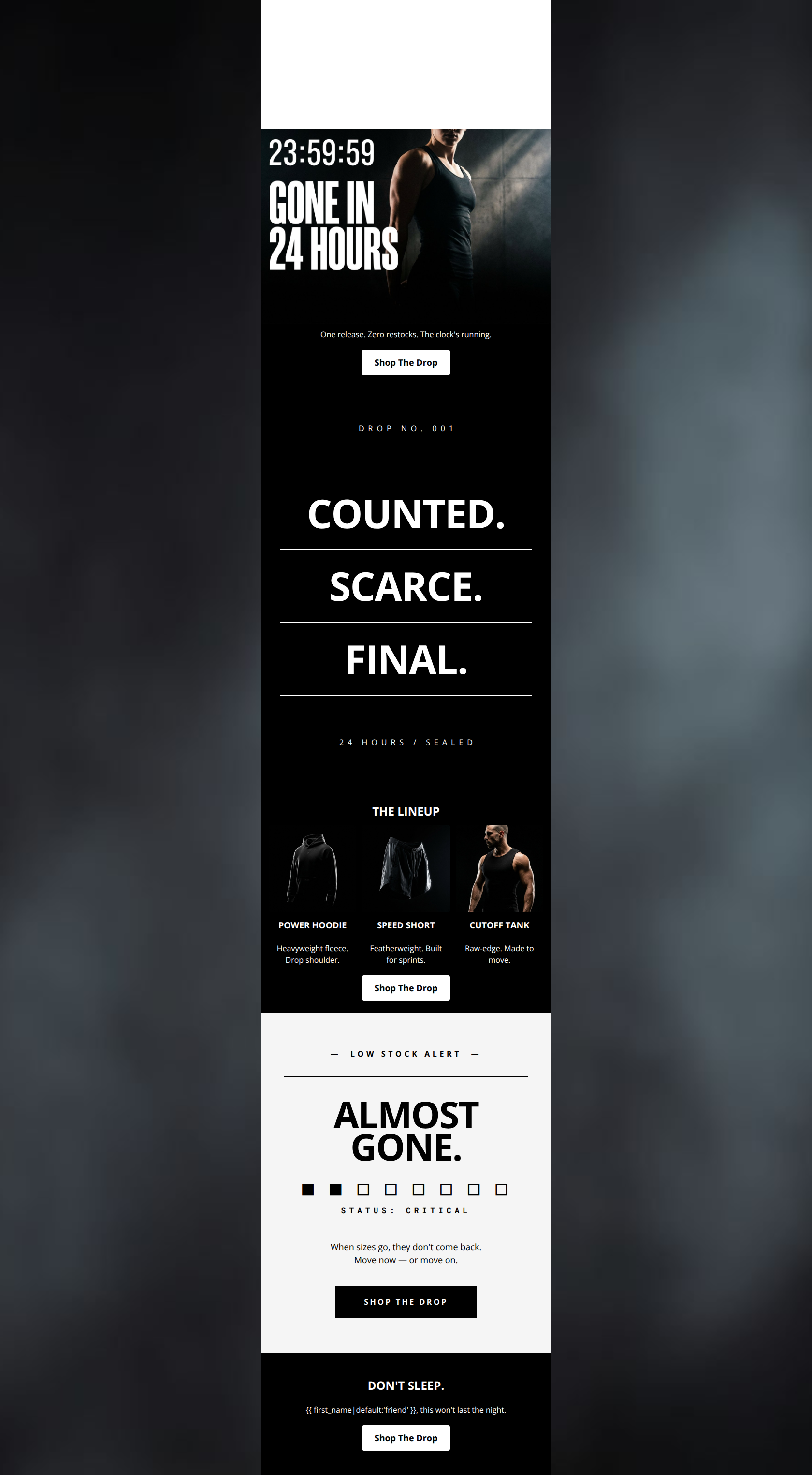
One release. Zero restocks. The clock's running.
→ Shop The Drop
THE LINEUP
POWER HOODIE
Heavyweight fleece. Drop shoulder.
SPEED SHORT
Featherweight. Built for sprints.
CUTOFF TANK
Raw-edge. Made to move.
→ Shop The Drop
DON'T SLEEP.
friend, this won't last the night.
→ Shop The Drop
Why This Email Works
This is a highly effective, hype-driven product launch email that perfectly executes the streetwear 'drop' aesthetic. It leans heavily into scarcity and exclusivity, utilizing stark typography, brutalist design elements, and exceptionally tight copy to drive urgency. The email successfully creates a strong emotional reaction (FOMO) tailored to Gymshark's young, trend-conscious demographic. The primary area for improvement lies in balancing this intense vibe with actual product clarity; the apparel itself is somewhat lost in the darkness, and adding benefit-driven copy to the features would strengthen the desire to click.
Hero Impact
85/100- Immediate establishment of urgency with 'GONE IN 24 HOURS'.
- Excellent use of stark, high-contrast imagery to command attention.
- Clear, unmissable primary CTA above the fold.
Content Structure & Flow
88/100- Logical progression from high-level hype to specific product offerings.
- Excellent use of a stark white contrast block near the bottom to jolt the reader's attention before the final CTA.
- Rhythm and pacing match the intense, energetic brand voice.
Visual Hierarchy & Layout
82/100- Masterful use of typography as a primary design element.
- Strong use of negative space to make the statements feel heavy and important.
- Clear demarcation between the 'hype' sections and the 'shopping' sections.
Call-to-Action Strength
95/100- Absolute clarity of action with zero competing destinations.
- Excellent repetition reinforcing the conversion goal.
- High-contrast styling ensures the buttons pop in a 'squint test'.
Message Clarity & Tone
86/100- Highly authentic to the brand's energetic and aspirational voice.
- Creates a strong emotional reaction (FOMO) rather than just pushing a rational transaction.
- Consistent tone from the preheader to the footer.
Readability & Scannability
90/100- Zero walls of text; relies on punchy, single-sentence copy.
- Strong visual anchors (the manifesto, the contrast block) guide the eye down the page.
- High-contrast text pairings ensure readability.
Offer & Value Proposition
78/100- Successfully creates immense perceived value through artificial scarcity.
- The 'Status: Critical' visualization is a highly effective way to communicate the offer's fleeting nature.
Personalization & Audience Fit
85/100- Deep understanding of the target demographic's buying behaviors (drop culture).
- Appropriate use of personalization to heighten the sense of a direct, urgent warning.
Copy Conciseness & Word Economy
98/100- Distilled, intentional messaging.
- Punchy sentence structures that dictate a fast reading pace.
- No repetition of concepts; each section adds a new angle to the urgency.
Quick Wins
- Increase the brightness/exposure on the three product images in 'THE LINEUP' so the garment details (seams, drawcords) are visible against the black background.
- Increase the font size of the descriptive text beneath the product images to ensure legibility on mobile.
- Widen the CTA buttons slightly to increase the tap target size and better match the heavy, monumental design aesthetic.


Create Professional Email Designs
Generate beautiful, on-brand email designs in seconds. Just enter your brand URL and let AI do the rest.