Fitness Promotional Email Template
“13 years. The Birthday Sale is coming.”
Design Score
82/100This is a strong, highly focused promotional email that effectively captures the disciplined, utilitarian ethos of the Pursue Fitness brand. The copy is punchy, the aesthetic is appropriately stark, and the repetition of the 'Build Your Wishlist' CTA is executed flawlessly, leaving zero ambiguity about what the user should do next. However, the email makes a critical structural error by burying the primary value proposition—the 'Up to 50% Off' offer—halfway down the scroll. Users who don't scroll past the 'How The Drop Works' section will have no idea how massive the sale actually is, leaving significant revenue on the table.
Create Your Own
Generate professional email designs like this one in seconds with Kopi AI.
Email Details
- Subject Line
- 13 years. The Birthday Sale is coming.
- Brand
- Pursue Fitness
- Industry
- Fitness
- Email Type
- Promotional
- Created
- September 9, 2026
Brand Colors
Email Copy
Preview text: Up to 50% off everything, plus an extra 15%. Build your wishlist before Sunday, 6pm BST.
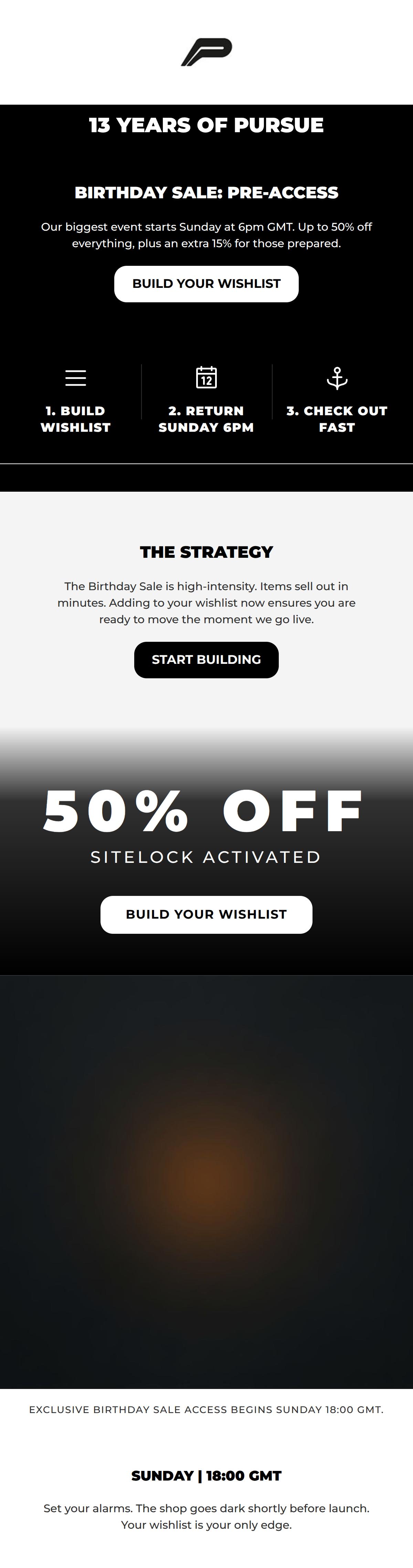
13 YEARS OF PURSUE
BIRTHDAY SALE: PRE-ACCESS
Our biggest event starts Sunday at 6pm GMT. Up to 50% off everything, plus an extra 15% for those prepared.
→ BUILD YOUR WISHLIST
THE STRATEGY
The Birthday Sale is high-intensity. Items sell out in minutes. Adding to your wishlist now ensures you are ready to move the moment we go live.
→ START BUILDING
SUNDAY | 18:00 GMT
Set your alarms. The shop goes dark shortly before launch. Your wishlist is your only edge.
Why This Email Works
This is a strong, highly focused promotional email that effectively captures the disciplined, utilitarian ethos of the Pursue Fitness brand. The copy is punchy, the aesthetic is appropriately stark, and the repetition of the 'Build Your Wishlist' CTA is executed flawlessly, leaving zero ambiguity about what the user should do next. However, the email makes a critical structural error by burying the primary value proposition—the 'Up to 50% Off' offer—halfway down the scroll. Users who don't scroll past the 'How The Drop Works' section will have no idea how massive the sale actually is, leaving significant revenue on the table.
Hero (top/initial part) Impact
65/100- Strong, brand-aligned lifestyle imagery.
- Clear declaration of the event (13 Years).
Content Structure & Flow
70/100- Clear delineation between distinct sections using stark background color changes.
- Ends with concrete product examples to initiate the wishlist building immediately.
Visual Hierarchy & Layout
85/100- Excellent use of high-contrast, black-and-white blocking to separate information.
- Numbered steps in the triptych create an immediate, scannable visual path.
Call-to-Action Strength
98/100- Perfect consistency in CTA messaging.
- Highly specific, action-oriented verb choice ('Build' instead of a generic 'Shop').
- Ample repetition ensures the CTA is always within viewport reach.
Message Clarity & Tone
90/100- Utilitarian, no-nonsense phrasing ('Sizes sell out quick. No hesitation.').
- Avoids fluffy marketing jargon in favor of direct instructions.
Readability & Scannability
88/100- Excellent use of bullet-style layouts (the triptych) to break up text.
- High-contrast headers instantly communicate the purpose of each section.
Offer & Value Proposition
75/100- Highly compelling, tiered discount structure.
- Clear timeline for when the value unlocks (Sunday, 6PM GMT).
Personalization & Audience Fit
85/100- Taps into FOMO and urgency appropriately for the demographic.
- Matches the 'focused athlete' brand psychographics by giving clear, disciplined instructions.
Copy Conciseness & Word Economy
95/100- Zero filler language.
- Punchy, outcome-focused product descriptions ('warm-ups that mean business').
Quick Wins
- Add 'Up to 50% Off' directly into the hero image or the text block immediately below it.
- Standardize the CTA button colors so the primary action looks identical in every section.
- Increase the contrast of the sub-text inside the black 'How The Drop Works' cards slightly.

Create Professional Email Designs
Generate beautiful, on-brand email designs in seconds. Just enter your brand URL and let AI do the rest.