Overall Grade
Needs Improvement
Score
50/100
Key Findings
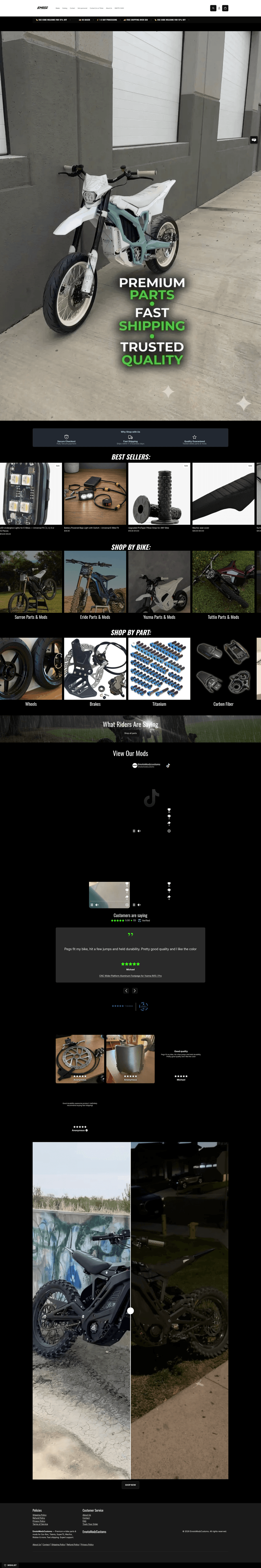
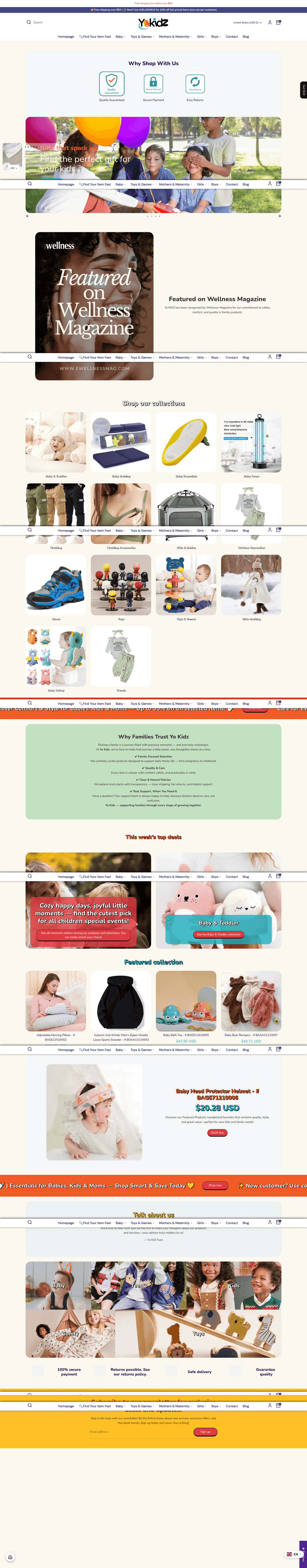
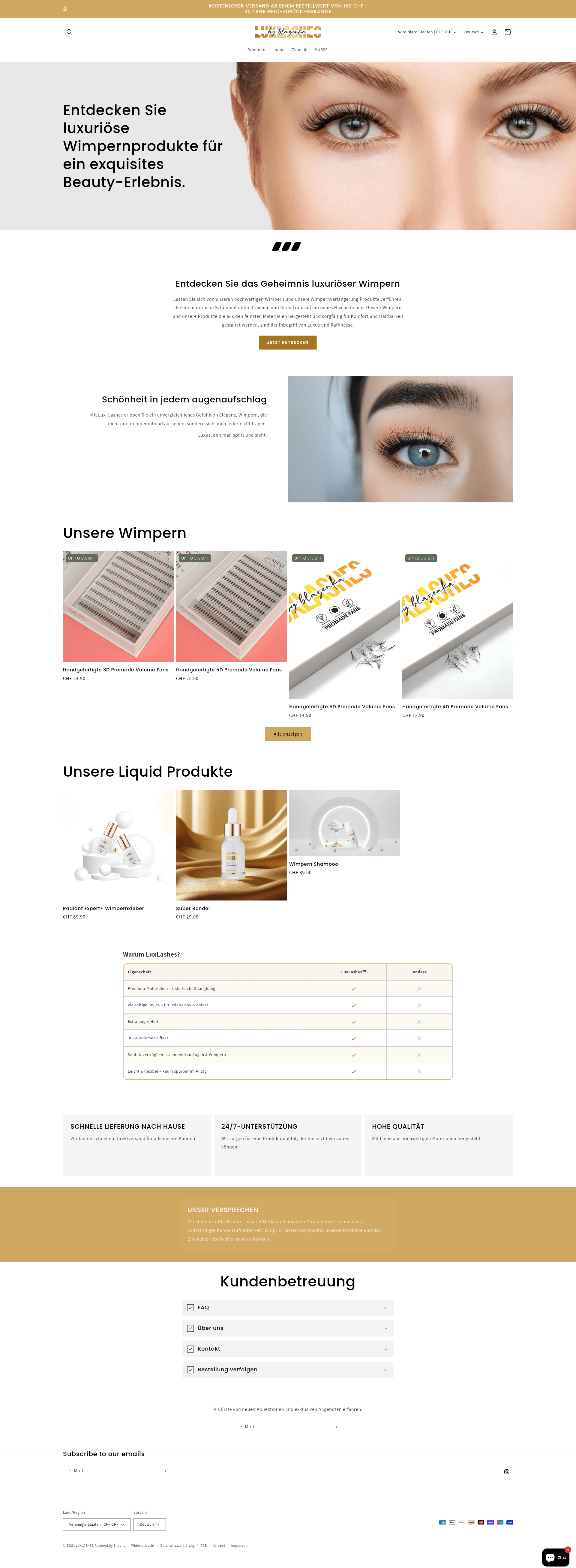
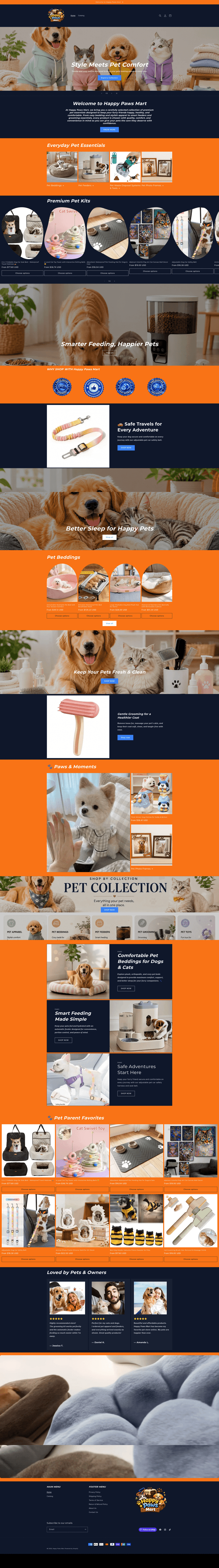
The product grid mixes various photography styles, backgrounds, and resolutions, creating a disjointed shopping experience.
The logo and graphic design are minimal and amateur, failing to establish the store as a premium fashion brand.
The menu and category structure are well-organized, making it easy to browse the large product catalog.
The total absence of reviews or testimonials on the homepage significantly hampers brand trust and conversion potential.
Your Top Priorities
Professional product photos and graphics can increase conversions by 30%+. Upgrade your visuals with Kopi AI.
Improve with Kopi AIUse a consistent background (e.g., all studio white) for all product images. Professional AI-powered background removal tools can help unify disparate supplier photos.
High PriorityRedesign the logo and hero banners to reflect a higher-end 'London' fashion aesthetic. Move away from generic theme defaults for a more custom look.
High PriorityImport and display customer reviews on the homepage and product cards. A 'Featured in' or 'Instagram Feed' section would also build significant trust.
Medium PriorityDevelop a unique brand story that moves beyond 'Quality clothing.' Explain what makes Londonrd special to reduce the generic dropshipping feel.
Medium PriorityAnalysis Report Card
1. Product Photography
1.5/5
Needs Work2. Graphics & Design
2/5
Needs Work3. Value Proposition
2.5/5
Needs Work4. Navigation & Usability
3.5/5
Okay5. Speed & Performance
Needs manual check
Info6. Mobile Responsiveness
3/5
Okay7. Trust Signals
2/5
Needs Work8. Visual Appeal & Branding
2/5
Needs Work9. Content & Messaging
2.5/5
Needs WorkDetailed Findings
1. Product & Lifestyle Photography
Product Image Quality
- Some assets appear to be low-res manufacturer crops
- Varying aspect ratios create an uneven grid
- Shadows and highlights are not uniform across the catalog
Quality is inconsistent across the catalog. Some images are sharp studio shots, while others (like the 'Water Sandals' or '2-in-1 Sports Pants') look like low-resolution supplier assets with varying lighting and color temperatures.
Lifestyle Photography
- Hero image feels generic and disconnected from products
- Stock-style imagery lacks brand authenticity
- Limited 'in-use' shots for many products
The hero and collection banners use lifestyle photography that feels like generic stock imagery. They lack a unique brand perspective and often feature models that do not appear in the actual product listings, creating a disconnect.
Image Consistency
- Mixing studio white backgrounds with cluttered lifestyle shots
- Inconsistent lighting across the product grid
- Noticeable difference in editing styles between products
Very poor consistency. The grid displays a mix of flat-lays, ghost mannequins, and live models with no unified editing style, lighting, or background treatment.
Improve Your Product Photos
Professional product photography can increase conversions by 30%+. Let Kopi AI help you create stunning visuals.
Improve with Kopi AITechnical & Heuristic Checks
Technical SEO
AI Content Heuristic
The copy is standard e-commerce filler text, likely written by a human or generated by basic Shopify theme settings rather than an LLM.
Dropshipping Heuristic
High indicators of dropshipping: Hong Kong warehouse address, inconsistent supplier-provided product photos, generic 'Clearance Sale' messaging, and a lack of custom brand assets.
Ready to Upgrade Your Store Images?
Professional product photos and graphics can increase your conversion rate by 30%+. Let Kopi AI help you create stunning visuals that sell.
Improve Your Marketing Emails
Create high-converting email campaigns with Kopi AI — design, copy, and strategy in one tool.
Get Your Free Store Review
Want a fast, professional analysis of your Shopify store? Get instant feedback on UX, trust signals, mobile optimization, and conversion rate optimization.
This Shopify store review was generated by Kopi AI's free ecommerce analysis tool. Our AI evaluates stores on UX design, trust signals, mobile responsiveness, conversion optimization, and content quality.
Checking authentication...