SaaS & Software Promotional Email Template
“You're overpaying for your tech stack.”
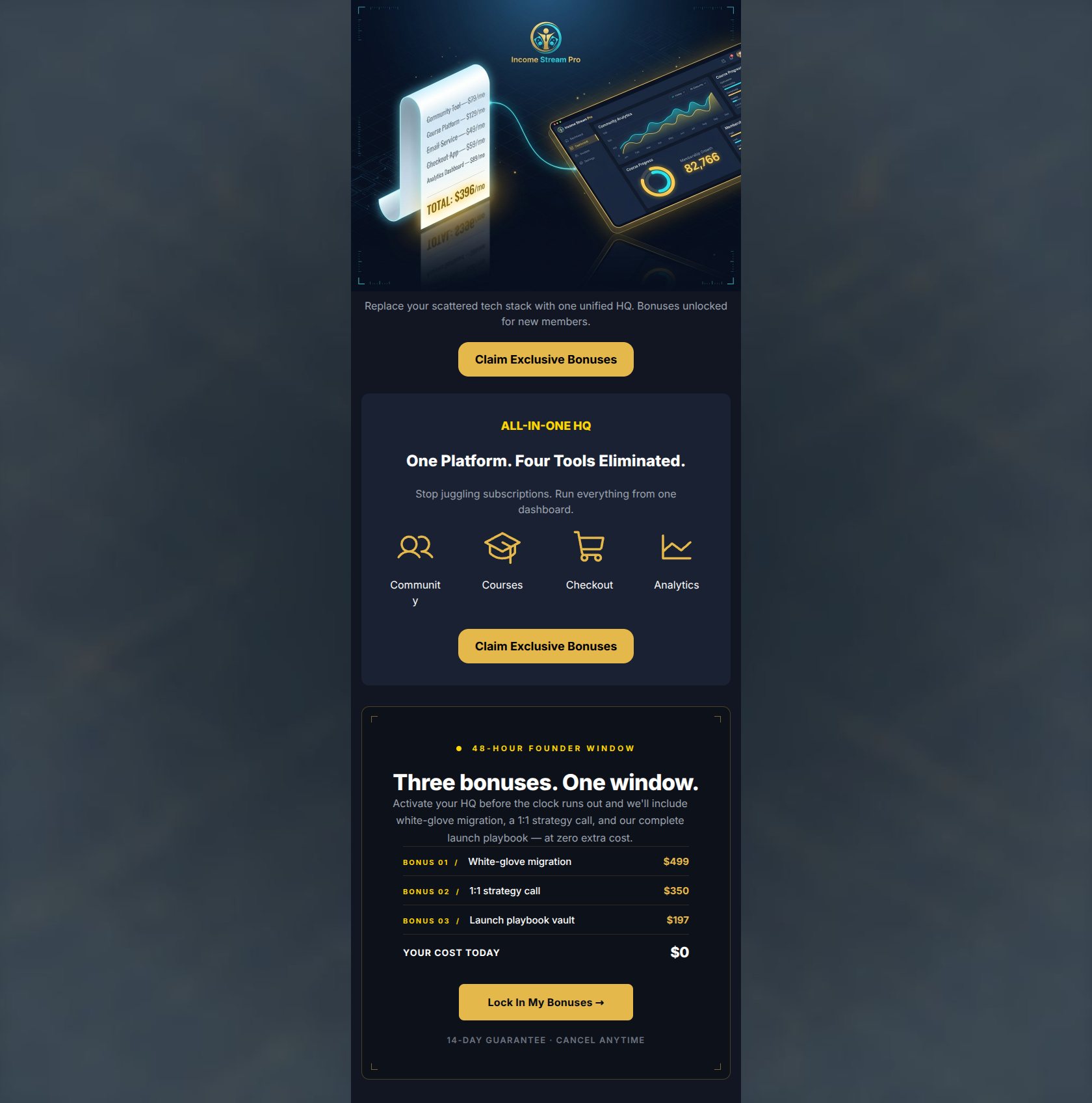
Design Score
91/100This email is a masterclass in SaaS conversion optimization. It acutely targets the audience's primary pain point—the 'scattered tool hell'—right from the hero image and clearly quantifies the financial relief of switching. The narrative flow from problem identification to solution, culminating in an irresistible, value-stacked bonus offer, is textbook. While the strategic execution is top-tier, there are minor front-end UI flaws—specifically awkward text wrapping and a reliance on text embedded within an image—that hold it back from absolute perfection. Overall, this is a highly effective, premium-feeling campaign positioned to drive significant click-through volume.
Create Your Own
Generate professional email designs like this one in seconds with Kopi AI.
Email Details
- Subject Line
- You're overpaying for your tech stack.
- Brand
- Income Stream Pro
- Industry
- SaaS & Software
- Email Type
- Promotional
- Created
- May 29, 2026
Brand Colors
Email Copy
Replace your scattered tech stack with one unified HQ. Bonuses unlocked for new members.
→ Claim Exclusive Bonuses
ALL-IN-ONE HQ
One Platform. Four Tools Eliminated.
Stop juggling subscriptions. Run everything from one dashboard.
Community
Courses
Checkout
Analytics
→ Claim Exclusive Bonuses
Why This Email Works
This email is a masterclass in SaaS conversion optimization. It acutely targets the audience's primary pain point—the 'scattered tool hell'—right from the hero image and clearly quantifies the financial relief of switching. The narrative flow from problem identification to solution, culminating in an irresistible, value-stacked bonus offer, is textbook. While the strategic execution is top-tier, there are minor front-end UI flaws—specifically awkward text wrapping and a reliance on text embedded within an image—that hold it back from absolute perfection. Overall, this is a highly effective, premium-feeling campaign positioned to drive significant click-through volume.
Hero (top/initial part) Impact
82/100- Brilliant conceptual visualization of the customer's financial pain point.
- Striking visual contrast that immediately establishes the premium 'dark mode' brand identity.
Content Structure & Flow
92/100- Logical 'Problem -> Solution -> Offer' narrative arc.
- Excellent use of distinct, bounded sections to separate different types of information.
Visual Hierarchy & Layout
85/100- Outstanding use of a bounded card for the final offer to draw the eye and isolate the value proposition.
- Gold highlights are used sparingly and deliberately to guide the reader down the page.
Call-to-Action Strength
96/100- Perfect repetition of the primary action without diluting the goal.
- Maximum color contrast ensures the buttons pass the 'squint test' effortlessly.
Message Clarity & Tone
90/100- Highly authoritative tone that matches the brand's 'strategic partner' persona.
- Directly addresses the 'scattered tool' pain point using language native to the target audience.
Readability & Scannability
86/100- The tabular cost breakdown in the final card ('YOUR COST TODAY $0') is instantly comprehensible.
- Great use of whitespace within the cards to prevent visual clutter.
Offer & Value Proposition
98/100- Clear quantification of bonus value makes the offer feel tangible and premium.
- The '48-Hour Founder Window' framing creates legitimate, event-based urgency.
Personalization & Audience Fit
95/100- Perfect psychographic alignment with the audience's desire for operational simplicity.
- The 'white-glove migration' bonus directly neutralizes the biggest objection to switching platforms (the hassle of moving data).
Copy Conciseness & Word Economy
95/100- Zero filler words; highly distilled, punchy sentences.
- Uses tables and structural elements to communicate value instead of long paragraphs.
Quick Wins
- Fix the text wrapping on the 'Community' icon label by adjusting grid column padding or slightly reducing the font size so it sits cleanly on one line.
- Add a true HTML <h1> headline above the hero body text to anchor the message natively.
- Increase the font size of the hero body text ('Replace your scattered tech stack...') to 16px or 18px to improve its visual weight against the dark background.

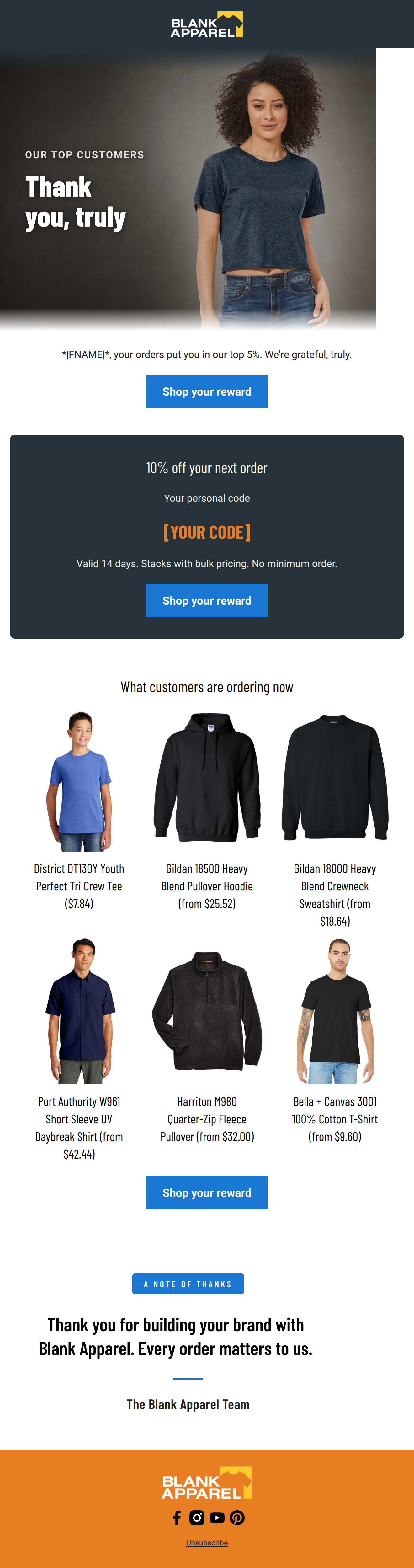


Create Professional Email Designs
Generate beautiful, on-brand email designs in seconds. Just enter your brand URL and let AI do the rest.