Fashion & Apparel Product Launch Email Template
“You're in. New arrivals are here.”
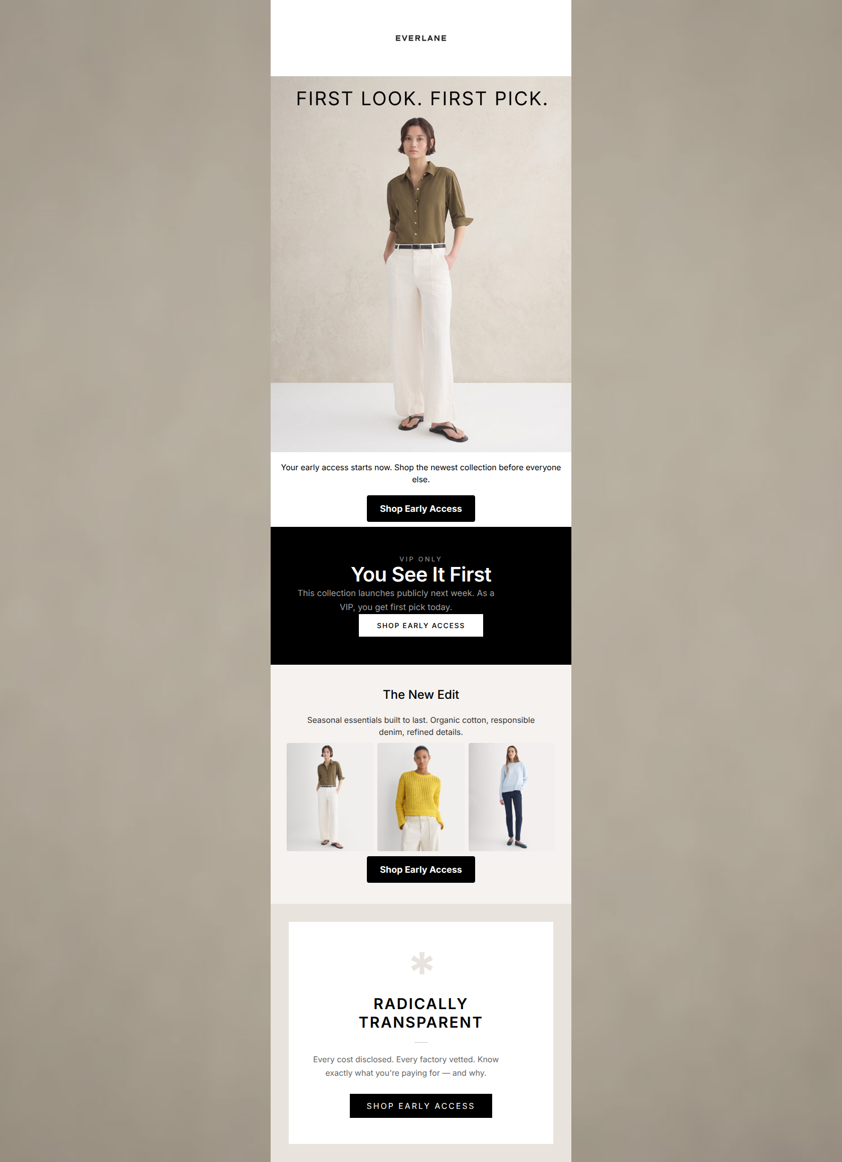
Design Score
76/100This email effectively leverages Everlane's minimalist aesthetic and strong CTA consistency to drive action, but it suffers from significant structural redundancy. The transition from the hero to the first content block repeats the exact same 'early access' message, creating unnecessary cognitive load and wasting prime vertical real estate. While the visual execution is clean, the copy needs tightening to move the user more efficiently from the 'VIP' hook to the actual product offering.
Create Your Own
Generate professional email designs like this one in seconds with Kopi AI.
Email Details
- Subject Line
- You're in. New arrivals are here.
- Brand
- Everlane [eval-prod 2026-04-08]
- Industry
- Fashion & Apparel
- Email Type
- Product Launch
- Created
- April 8, 2026
Brand Colors
Email Copy
Your early access starts now. Shop the newest collection before everyone else.
→ Shop Early Access
The New Edit
Seasonal essentials built to last. Organic cotton, responsible denim, refined details.
→ Shop Early Access
Why This Email Works
This email effectively leverages Everlane's minimalist aesthetic and strong CTA consistency to drive action, but it suffers from significant structural redundancy. The transition from the hero to the first content block repeats the exact same 'early access' message, creating unnecessary cognitive load and wasting prime vertical real estate. While the visual execution is clean, the copy needs tightening to move the user more efficiently from the 'VIP' hook to the actual product offering.
1. Hero Impact
85/100- Immediate introduction of the exclusivity value proposition.
- High-quality, on-brand, unretouched photography.
2. Content Structure & Flow
60/100- The inclusion of the 'Radically Transparent' block at the end effectively reinforces core brand values without distracting from the main offer.
3. Visual Hierarchy & Layout
75/100- Excellent use of the brand's 'soft brutalism' aesthetic.
- Clear visual separation between the product showcase and the brand value footer.
4. Call-to-Action Strength
95/100- Zero ambiguity: the user knows exactly what action to take and where it leads.
- High contrast buttons that stand out clearly against both light and dark backgrounds.
5. Message Clarity & Tone
80/100- Strong alignment with the brand's editorial, hype-free voice.
- Effective use of the 'Radical Transparency' language to build trust.
6. Readability & Scannability
85/100- High contrast between text and background colors.
- Minimal text ensures the visual elements carry the weight of the communication.
7. Offer & Value Proposition
80/100- The exclusivity hook is a proven driver for click-through rates.
- The brand's overarching value proposition (transparency/ethics) is strongly reinforced at the end.
8. Personalization & Audience Fit
85/100- Aesthetic execution is highly resonant with the conscious consumer persona.
- Language appeals directly to the audience's desire for considered, non-frivolous consumption.
9. Copy Conciseness & Word Economy
60/100- The copy in the 'New Edit' and 'Radically Transparent' sections is tight and purposeful.
Quick Wins
- Delete the dark 'VIP ONLY' section entirely to remove redundancy and shorten the path to the product showcase.
- Ensure the hero image is a clickable link to the new arrivals collection.



Create Professional Email Designs
Generate beautiful, on-brand email designs in seconds. Just enter your brand URL and let AI do the rest.