SaaS & Software Promotional Email Template
“Your website should work harder”
Design Score
87/100This is a highly effective, well-structured promotional email that perfectly captures the brand's 'jargon-free, results-oriented' ethos. The copy is punchy, the value proposition is tied directly to business outcomes, and the visual hierarchy drives the user naturally down the page. The relentless consistency of the 'Let's Talk' CTA is a textbook example of clear conversion routing. To move this from great to exceptional, the hero imagery needs to better align with digital agency services, and introducing a slightly lower-friction offer could increase lead capture.
Create Your Own
Generate professional email designs like this one in seconds with Kopi AI.
Email Details
- Subject Line
- Your website should work harder
- Brand
- Beyond the Brand Media®
- Industry
- SaaS & Software
- Email Type
- Promotional
- Created
- April 23, 2026
Brand Colors
Email Copy
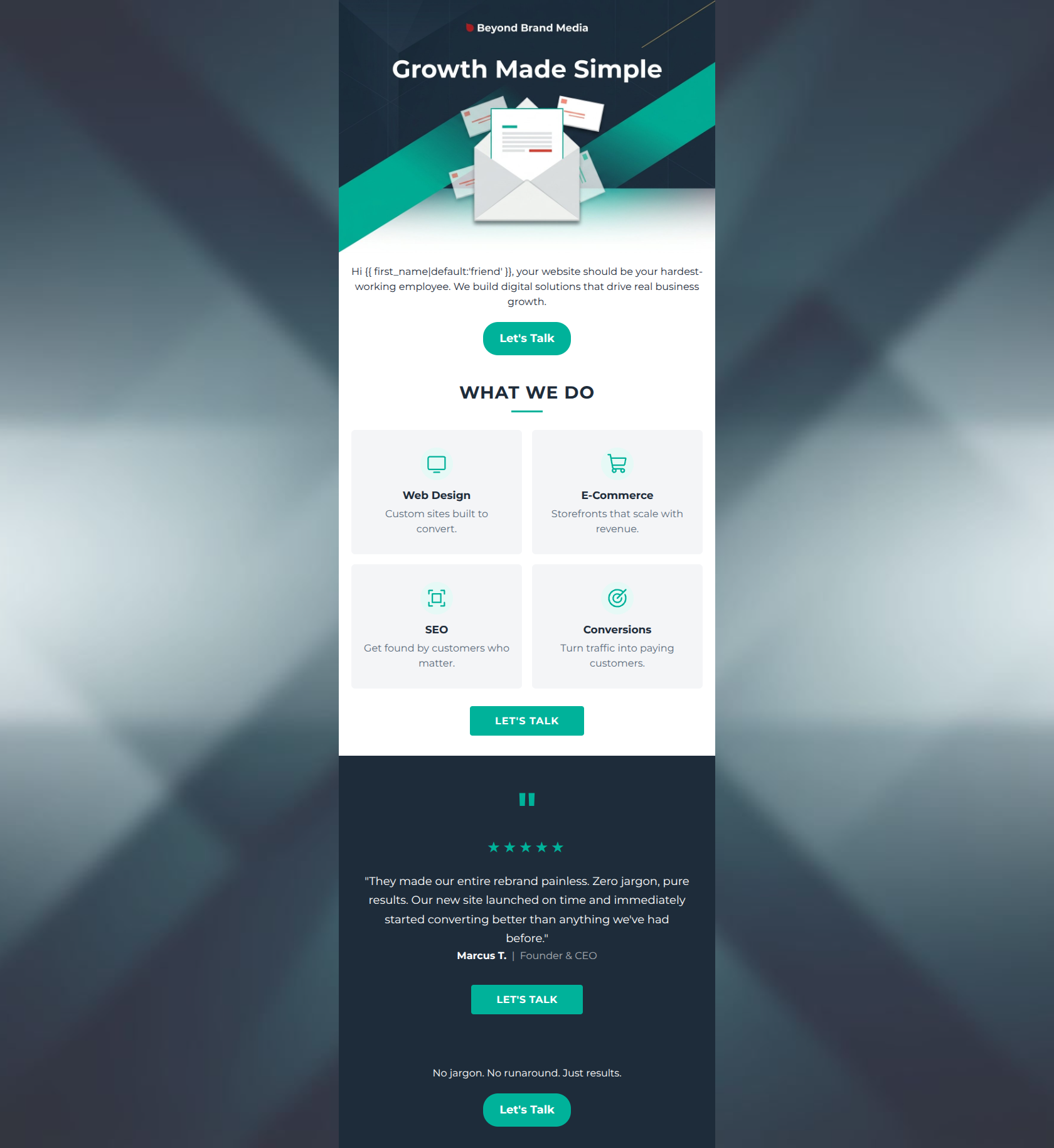
Hi friend, your website should be your hardest-working employee. We build digital solutions that drive real business growth.
→ Let's Talk
No jargon. No runaround. Just results.
→ Let's Talk
Why This Email Works
This is a highly effective, well-structured promotional email that perfectly captures the brand's 'jargon-free, results-oriented' ethos. The copy is punchy, the value proposition is tied directly to business outcomes, and the visual hierarchy drives the user naturally down the page. The relentless consistency of the 'Let's Talk' CTA is a textbook example of clear conversion routing. To move this from great to exceptional, the hero imagery needs to better align with digital agency services, and introducing a slightly lower-friction offer could increase lead capture.
Hero (top/initial part) Impact
82/100- The copy instantly reframes a website from a technical requirement to a business asset ('hardest-working employee').
- The 'Growth Made Simple' text overlay immediately reinforces the brand promise.
Content Structure & Flow
88/100- Logical narrative flow: Problem/Hook -> Solution (Services) -> Proof (Testimonial) -> Action.
- The grid layout for services breaks up the vertical scroll nicely and prevents reader fatigue.
Visual Hierarchy & Layout
85/100- Excellent use of the 2x2 grid to make the four core services digestible.
- Strong visual framing with the dark navy footer capping off the white/light gray body.
Call-to-Action Strength
95/100- Relentless repetition of 'Let's Talk' pointing to the same destination.
- The teal (#00B29A) buttons provide maximum contrast against both white and navy backgrounds, passing the squint test easily.
Message Clarity & Tone
92/100- Service descriptions are outcome-focused ('Turn traffic into paying customers' instead of 'We do CRO').
- The tone is confident and professional without relying on industry jargon.
Readability & Scannability
86/100- Bullet-point brevity in the service cards (under 8 words each) makes them instantly scannable.
- High contrast typography against the backgrounds ensures text is legible.
Offer & Value Proposition
80/100- Clearly connects agency capabilities to the client's desire for revenue and scale.
- The value prop is front-and-center in the hero.
Personalization & Audience Fit
82/100- The anti-jargon stance perfectly matches the audience's stated pain points.
- Focuses on 'your business growth' rather than 'our technical skills'.
Copy Conciseness & Word Economy
90/100- Zero throat-clearing in the service descriptions.
- The footer summary 'No jargon. No runaround. Just results.' is a masterclass in concise brand positioning.
Quick Wins
- Left-align the hero paragraph and the multi-line testimonial quote to improve reading speed.
- Add more vertical space between the hero paragraph and the first 'Let's Talk' button.
- Remove the 'Hi {{first_name}}' intro and start immediately with 'Your website should be your hardest-working employee.'


Create Professional Email Designs
Generate beautiful, on-brand email designs in seconds. Just enter your brand URL and let AI do the rest.