Other Promotional Email Template
“Your website is costing you sales”
Design Score
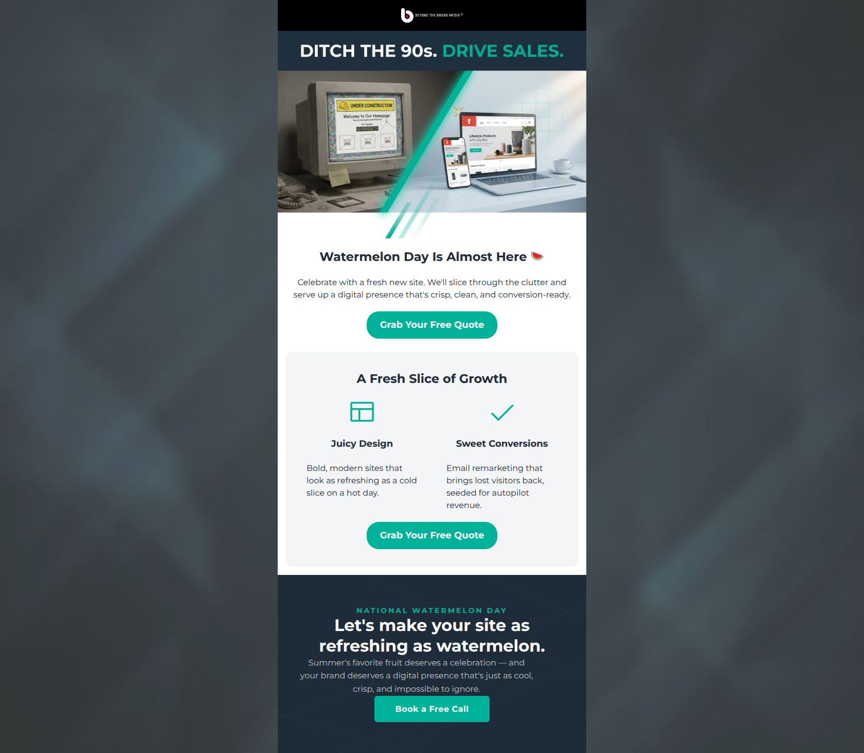
85/100This is a strong, highly effective promotional email that perfectly captures the brand's 'zero jargon, just results' ethos. The visual design is striking, utilizing the brand's navy and teal palette to create a modern, technical feel. The copy is exceptionally tight and focused almost entirely on customer outcomes (driving sales, recovering revenue) rather than agency features. The flawless execution of a consistent, high-contrast primary CTA across three distinct sections creates a frictionless path to conversion.
Create Your Own
Generate professional email designs like this one in seconds with Kopi AI.
Email Details
- Subject Line
- Your website is costing you sales
- Brand
- Beyond the Brand Media®
- Industry
- Other
- Email Type
- Promotional
- Created
- April 24, 2026
Brand Colors
Email Copy
Watermelon Day Is Almost Here 🍉
Celebrate with a fresh new site. We'll slice through the clutter and serve up a digital presence that's crisp, clean, and conversion-ready.
→ Grab Your Free Quote
A Fresh Slice of Growth
Juicy Design
Bold, modern sites that look as refreshing as a cold slice on a hot day.
Sweet Conversions
Email remarketing that brings lost visitors back, seeded for autopilot revenue.
→ Grab Your Free Quote
Why This Email Works
This is a strong, highly effective promotional email that perfectly captures the brand's 'zero jargon, just results' ethos. The visual design is striking, utilizing the brand's navy and teal palette to create a modern, technical feel. The copy is exceptionally tight and focused almost entirely on customer outcomes (driving sales, recovering revenue) rather than agency features. The flawless execution of a consistent, high-contrast primary CTA across three distinct sections creates a frictionless path to conversion.
Hero (top/initial part) Impact
85/100- Instantly recognizable visual metaphor for the problem and solution.
- Punchy, action-oriented top headline.
- Excellent use of brand colors to draw the eye downward.
Content Structure & Flow
80/100- Clear delineation between the 'Hook', the 'How', and the 'Why Us'.
- The final dark block acts as a strong visual anchor to close the email.
Visual Hierarchy & Layout
82/100- Strong use of whitespace prevents cognitive overload.
- Clear visual distinction between different content blocks.
- Headings are appropriately sized to guide the scanning eye.
Call-to-Action Strength
95/100- Perfect consistency in destination and copy across all three buttons.
- High contrast teal against both white and navy backgrounds ensures the buttons pop.
- Strategic placement catches readers regardless of how far they scroll.
Message Clarity & Tone
88/100- Speaks directly to the business owner's desired outcome (revenue) rather than the agency's inputs.
- The tone is confident, capable, and reassuring.
Readability & Scannability
85/100- Excellent use of icons to anchor bullet points.
- Short, punchy sentences.
- Clear typographic hierarchy.
Offer & Value Proposition
80/100- The core value prop (more sales, less headache) is front and center.
- Addresses the pain point of wasted time ('No endless timelines').
Personalization & Audience Fit
78/100- Perfectly targets the emotional pain points of the ideal customer profile.
- Avoids the trap of talking about the agency, focusing entirely on the client's needs.
Copy Conciseness & Word Economy
92/100- Zero filler words or generic agency platitudes.
- Uses short, punchy statements to create momentum.
- High information density without feeling overwhelming.
Quick Wins
- Verify the contrast ratio of the light gray text on the navy background in the final block to ensure maximum legibility.
- Tighten the transition between the top graphic and the 'Your Site Should Sell For You' heading to make them feel like a single cohesive block.



Create Professional Email Designs
Generate beautiful, on-brand email designs in seconds. Just enter your brand URL and let AI do the rest.