SaaS & Software Promotional Email Template
“Your website is costing you sales.”
Design Score
88/100This is a top-tier B2B promotional email that sharply executes on the brand's 'complex things simple' mandate. The inverted pyramid structure flows flawlessly from a high-agitation pain point (losing mobile shoppers) into concrete proof (US Optical case study) and resolves with a zero-friction process ('You Talk, We Build, You Grow'). It respects the reader's time with excellent scannability and strong visual hierarchy. To push this into the 90+ range, the primary offer needs an upgrade—'Free Quote' is an agency cliché that lacks immediate perceived value compared to a 'Free Site Audit' or 'Growth Strategy Session.'
Create Your Own
Generate professional email designs like this one in seconds with Kopi AI.
Email Details
- Subject Line
- Your website is costing you sales.
- Brand
- Beyond the Brand Media®
- Industry
- SaaS & Software
- Email Type
- Promotional
- Created
- April 6, 2026
Brand Colors
Email Copy
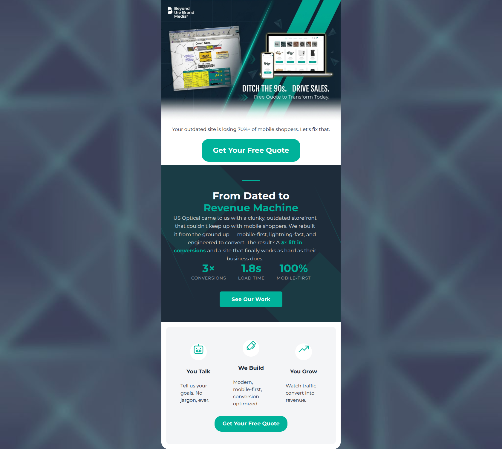
Your outdated site is losing 70%+ of mobile shoppers. Let's fix that.
→ Get Your Free Quote
You Talk
Tell us your goals. No jargon, ever.
We Build
Modern, mobile-first, conversion-optimized.
You Grow
Watch traffic convert into revenue.
→ Get Your Free Quote
Why This Email Works
This is a top-tier B2B promotional email that sharply executes on the brand's 'complex things simple' mandate. The inverted pyramid structure flows flawlessly from a high-agitation pain point (losing mobile shoppers) into concrete proof (US Optical case study) and resolves with a zero-friction process ('You Talk, We Build, You Grow'). It respects the reader's time with excellent scannability and strong visual hierarchy. To push this into the 90+ range, the primary offer needs an upgrade—'Free Quote' is an agency cliché that lacks immediate perceived value compared to a 'Free Site Audit' or 'Growth Strategy Session.'
Hero (top/initial part) Impact
85/100- Immediate establishment of the core problem (outdated, non-mobile friendly sites).
- Strong use of data (70%+) to create urgency.
- Clear, high-contrast CTA button above the fold.
Content Structure & Flow
92/100- Flawless inverted pyramid structure guiding the reader downward.
- Logical transition from emotional pain point to logical proof.
- The 3-step process section effectively reduces anxiety about the engagement model.
Visual Hierarchy & Layout
88/100- Excellent use of the brand's teal color to draw attention to actionable elements and key metrics.
- The 3-column process layout at the bottom is spacious and balances the email visually.
- Strong use of typography size to indicate importance (large stats, clear H4 headers).
Call-to-Action Strength
75/100- Buttons are large, clear, and feature high color contrast (#00B29A teal on white/navy).
- CTAs are strategically placed at the top, middle, and bottom of the email.
Message Clarity & Tone
94/100- Perfect alignment with the 'make complex things simple' brand ethos.
- Tone is authoritative yet accessible.
- Focuses entirely on customer outcomes (revenue, growth) rather than agency features.
Readability & Scannability
90/100- Exceptional use of isolated statistics to tell a story.
- Icons in the bottom section anchor the text and draw the eye left-to-right.
- Short, punchy sentences ('Let's fix that', 'You Talk').
Offer & Value Proposition
82/100- The value prop is proven instantly via the US Optical case study.
- The emotional value prop (no stress, no jargon) is clearly stated in the 3-step section.
Personalization & Audience Fit
92/100- Deep understanding of the target audience's pain points and desired outcomes.
- Uses 'You' and 'Your' effectively to center the narrative on the prospect.
Copy Conciseness & Word Economy
95/100- Ruthless editing; no throat-clearing openers.
- The 3-step process descriptions are incredibly concise (e.g., 'Tell us your goals. No jargon, ever.').
Quick Wins
- Remove the redundant 'Free Quote to Transform Today' text from the hero graphic.
- Change the middle CTA from 'See Our Work' to a more specific 'View the Case Study' or 'Read the US Optical Story'.
- Bold the key outcomes in the middle paragraph to help skimmers (e.g., 'rebuilt it from the ground up').



Create Professional Email Designs
Generate beautiful, on-brand email designs in seconds. Just enter your brand URL and let AI do the rest.