SaaS & Software Promotional Email Template
“Your website called — it wants out of the 90s”
Design Score
81/100This is a highly competent, well-structured B2B lead generation email. It successfully captures the brand's 'no jargon' positioning and speaks directly to the target audience's pain points regarding outdated websites and confusing agency processes. The visual hierarchy effectively funnels the reader toward the primary CTA. However, it leaves some conversion potential on the table due to a commoditized offer ('Free Quote'), slight visual inconsistencies in the service cards, and competing secondary CTAs that introduce unnecessary cognitive friction.
Create Your Own
Generate professional email designs like this one in seconds with Kopi AI.
Email Details
- Subject Line
- Your website called — it wants out of the 90s
- Brand
- Beyond the Brand Media®
- Industry
- SaaS & Software
- Email Type
- Promotional
- Created
- April 1, 2026
Brand Colors
Email Copy
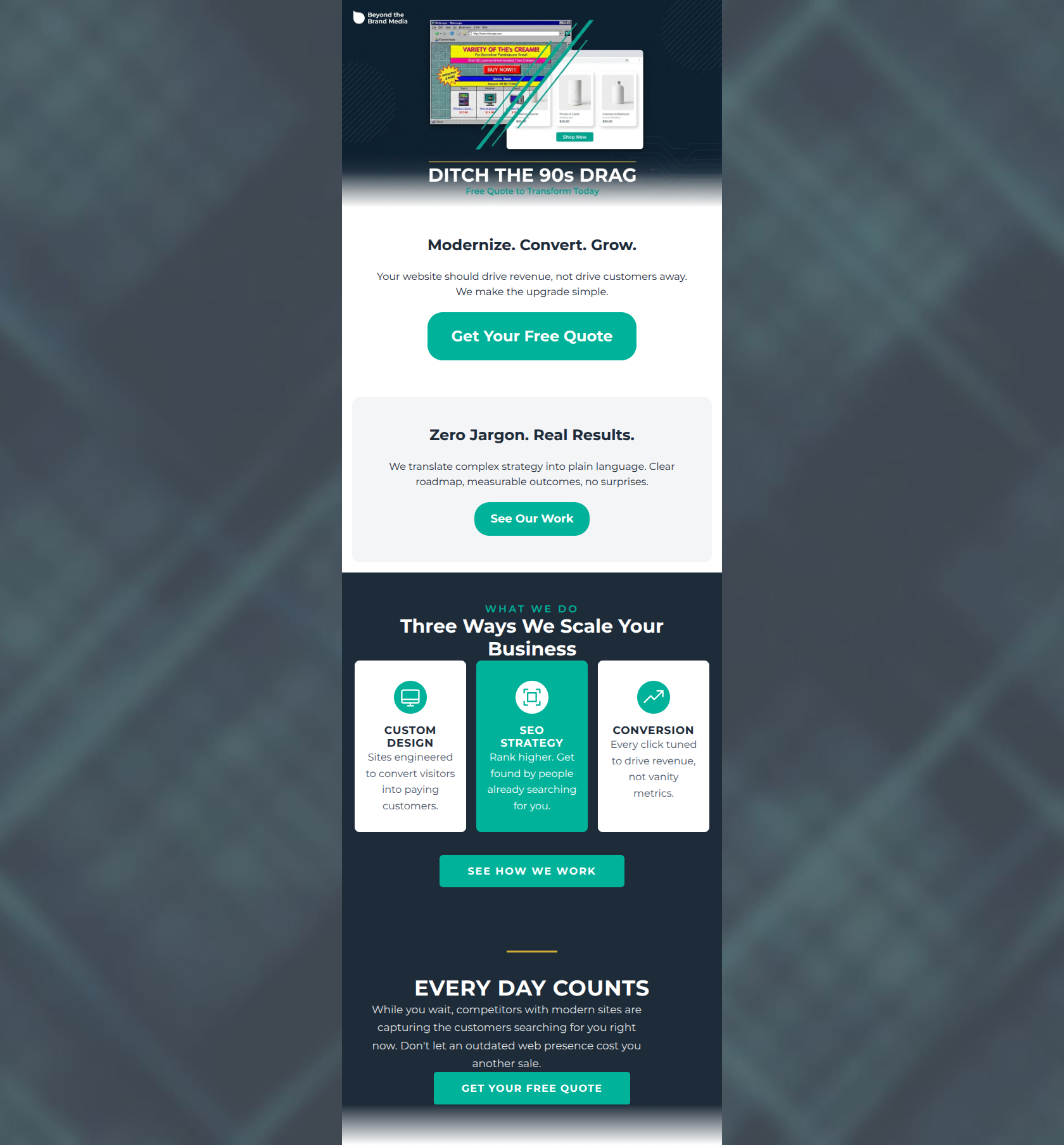
Modernize. Convert. Grow.
Your website should drive revenue, not drive customers away. We make the upgrade simple.
→ Get Your Free Quote
Zero Jargon. Real Results.
We translate complex strategy into plain language. Clear roadmap, measurable outcomes, no surprises.
→ See Our Work
Why This Email Works
This is a highly competent, well-structured B2B lead generation email. It successfully captures the brand's 'no jargon' positioning and speaks directly to the target audience's pain points regarding outdated websites and confusing agency processes. The visual hierarchy effectively funnels the reader toward the primary CTA. However, it leaves some conversion potential on the table due to a commoditized offer ('Free Quote'), slight visual inconsistencies in the service cards, and competing secondary CTAs that introduce unnecessary cognitive friction.
Hero (top/initial part) Impact
75/100- The headline 'Modernize. Convert. Grow.' is punchy, outcome-focused, and instantly communicates value.
- The primary CTA button is placed immediately above the fold, providing a fast track for high-intent users.
Content Structure & Flow
85/100- Distinct, well-padded sections clearly guide the user's eye down the page.
- The email ends on a strong note, using an urgency-driven section ('Every Day Counts') immediately preceding the final CTA.
Visual Hierarchy & Layout
82/100- Excellent use of high-contrast teal (#00B29A) for all CTAs, ensuring they are the most prominent elements on the screen.
- The three-column layout for services makes complex offerings highly scannable and digestible.
Call-to-Action Strength
78/100- The primary CTA is repeated at both the top and bottom of the email, catering to different scrolling behaviors.
- The CTA copy uses clear, expectation-setting language.
Message Clarity & Tone
86/100- The 'Zero Jargon. Real Results.' section perfectly distills the brand's core value proposition into four words.
- The copy connects technical services directly to business outcomes (e.g., 'Every click tuned to drive revenue, not vanity metrics.').
Readability & Scannability
84/100- Generous line height and padding around text blocks reduce cognitive load.
- Excellent use of descriptive subheadings to break up the narrative.
Offer & Value Proposition
75/100- The email clearly establishes *why* a user should choose this agency over competitors (clarity, no surprises, revenue focus).
Personalization & Audience Fit
80/100- The urgency section ('Every Day Counts') masterfully triggers the specific FOMO of growth-minded business leaders by referencing competitors 'stealing' customers.
Copy Conciseness & Word Economy
88/100- The email relies on punchy, fragmented sentences ('Clear roadmap, measurable outcomes, no surprises.') which creates a fast, confident reading rhythm.
- No space is wasted on generic introductory text ('We are excited to announce...').
Quick Wins
- Differentiate the copy on the two secondary buttons ('See Our Work' vs 'See How We Work') to remove cognitive friction.
- Change the middle service card ('SEO Strategy') background to white to match the others and restore visual symmetry.
- Left-align the paragraph text in the first two sections to improve reading speed.


Create Professional Email Designs
Generate beautiful, on-brand email designs in seconds. Just enter your brand URL and let AI do the rest.