Health & Wellness Promotional Email Template
“Your team's wellness upgrade is free to try”
Design Score
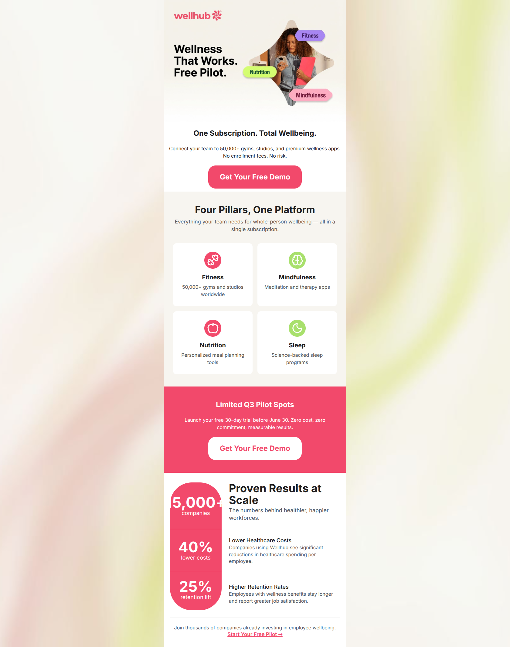
85/100This is a highly effective, well-structured B2B promotional email. It perfectly executes the inverted pyramid model, leading the reader from a clear value proposition down to social proof. The visual hierarchy is strong, utilizing whitespace and color-blocking to guide the eye. The primary flaw preventing this from being a top-tier email is the inconsistent terminology surrounding the offer, which creates cognitive friction regarding what exactly the user is signing up for (a demo, a pilot, or a trial).
Create Your Own
Generate professional email designs like this one in seconds with Kopi AI.
Email Details
- Subject Line
- Your team's wellness upgrade is free to try
- Brand
- Wellhub
- Industry
- Health & Wellness
- Email Type
- Promotional
- Created
- March 28, 2026
Brand Colors
Email Copy
One Subscription. Total Wellbeing.
Connect your team to 50,000+ gyms, studios, and premium wellness apps. No enrollment fees. No risk.
→ Get Your Free Demo
Limited Q3 Pilot Spots
Launch your free 30-day trial before June 30. Zero cost, zero commitment, measurable results.
→ Get Your Free Demo
Why This Email Works
This is a highly effective, well-structured B2B promotional email. It perfectly executes the inverted pyramid model, leading the reader from a clear value proposition down to social proof. The visual hierarchy is strong, utilizing whitespace and color-blocking to guide the eye. The primary flaw preventing this from being a top-tier email is the inconsistent terminology surrounding the offer, which creates cognitive friction regarding what exactly the user is signing up for (a demo, a pilot, or a trial).
Hero (top/initial part) Impact
82/100- Immediate clarity on the value proposition ('One Subscription. Total Wellbeing.').
- Strong risk reversal directly in the subcopy.
Content Structure & Flow
92/100- Excellent use of the inverted pyramid.
- Each section serves a distinct, non-overlapping purpose in the narrative.
Visual Hierarchy & Layout
85/100- The 2x2 grid for the 'Four Pillars' is highly scannable.
- Color blocking (the pink section) is used purposefully to highlight a time-sensitive offer.
Call-to-Action Strength
72/100- Excellent color contrast on buttons against their respective backgrounds.
- Action-oriented verb usage ('Get').
Message Clarity & Tone
88/100- Direct, benefit-driven language.
- Avoids HR jargon while still appealing to benefits managers.
Readability & Scannability
90/100- Effective use of bullet-style cards for the pillars.
- Clear hierarchy of typography (H2s stand out clearly from body text).
Offer & Value Proposition
88/100- Strong, clear B2B value proposition.
- Risk reversal is highlighted multiple times.
Personalization & Audience Fit
85/100- Directly addresses key B2B metrics (costs, retention).
- Uses 'your team' to maintain a you-centric focus for the buyer.
Copy Conciseness & Word Economy
92/100- No throat-clearing openers.
- Short, punchy sentences.
Quick Wins
- Unify the CTA language. Choose 'Demo', 'Pilot', or 'Trial' and use it consistently across the hero image, body copy, and buttons.
- Remove the subheadline 'The numbers behind healthier, happier workforces.' to tighten the stats section.

Create Professional Email Designs
Generate beautiful, on-brand email designs in seconds. Just enter your brand URL and let AI do the rest.