Fitness Promotional Email Template
“Your SCULPT set called: Meet us at SAMA”
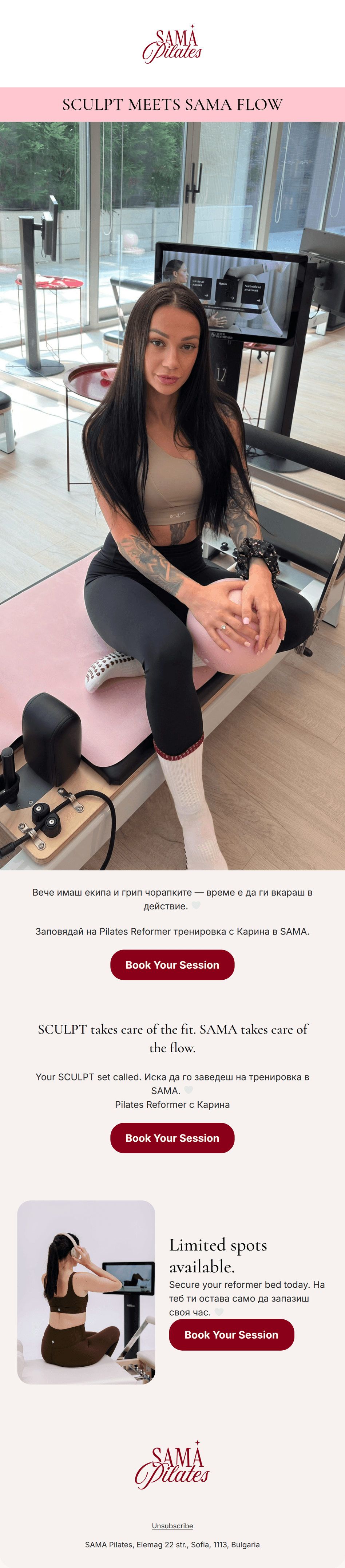
Design Score
84/100This email perfectly embodies the SAMA Pilates 'quiet luxury' brand identity. It uses high-quality editorial imagery and consistent, high-contrast CTAs to drive a single clear action: booking a session. The visual hierarchy is sophisticated, utilizing a serif-led typography that aligns with the target audience's premium expectations. While the aesthetic is flawless, the value proposition is slightly obscured by the bilingual copy and a lack of specific context regarding the 'SCULPT' partnership, which may leave uninitiated readers wondering if 'SCULPT' is a class type or an apparel brand.
Create Your Own
Generate professional email designs like this one in seconds with Kopi AI.
Email Details
- Subject Line
- Your SCULPT set called: Meet us at SAMA
- Brand
- SAMA Pilates
- Industry
- Fitness
- Email Type
- Promotional
- Created
- August 29, 2026
Brand Colors
Email Copy
Preview text: Put your favorite activewear and grip socks to work. Book a Reformer Pilates flow with Karina.
SCULPT MEETS SAMA FLOW
Вече имаш екипа и грип чорапките — време е да ги вкараш в действие. 🤍
Заповядай на Pilates Reformer тренировка с Карина в SAMA.
→ Book Your Session
SCULPT takes care of the fit. SAMA takes care of the flow.
Your SCULPT set called. Иска да го заведеш на тренировка в SAMA. 🤍 Pilates Reformer с Карина
→ Book Your Session
Unsubscribe
SAMA Pilates, Elemag 22 str., Sofia, 1113, Bulgaria
Why This Email Works
This email perfectly embodies the SAMA Pilates 'quiet luxury' brand identity. It uses high-quality editorial imagery and consistent, high-contrast CTAs to drive a single clear action: booking a session. The visual hierarchy is sophisticated, utilizing a serif-led typography that aligns with the target audience's premium expectations. While the aesthetic is flawless, the value proposition is slightly obscured by the bilingual copy and a lack of specific context regarding the 'SCULPT' partnership, which may leave uninitiated readers wondering if 'SCULPT' is a class type or an apparel brand.
Hero (top/initial part) Impact
85/100- High-quality, brand-aligned photography.
- Clean, minimalist header area.
Content Structure & Flow
82/100- Clear progression from aspiration to action.
- Effective use of whitespace to separate ideas.
Visual Hierarchy & Layout
88/100- Consistent button styling.
- Excellent use of the secondary-crimson for high-contrast actions.
Call-to-Action Strength
95/100- Perfect repetition of the primary CTA.
- High-contrast color usage (#8B0018) makes buttons impossible to miss.
Message Clarity & Tone
78/100- Understated and accessible brand voice.
- Personalized mention of 'Karina' adds a human element.
Readability & Scannability
85/100- Clean typography choices.
- Generous line height in body copy.
Offer & Value Proposition
72/100- Emotional appeal to 'looking the part' with Sculpt sets.
Personalization & Audience Fit
80/100- Deep understanding of the customer's ritual (socks, sets, flow).
Copy Conciseness & Word Economy
90/100- Zero filler adjectives.
- Short, punchy sentences.
Quick Wins
- Clarify the 'SCULPT' relationship in the hero subheader to prevent confusion for new subscribers.
- Standardize the bilingual text layout to prevent mid-sentence language switching.



Create Professional Email Designs
Generate beautiful, on-brand email designs in seconds. Just enter your brand URL and let AI do the rest.