Health & Wellness Promotional Email Template
“Your monthly vitality brief”
Design Score
84/100This email executes beautifully on the brand's clinical, authoritative aesthetic. The structured flow from the 'how' (the protocol) to the 'why' (the clinical data) is highly effective for a bio-hacking audience. It relies heavily on visual contrast to pull the reader down the page, which works very well. The primary weakness is a structural void in the hero section, which relies on a single block of body text rather than a compelling, standalone headline to hook the reader immediately.
Create Your Own
Generate professional email designs like this one in seconds with Kopi AI.
Email Details
- Subject Line
- Your monthly vitality brief
- Brand
- ARMRA [eval-prod 2026-05-07]
- Industry
- Health & Wellness
- Email Type
- Promotional
- Created
- May 7, 2026
Brand Colors
Email Copy
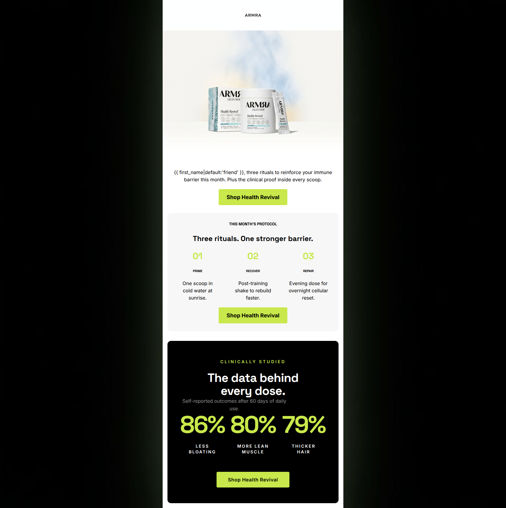
friend, three rituals to reinforce your immune barrier this month. Plus the clinical proof inside every scoop.
→ Shop Health Revival
THIS MONTH'S PROTOCOL
Three rituals. One stronger barrier.
01
PRIME
One scoop in cold water at sunrise.
02
RECOVER
Post-training shake to rebuild faster.
03
REPAIR
Evening dose for overnight cellular reset.
→ Shop Health Revival
Why This Email Works
This email executes beautifully on the brand's clinical, authoritative aesthetic. The structured flow from the 'how' (the protocol) to the 'why' (the clinical data) is highly effective for a bio-hacking audience. It relies heavily on visual contrast to pull the reader down the page, which works very well. The primary weakness is a structural void in the hero section, which relies on a single block of body text rather than a compelling, standalone headline to hook the reader immediately.
Hero (top/initial part) Impact
65/100- High-quality product imagery that clearly displays what is being sold.
- The subtle aura/smoke effect in the image perfectly aligns with the brand's clinical yet vibrant visual identity.
Content Structure & Flow
88/100- Excellent use of the 'Rule of Three' in the protocol section makes the routine feel achievable.
- Placing the heaviest, most compelling data at the bottom rewards the user for scrolling and provides a strong logical closer before the final CTA.
Visual Hierarchy & Layout
82/100- The oversized typography in the black 'Clinically Studied' section creates massive visual gravity, drawing the eye exactly where it needs to go.
- The three-column layout in the protocol section is perfectly balanced and easy to digest.
Call-to-Action Strength
92/100- Strict adherence to a single destination and identical CTA copy creates a frictionless, predictable experience.
- Excellent color contrast; the black text on the lime green button (#c8e84b) is highly legible against all three background colors used in the email.
Message Clarity & Tone
86/100- Maintains an authoritative, physician-founded voice without becoming bogged down in overly dense medical jargon.
- The labels 'PRIME, RECOVER, REPAIR' clearly communicate the distinct purpose of each dose.
Readability & Scannability
90/100- The protocol section uses tight, single-line descriptions that don't require deep reading.
- The oversized percentage numbers do the heavy lifting for the value proposition, bypassing the need for explanatory paragraphs.
Offer & Value Proposition
88/100- Translates a generic supplement routine into a structured, outcome-driven 'protocol'.
- Uses concrete, impressive data points (86%, 80%, 79%) rather than vague promises.
Personalization & Audience Fit
85/100- Perfect alignment with the audience's desire for rigorous sports science and high-end wellness.
- Focuses on outcomes (muscle, hair, bloating) that matter deeply to this specific demographic.
Copy Conciseness & Word Economy
90/100- The protocol descriptions are masterclasses in concise copywriting (e.g., 'One scoop in cold water at sunrise.').
- Allows the design and data to speak louder than paragraphs of persuasive text.
Quick Wins
- Add a bold, standalone H1 headline to the top of the email, above the current body text, to create an immediate hook.
- Ensure the word 'Colostrum' appears in the top text section to ground the product identity early.
- Check the contrast ratio of the lime green text ('01, 02, 03') against the light grey background to ensure accessibility standards are met.

Create Professional Email Designs
Generate beautiful, on-brand email designs in seconds. Just enter your brand URL and let AI do the rest.