Health & Wellness Newsletter Email Template
“Your monthly ritual reset”
Design Score
87/100This is a highly effective, beautifully designed newsletter-style email that perfectly captures ARMRA's premium, clinical-yet-vibrant brand identity. The visual pacing is excellent, utilizing stark contrast to guide the reader's eye down the page. The use of large, prominent statistics effectively communicates value and builds trust. The consistent use of the high-contrast lime green CTA reinforces the primary conversion goal without creating confusion. To push this into the 90+ range, the hero section needs a stronger, more benefit-driven hook rather than relying on generic 'newsletter' framing.
Create Your Own
Generate professional email designs like this one in seconds with Kopi AI.
Email Details
- Subject Line
- Your monthly ritual reset
- Brand
- ARMRA [eval-prod 2026-05-07]
- Industry
- Health & Wellness
- Email Type
- Newsletter
- Created
- May 7, 2026
Brand Colors
Email Copy
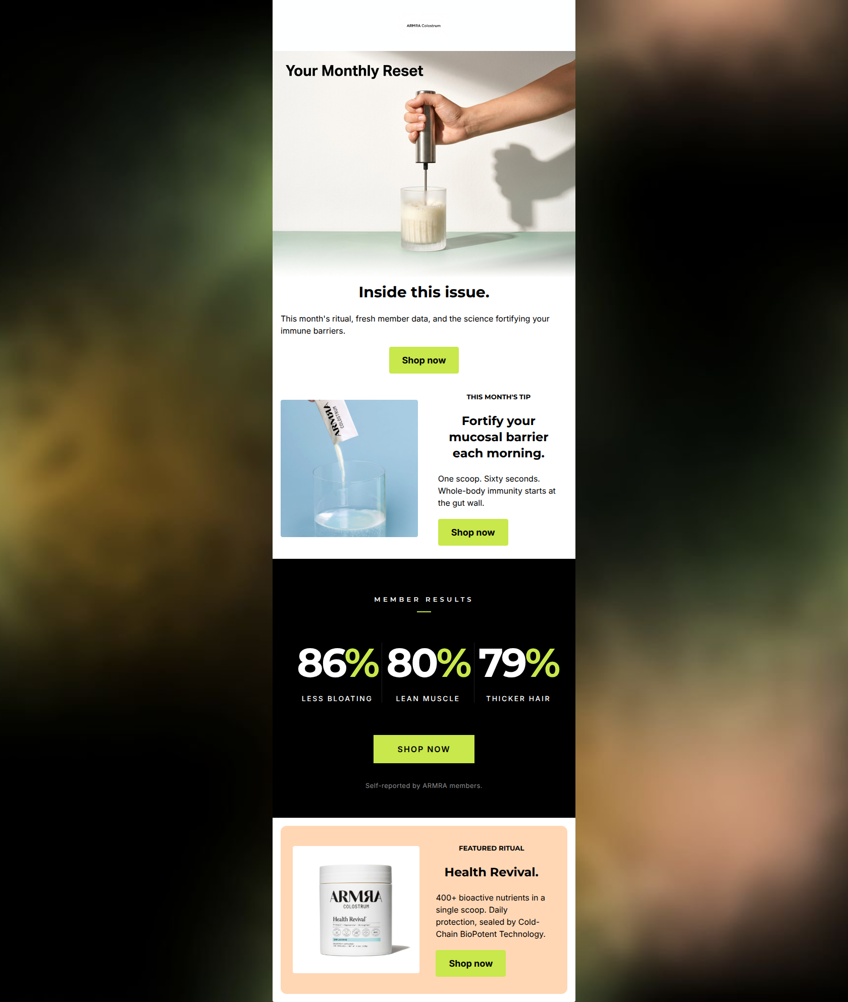
Inside this issue.
This month's ritual, fresh member data, and the science fortifying your immune barriers.
→ Shop now
THIS MONTH'S TIP
Fortify your mucosal barrier each morning.
One scoop. Sixty seconds. Whole-body immunity starts at the gut wall.
→ Shop now
FEATURED RITUAL
Health Revival.
400+ bioactive nutrients in a single scoop. Daily protection, sealed by Cold-Chain BioPotent Technology.
→ Shop now
Why This Email Works
This is a highly effective, beautifully designed newsletter-style email that perfectly captures ARMRA's premium, clinical-yet-vibrant brand identity. The visual pacing is excellent, utilizing stark contrast to guide the reader's eye down the page. The use of large, prominent statistics effectively communicates value and builds trust. The consistent use of the high-contrast lime green CTA reinforces the primary conversion goal without creating confusion. To push this into the 90+ range, the hero section needs a stronger, more benefit-driven hook rather than relying on generic 'newsletter' framing.
Hero Impact
75/100- The image is dynamic, showing the product being prepared, which helps visualize the ritual.
- The layout cleanly separates the image from the text, making the introduction easy to digest.
Content Structure & Flow
90/100- The stark black 'MEMBER RESULTS' section acts as a brilliant visual pattern interrupt, re-engaging scrolling users.
- Alternating left/right image alignments in the two-column sections creates a pleasing rhythmic reading experience.
Visual Hierarchy & Layout
88/100- The massive typography in the stats section (86%, 80%, 79%) immediately communicates the most important value propositions.
- The layout feels premium and uncluttered, perfectly aligning with a luxury biohacking brand.
Call-to-Action Strength
95/100- Consistent CTA destination and wording eliminates cognitive load.
- The lime green button color (#C8E84B) pops brilliantly against white, black, and peach backgrounds, ensuring the action is always obvious.
Message Clarity & Tone
86/100- The stats section distills complex health benefits into easily understandable, concrete outcomes ('less bloating', 'lean muscle').
- The language feels expert-led and trustworthy without being overly dense.
Readability & Scannability
92/100- The 'One scoop. Sixty seconds.' copy is a masterclass in scannable, rhythmic copywriting.
- The use of bolding and distinct colors for numbers draws the eye exactly where it needs to go.
Offer & Value Proposition
85/100- Relying on strong data (86%, 80%, 79%) is often more persuasive to a health-conscious audience than a standard 10% off discount.
- Positioning the product as a 'ritual' increases its perceived value from a simple supplement to a lifestyle upgrade.
Personalization & Audience Fit
88/100- The visual design (stark contrast, lime green accents) feels like a modern health app or clinical dashboard, appealing directly to the target persona.
Copy Conciseness & Word Economy
90/100- Using isolated fragments ('One scoop. Sixty seconds.') creates urgency and speed.
- The stats descriptors ('less bloating', 'lean muscle') are aggressively concise, maximizing impact.
Quick Wins
- Increase the contrast of the disclaimer text in the black section to ensure readability.
- Increase the font size of the hero H1 ('Inside this issue.') to establish a stronger visual hierarchy at the top.
- Remove the 'Your Monthly Reset' text overlay from the hero image to reduce visual clutter and potential conflict with the main headline.
Create Professional Email Designs
Generate beautiful, on-brand email designs in seconds. Just enter your brand URL and let AI do the rest.