Health & Wellness Announcement Email Template
“More than hydration.”
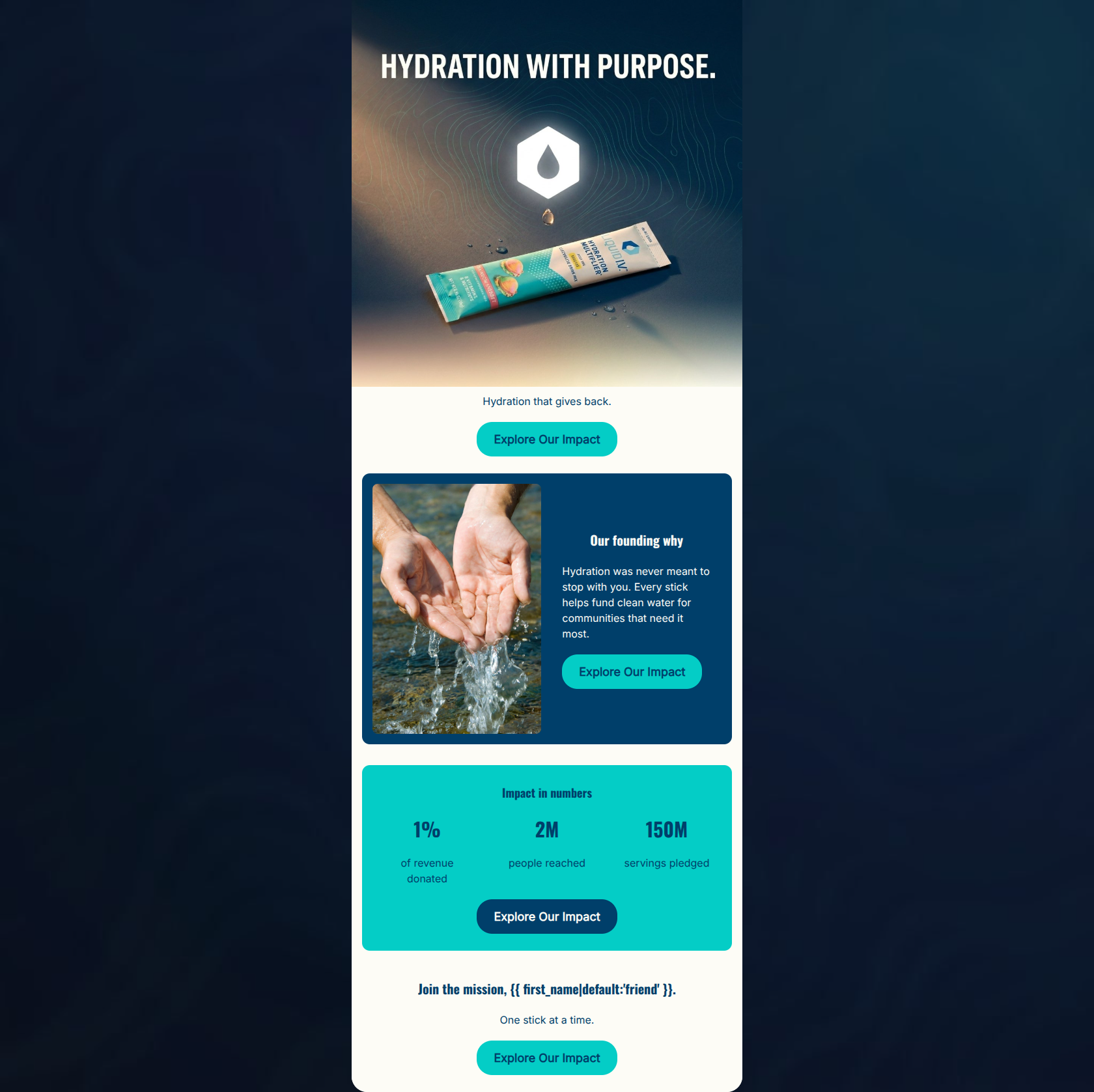
Design Score
88/100This is a highly effective, mission-driven email that excels in visual hierarchy and CTA consistency. The modular layout and tight copy make it incredibly easy to scan, while the repeated, identical CTAs create a frictionless path to conversion. It clearly speaks to the target audience's desire for socially responsible brands. The primary area for improvement is bridging the gap between the brand's social mission and the functional product benefits to reinforce why the customer should make a purchase to support the cause.
Create Your Own
Generate professional email designs like this one in seconds with Kopi AI.
Email Details
- Subject Line
- More than hydration.
- Brand
- Liquid I.V.
- Industry
- Health & Wellness
- Email Type
- Announcement
- Created
- May 7, 2026
Brand Colors
Email Copy
Hydration that gives back.
→ Explore Our Impact
Our founding why
Hydration was never meant to stop with you. Every stick helps fund clean water for communities that need it most.
→ Explore Our Impact
Impact in numbers
1%
of revenue donated
2M
people reached
150M
servings pledged
→ Explore Our Impact
Join the mission, friend.
One stick at a time.
→ Explore Our Impact
Why This Email Works
This is a highly effective, mission-driven email that excels in visual hierarchy and CTA consistency. The modular layout and tight copy make it incredibly easy to scan, while the repeated, identical CTAs create a frictionless path to conversion. It clearly speaks to the target audience's desire for socially responsible brands. The primary area for improvement is bridging the gap between the brand's social mission and the functional product benefits to reinforce why the customer should make a purchase to support the cause.
Hero Impact
82/100- Striking visual that aligns perfectly with the brand's aesthetic.
- Primary CTA is visible above the fold.
Content Structure & Flow
88/100- Excellent use of modular, color-blocked sections.
- Logical narrative progression that builds the case for clicking.
Visual Hierarchy & Layout
92/100- Clear section delineation through color blocking.
- The 3-column layout for the statistics is perfectly executed for quick scanning.
Call-to-Action Strength
98/100- Relentless focus on a single primary action.
- High-contrast button colors ensure the CTA pops against every background variation.
Message Clarity & Tone
85/100- Emotionally engaging copy that avoids corporate jargon.
- Clear connection to the audience's values.
Readability & Scannability
94/100- Massive, high-contrast numbers in the stats block.
- Short, punchy sentences that avoid walls of text.
Offer & Value Proposition
78/100- Clearly articulates the scale of the brand's social impact.
- Appeals directly to the target demographic's psychographic profile.
Personalization & Audience Fit
85/100- Directly addresses the user ('Join the mission').
- Aligns with the audience's desire for purpose-driven consumption.
Copy Conciseness & Word Economy
95/100- Excellent distillation of a complex impact program into a few key numbers and sentences.
- Zero throat-clearing in the body copy.
Quick Wins
- Remove the 'Hydration that gives back' text block below the hero image to pull the primary CTA higher up the screen.
- Bump up the body text size slightly in the 'Our founding why' section to improve readability on the dark background.

Create Professional Email Designs
Generate beautiful, on-brand email designs in seconds. Just enter your brand URL and let AI do the rest.