Health & Wellness Newsletter Email Template
“Your monthly dose of cellular vitality”
Design Score
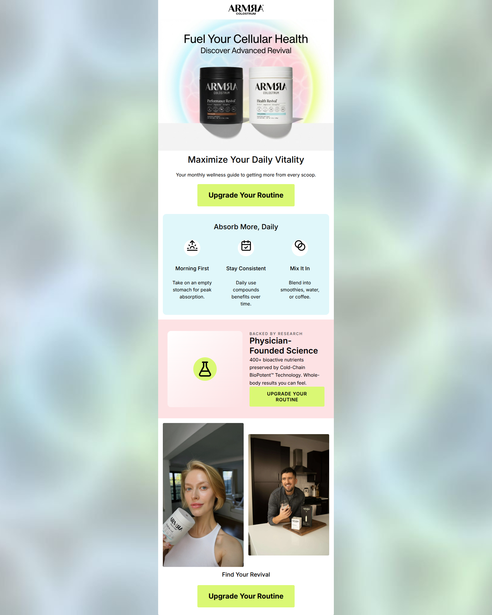
82/100This email is visually striking and does an excellent job of matching ARMRA’s premium, clinical-yet-vibrant brand identity. The scannability and word economy are top-tier, making it easy for the reader to digest the key value propositions. However, the email suffers from a slight identity crisis—it introduces itself as a 'monthly wellness guide' but immediately pushes an aggressive 'Upgrade Your Routine' CTA, which feels disjointed. Additionally, repeating the exact same CTA copy three times creates banner blindness and misses opportunities to drive contextual clicks based on the adjacent content.
Create Your Own
Generate professional email designs like this one in seconds with Kopi AI.
Email Details
- Subject Line
- Your monthly dose of cellular vitality
- Brand
- ARMRA [eval 2026-03-26]
- Industry
- Health & Wellness
- Email Type
- Newsletter
- Created
- March 26, 2026
Brand Colors
Email Copy
Maximize Your Daily Vitality
Your monthly wellness guide to getting more from every scoop.
→ Upgrade Your Routine
Absorb More, Daily
Morning First
Take on an empty stomach for peak absorption.
Stay Consistent
Daily use compounds benefits over time.
Mix It In
Blend into smoothies, water, or coffee.
Find Your Revival
→ Upgrade Your Routine
Why This Email Works
This email is visually striking and does an excellent job of matching ARMRA’s premium, clinical-yet-vibrant brand identity. The scannability and word economy are top-tier, making it easy for the reader to digest the key value propositions. However, the email suffers from a slight identity crisis—it introduces itself as a 'monthly wellness guide' but immediately pushes an aggressive 'Upgrade Your Routine' CTA, which feels disjointed. Additionally, repeating the exact same CTA copy three times creates banner blindness and misses opportunities to drive contextual clicks based on the adjacent content.
Hero (top/initial part) Impact
75/100- Striking, on-brand hero image that immediately communicates 'cellular health'.
- Clear, bold H1 typography that stands out.
Content Structure & Flow
78/100- Effective use of background colors to delineate distinct sections.
- Logical grouping of the 'three steps' for daily absorption.
Visual Hierarchy & Layout
82/100- Exceptional use of the primary brand color to make CTAs pop against softer backgrounds.
- Generous white space (and pastel space) prevents visual clutter.
Call-to-Action Strength
65/100- CTAs pass the 'squint test' with flying colors due to strong background contrast.
- Buttons are sized appropriately for easy tapping/clicking.
Message Clarity & Tone
85/100- Perfect alignment with the brand's sophisticated, science-backed voice.
- Translates technical features (Cold-Chain BioPotent) into user benefits (results you can feel).
Readability & Scannability
92/100- Excellent chunking of information into digestible three-column and two-column layouts.
- High-contrast text ensures legibility across all sections.
Offer & Value Proposition
80/100- Clearly highlights the proprietary technology as a key differentiator.
- Focuses on outcomes ('whole-body results') rather than just features.
Personalization & Audience Fit
88/100- Directly addresses the audience's desire for maximizing efficiency and results.
- Lifestyle imagery accurately reflects the target demographic (28-55, health-conscious).
Copy Conciseness & Word Economy
95/100- Zero fluff in the body copy.
- Icon labels ('Morning First', 'Stay Consistent') are punchy and action-oriented.
Quick Wins
- Change the secondary and tertiary CTA button text to avoid repeating 'Upgrade Your Routine' three times.
- Update the generic vector flask icon in the science section to a higher-fidelity image or product shot to match the premium brand feel.
- Resolve the contradiction in the hero section by either removing the word 'guide' or changing the CTA to reflect content consumption.
Create Professional Email Designs
Generate beautiful, on-brand email designs in seconds. Just enter your brand URL and let AI do the rest.