Health & Wellness Promotional Email Template
“Your Exclusive 15% Off Awaits!”
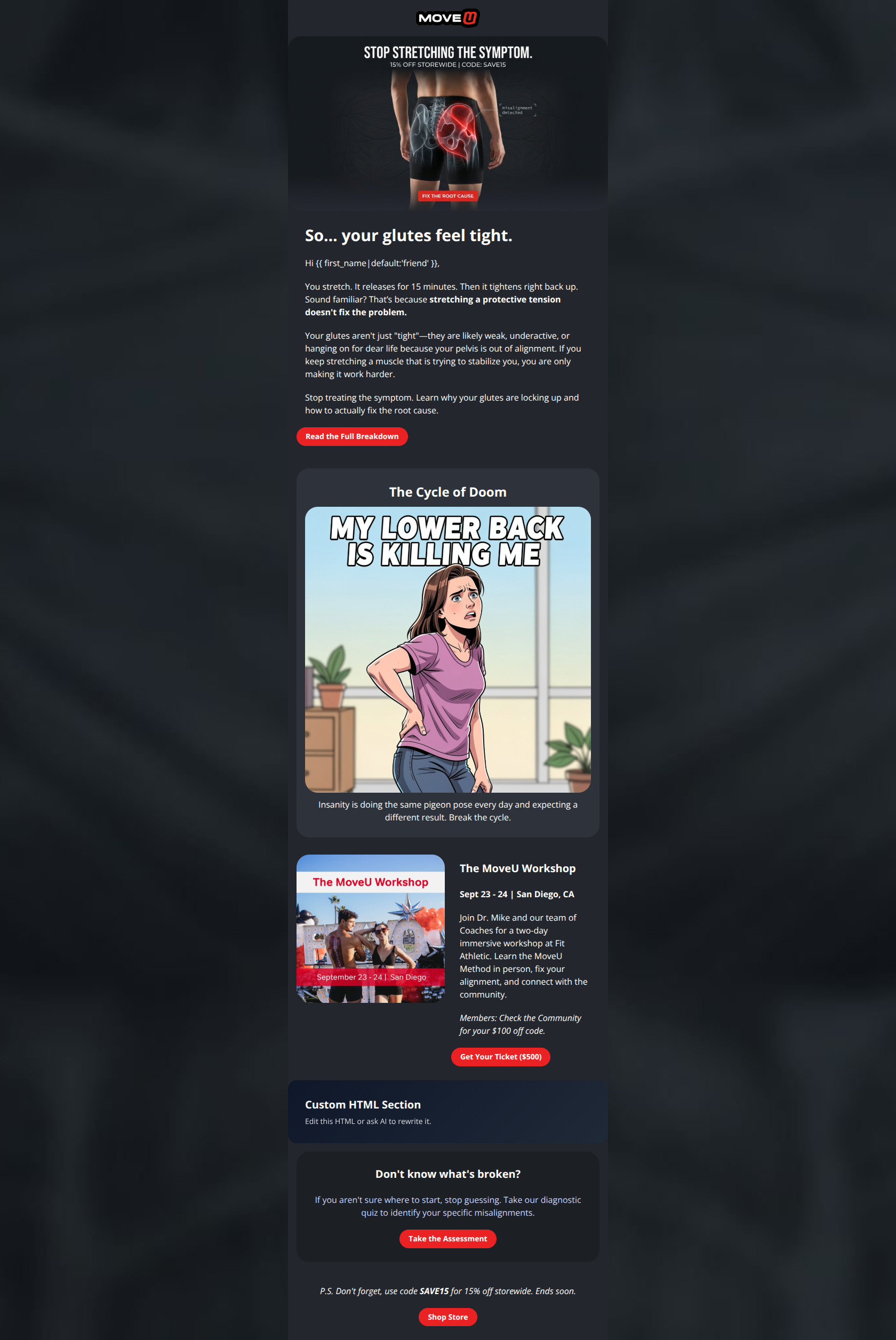
Design Score
74/100This email succeeds admirably in capturing the MoveU brand voice—authoritative, contrarian, and educational. The visual execution in dark mode is distinct and readable. However, it suffers significantly from "kitchen sink" syndrome: the hero image promotes a sale, the body copy promotes a blog post, the middle section sells a $500 ticket, and the footer pushes a diagnostic tool. This lack of a singular conversion goal dilutes the effectiveness of every individual offer.
Create Your Own
Generate professional email designs like this one in seconds with Kopi AI.
Email Details
- Subject Line
- Your Exclusive 15% Off Awaits!
- Brand
- MoveU
- Industry
- Health & Wellness
- Email Type
- Promotional
- Created
- February 21, 2026
Brand Colors
Email Copy
So… your glutes feel tight.
Hi friend,
You stretch. It releases for 15 minutes. Then it tightens right back up. Sound familiar? That’s because stretching a protective tension doesn't fix the problem.
Your glutes aren't just "tight"—they are likely weak, underactive, or hanging on for dear life because your pelvis is out of alignment. If you keep stretching a muscle that is trying to stabilize you, you are only making it work harder.
Stop treating the symptom. Learn why your glutes are locking up and how to actually fix the root cause.
→ Read the Full Breakdown
The Cycle of Doom
Insanity is doing the same pigeon pose every day and expecting a different result. Break the cycle.
The MoveU Workshop
Sept 23 - 24 | San Diego, CA
Join Dr. Mike and our team of Coaches for a two-day immersive workshop at Fit Athletic. Learn the MoveU Method in person, fix your alignment, and connect with the community.
Members: Check the Community for your $100 off code.
→ Get Your Ticket ($500)
Don't know what's broken?
If you aren't sure where to start, stop guessing. Take our diagnostic quiz to identify your specific misalignments.
→ Take the Assessment
P.S. Don't forget, use code SAVE15 for 15% off storewide. Ends soon.
→ Shop Store
Why This Email Works
This email succeeds admirably in capturing the MoveU brand voice—authoritative, contrarian, and educational. The visual execution in dark mode is distinct and readable. However, it suffers significantly from "kitchen sink" syndrome: the hero image promotes a sale, the body copy promotes a blog post, the middle section sells a $500 ticket, and the footer pushes a diagnostic tool. This lack of a singular conversion goal dilutes the effectiveness of every individual offer.
Hero (top/initial part) Impact
75/100- Strong anatomical imagery establishes immediate authority.
- Headline "So… your glutes feel tight" is empathetic and directly addresses the user's state.
Content Structure & Flow
60/100- The transition from the educational copy to the "Cycle of Doom" card is logical and reinforces the problem.
Visual Hierarchy & Layout
80/100- Excellent use of card-based design to separate different ideas.
- Headings are distinct and easy to scan.
Call-to-Action Strength
70/100- Red buttons on dark backgrounds pass the squint test easily.
- "Take the Assessment" is a strong, low-friction CTA.
Message Clarity & Tone
85/100- Voice is consistent, authoritative, and relatable.
- The explanation of "protective tension" simplifies a complex medical concept effectively.
Readability & Scannability
90/100- Strategic bolding (e.g., "stretching a protective tension doesn't fix the problem") allows skimmers to get the main point in seconds.
Offer & Value Proposition
65/100- The value of the educational content (understanding glute tightness) is established very quickly.
Personalization & Audience Fit
80/100- Specific callout to "tight glutes" resonates deeply with the target demographic.
Quick Wins
- Remove the "15% OFF STOREWIDE" text from the Hero Image unless you rewrite the body copy to be about the sale. The mismatch hurts clarity.
- Add a button to the "Cycle of Doom" card (e.g., "Break the Cycle") that leads to the same destination as the blog post.
- Change the Workshop button copy from "Get Your Ticket ($500)" to "View Workshop Details" to encourage click-throughs without immediate sticker shock.
- Move the "P.S." discount code higher up or give it its own small banner if driving sales is a priority.

Create Professional Email Designs
Generate beautiful, on-brand email designs in seconds. Just enter your brand URL and let AI do the rest.