Health & Wellness Newsletter Email Template
“Your body's barriers need this”
Design Score
81/100This is a strong, cohesive email that effectively communicates the brand's authoritative, science-led positioning. It utilizes a logical flow—introducing the product, educating on the underlying mechanism, highlighting tangible benefits, and presenting product options—while relentlessly driving toward a single, unified conversion goal. The execution is highly competent, but it falls short of 'outstanding' due to minor scannability issues in the educational block, dated visual transitions, and the absence of an explicit offer to overcome purchase friction for a premium product.
Create Your Own
Generate professional email designs like this one in seconds with Kopi AI.
Email Details
- Subject Line
- Your body's barriers need this
- Brand
- ARMRA [eval 2026-03-25]
- Industry
- Health & Wellness
- Email Type
- Newsletter
- Created
- April 24, 2026
Brand Colors
Email Copy
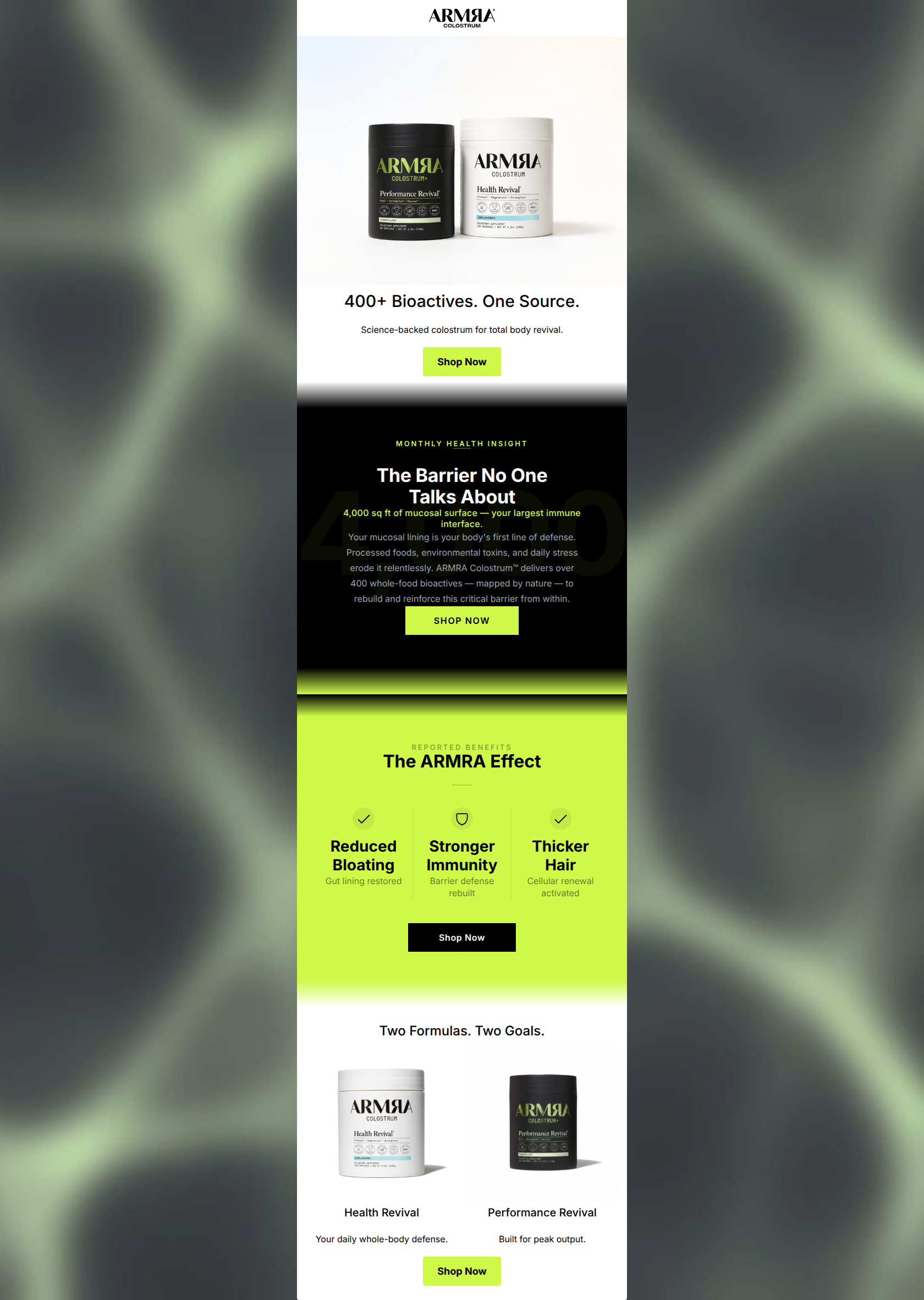
400+ Bioactives. One Source.
Science-backed colostrum for total body revival.
→ Shop Now
Two Formulas. Two Goals.
Health Revival
Your daily whole-body defense.
Performance Revival
Built for peak output.
→ Shop Now
Why This Email Works
This is a strong, cohesive email that effectively communicates the brand's authoritative, science-led positioning. It utilizes a logical flow—introducing the product, educating on the underlying mechanism, highlighting tangible benefits, and presenting product options—while relentlessly driving toward a single, unified conversion goal. The execution is highly competent, but it falls short of 'outstanding' due to minor scannability issues in the educational block, dated visual transitions, and the absence of an explicit offer to overcome purchase friction for a premium product.
Hero (top/initial part) Impact
85/100- Immediate brand and product recognition via clear photography.
- Headline matches the sophisticated, objective brand voice.
- Clear, high-contrast CTA placed above the fold.
Content Structure & Flow
82/100- Distinct thematic sections guide the reader naturally down the page.
- Alternating background colors effectively signal shifts in context.
- Ends strong by presenting the two distinct product choices just before the final CTA.
Visual Hierarchy & Layout
76/100- Excellent use of a three-column grid for 'The ARMRA Effect' to make benefits easily digestible.
- Headings maintain visual dominance over supporting text throughout.
Call-to-Action Strength
95/100- Flawless consistency in CTA text and assumed destination.
- Strategic placement at the end of every logical thought sequence.
- High-contrast color choices (lime on black, black on lime) ensure the buttons pop.
Message Clarity & Tone
88/100- Use of precise terminology ('mucosal surface', 'cellular renewal') builds trust.
- Frames the problem effectively around 'modern stressors', directly speaking to the target audience's pain points.
Readability & Scannability
72/100- The benefits section uses icons and minimal text for rapid comprehension.
- The final product comparison uses short, punchy descriptors ('Built for peak output').
Offer & Value Proposition
68/100- Clearly articulates what the product does and why it is unique (cold-processed, whole-food bioactives).
Personalization & Audience Fit
75/100- Addresses specific, relevant pain points (bloating, immunity, modern stress).
- Aesthetic and tone align perfectly with an educated, premium-seeking demographic.
Copy Conciseness & Word Economy
80/100- Excellent distillation of complex scientific concepts into short phrases ('Gut lining restored', 'Cellular renewal activated').
- No unnecessary throat-clearing in the introductory text.
Quick Wins
- Left-align the body copy in the dark 'Monthly Health Insight' section to immediately improve readability.
- Add a brief text callout stating the current active offer (e.g., 'Save 30% on your first order') near the hero CTA to reduce purchase hesitation.
- Remove the blurry gradients between the white, black, and lime sections, replacing them with sharp, solid color blocks.
Create Professional Email Designs
Generate beautiful, on-brand email designs in seconds. Just enter your brand URL and let AI do the rest.