SaaS & Software Promotional Email Template
“Your 90s website is costing you sales”
Design Score
80/100This is a structurally sound, highly scannable email that perfectly executes the brand's 'no jargon' voice. The copy is tight, outcome-focused, and treats the reader's time with respect. However, it leaves money on the table by relying on a commoditized 'Free Quote' offer and conceptual before/after imagery rather than concrete, data-backed proof. By upgrading the offer to a high-value lead magnet and injecting tangible results, this campaign could shift from competent to highly lucrative.
Create Your Own
Generate professional email designs like this one in seconds with Kopi AI.
Email Details
- Subject Line
- Your 90s website is costing you sales
- Brand
- Beyond the Brand Media®
- Industry
- SaaS & Software
- Email Type
- Promotional
- Created
- April 1, 2026
Brand Colors
Email Copy
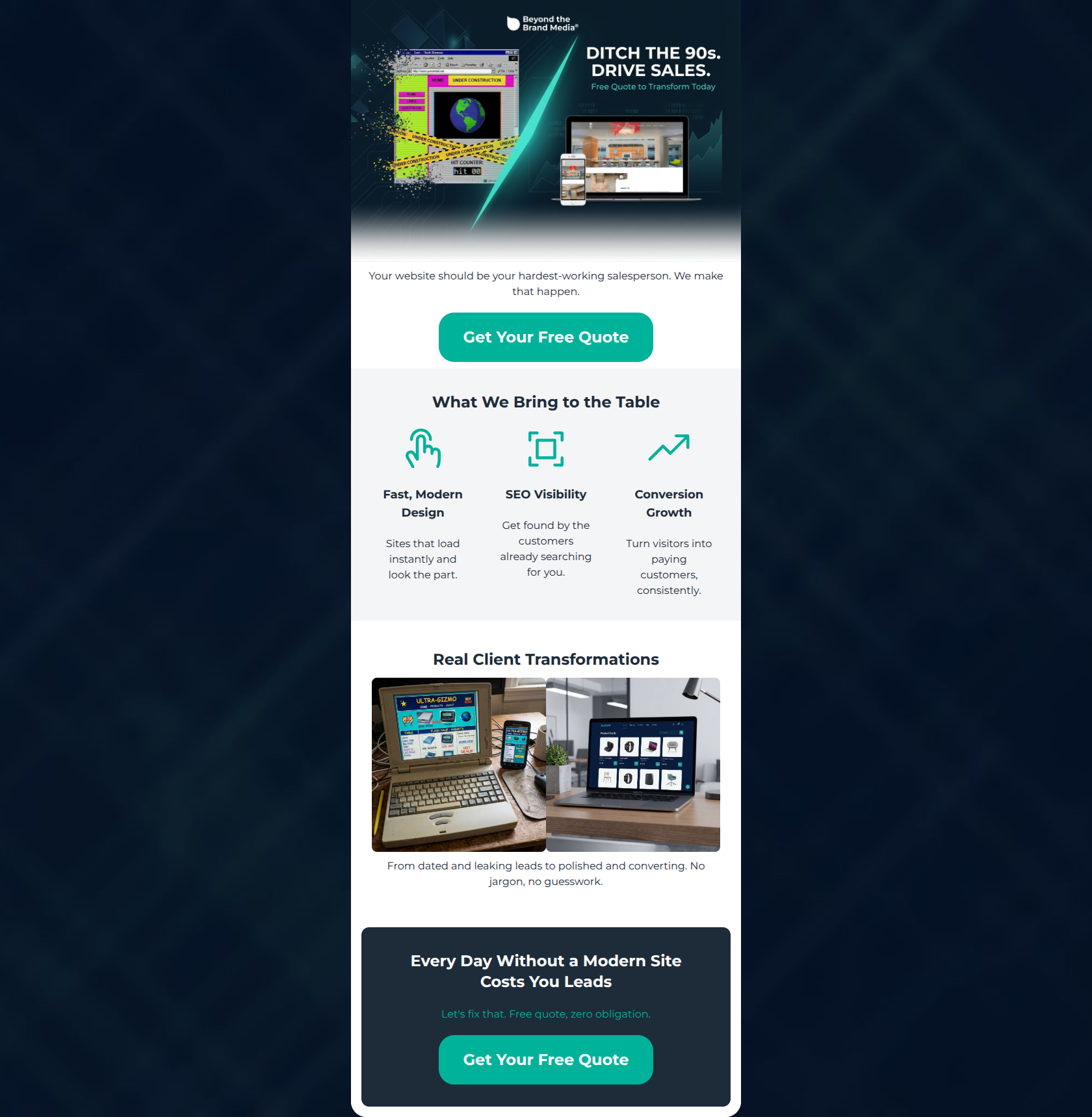
Your website should be your hardest-working salesperson. We make that happen.
→ Get Your Free Quote
What We Bring to the Table
Fast, Modern Design
Sites that load instantly and look the part.
SEO Visibility
Get found by the customers already searching for you.
Conversion Growth
Turn visitors into paying customers, consistently.
Real Client Transformations
From dated and leaking leads to polished and converting. No jargon, no guesswork.
Every Day Without a Modern Site Costs You Leads
Let's fix that. Free quote, zero obligation.
→ Get Your Free Quote
Why This Email Works
This is a structurally sound, highly scannable email that perfectly executes the brand's 'no jargon' voice. The copy is tight, outcome-focused, and treats the reader's time with respect. However, it leaves money on the table by relying on a commoditized 'Free Quote' offer and conceptual before/after imagery rather than concrete, data-backed proof. By upgrading the offer to a high-value lead magnet and injecting tangible results, this campaign could shift from competent to highly lucrative.
Hero Impact
82/100- The conceptual split-screen image perfectly illustrates the 'before and after' pain point of the audience.
- The supporting copy ('hardest-working salesperson') frames a technical service purely in business-growth terms.
Content Structure & Flow
80/100- Excellent use of the PAS (Problem, Agitation, Solution) framework.
- The dark navy bottom section acts as a strong visual anchor, catching 'scroll-to-bottom' readers with a high-contrast final pitch.
Visual Hierarchy & Layout
72/100- Generous whitespace around the three-column service block makes it highly scannable.
- The layout cleanly separates different thoughts into distinct visual 'cards' or bands.
Call-to-Action Strength
75/100- The vibrant teal (#00B29A) buttons provide excellent contrast against both the white and dark navy backgrounds.
- Button placement is strategic, capturing high-intent users immediately and re-engaging readers at the end.
Message Clarity & Tone
88/100- The tone is confident, professional, and refreshingly direct.
- Service descriptions ('Get found by the customers already searching for you') are perfectly translated from features into benefits.
Readability & Scannability
85/100- Paragraphs are kept to single sentences, eliminating 'wall of text' fatigue.
- Iconography effectively anchors the eye to the key service pillars.
Offer & Value Proposition
65/100- The final section successfully introduces urgency ('Every Day Without a Modern Site Costs You Leads').
- The risk-reversal copy ('zero obligation') is present and helpful.
Personalization & Audience Fit
82/100- Heavy use of 'you/your' phrasing keeps the narrative focused on the prospect, not the agency.
- Directly addresses the audience's core desire: consistent, automated lead generation.
Copy Conciseness & Word Economy
92/100- Distilled messaging that respects the reader's time.
- Avoids empty marketing adjectives like 'incredible' or 'revolutionary'.
Quick Wins
- Add 'Before' and 'After' text labels over the transformation images for instant cognitive clarity.
- Change the 'What We Bring to the Table' heading to a specific, outcome-driven statement.
- Update the teal text in the final CTA block to white to improve contrast and readability.



Create Professional Email Designs
Generate beautiful, on-brand email designs in seconds. Just enter your brand URL and let AI do the rest.