Electronics & Tech Promotional Email Template
“Your 90s website is costing you sales.”
Design Score
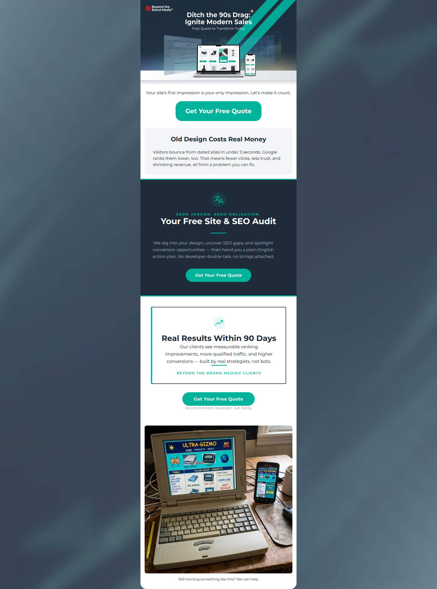
73/100This email effectively utilizes the brand's bold, high-contrast color palette and anti-jargon positioning to create a professional, visually striking impression. The dark navy central block does an excellent job of commanding attention for the core offer. However, the email suffers from a significant conversion bottleneck: a severe cognitive disconnect between the promised value (a 'Free Site & SEO Audit') and the button copy ('Get Your Free Quote'). A quote feels like a sales pitch; an audit feels like a gift. Furthermore, placing a massive, distracting image of a vintage laptop below the final Call-to-Action creates a visual exit ramp that leads users away from converting. Fixing the offer consistency and restructuring the ending will drastically improve click-through rates.
Create Your Own
Generate professional email designs like this one in seconds with Kopi AI.
Email Details
- Subject Line
- Your 90s website is costing you sales.
- Brand
- Beyond the Brand Media®
- Industry
- Electronics & Tech
- Email Type
- Promotional
- Created
- April 1, 2026
Brand Colors
Email Copy
Your site's first impression is your only impression. Let's make it count.
→ Get Your Free Quote
Old Design Costs Real Money
Visitors bounce from dated sites in under 3 seconds. Google ranks them lower, too. That means fewer clicks, less trust, and shrinking revenue, all from a problem you can fix.
Still running something like this? We can help.
Why This Email Works
This email effectively utilizes the brand's bold, high-contrast color palette and anti-jargon positioning to create a professional, visually striking impression. The dark navy central block does an excellent job of commanding attention for the core offer. However, the email suffers from a significant conversion bottleneck: a severe cognitive disconnect between the promised value (a 'Free Site & SEO Audit') and the button copy ('Get Your Free Quote'). A quote feels like a sales pitch; an audit feels like a gift. Furthermore, placing a massive, distracting image of a vintage laptop below the final Call-to-Action creates a visual exit ramp that leads users away from converting. Fixing the offer consistency and restructuring the ending will drastically improve click-through rates.
Hero Impact
75/100- Strong, immediate use of the brand's vibrant teal to highlight the primary CTA above the fold.
- High-quality graphic that clearly communicates the digital/e-commerce nature of the service.
Content Structure & Flow
60/100- The progression from identifying the pain point to offering a low-friction solution is strategically sound.
- The use of a dedicated client proof section effectively builds trust before the final ask.
Visual Hierarchy & Layout
82/100- Excellent use of the brand's canvas background (#1E2C3A) to frame the inner content.
- The central dark navy block perfectly isolates and elevates the primary value proposition.
Call-to-Action Strength
68/100- Perfect color contrast makes the buttons impossible to miss.
- Consistent button sizing and pill-shape design create a familiar, clickable pattern.
Message Clarity & Tone
85/100- Translates technical SEO/design problems into plain-English business consequences.
- The 'No developer double-talk' line perfectly validates the target audience's primary frustration.
Readability & Scannability
80/100- Flawless color contrast passing any accessibility or 'squint' test.
- Clear hierarchy between H2 headings and body copy.
Offer & Value Proposition
70/100- The offer requires low commitment ('No strings attached') while delivering high perceived value.
- Directly solves the user's pain point of not knowing what is wrong with their current site.
Personalization & Audience Fit
88/100- Perfect alignment with the audience's desire for reliable, jargon-free digital solutions.
- Focuses on the emotional relief of clarity ('Just clarity.') over technical feature lists.
Copy Conciseness & Word Economy
82/100- Excellent use of short, punchy subheadings ('Zero Jargon. Zero Obligation.').
- Avoids long-winded introductions, getting straight to the problem and solution.
Quick Wins
- Change all CTA button text from 'Get Your Free Quote' to 'Claim My Free Audit' to align with the core offer and reduce friction.
- Remove the vintage laptop image from the bottom of the email, or move it up into the 'Old Design Costs Real Money' section.
- Reformat the text in the 'Old Design Costs Real Money' section into a short bulleted list for easier scanning.

Create Professional Email Designs
Generate beautiful, on-brand email designs in seconds. Just enter your brand URL and let AI do the rest.