Health & Wellness Announcement Email Template
“Why We Started Liquid I.V.”
Design Score
76/100This email is visually strong and captures the vibrant, purposeful brand identity of Liquid I.V. well. It excels in its disciplined approach to Call-to-Action consistency, driving a single, unambiguous goal. However, as a conversion vehicle, it suffers from an inverted priority structure: it leans too heavily into brand philanthropy at the top while burying the core functional benefits (the 'Science Inside') at the bottom. Without a clear offer or personal value proposition in the hero, it risks losing readers who are looking for a solution to their immediate hydration pain points rather than a charity update.
Create Your Own
Generate professional email designs like this one in seconds with Kopi AI.
Email Details
- Subject Line
- Why We Started Liquid I.V.
- Brand
- Liquid IV [eval-prod 2026-04-15]
- Industry
- Health & Wellness
- Email Type
- Announcement
- Created
- April 15, 2026
Brand Colors
Email Copy
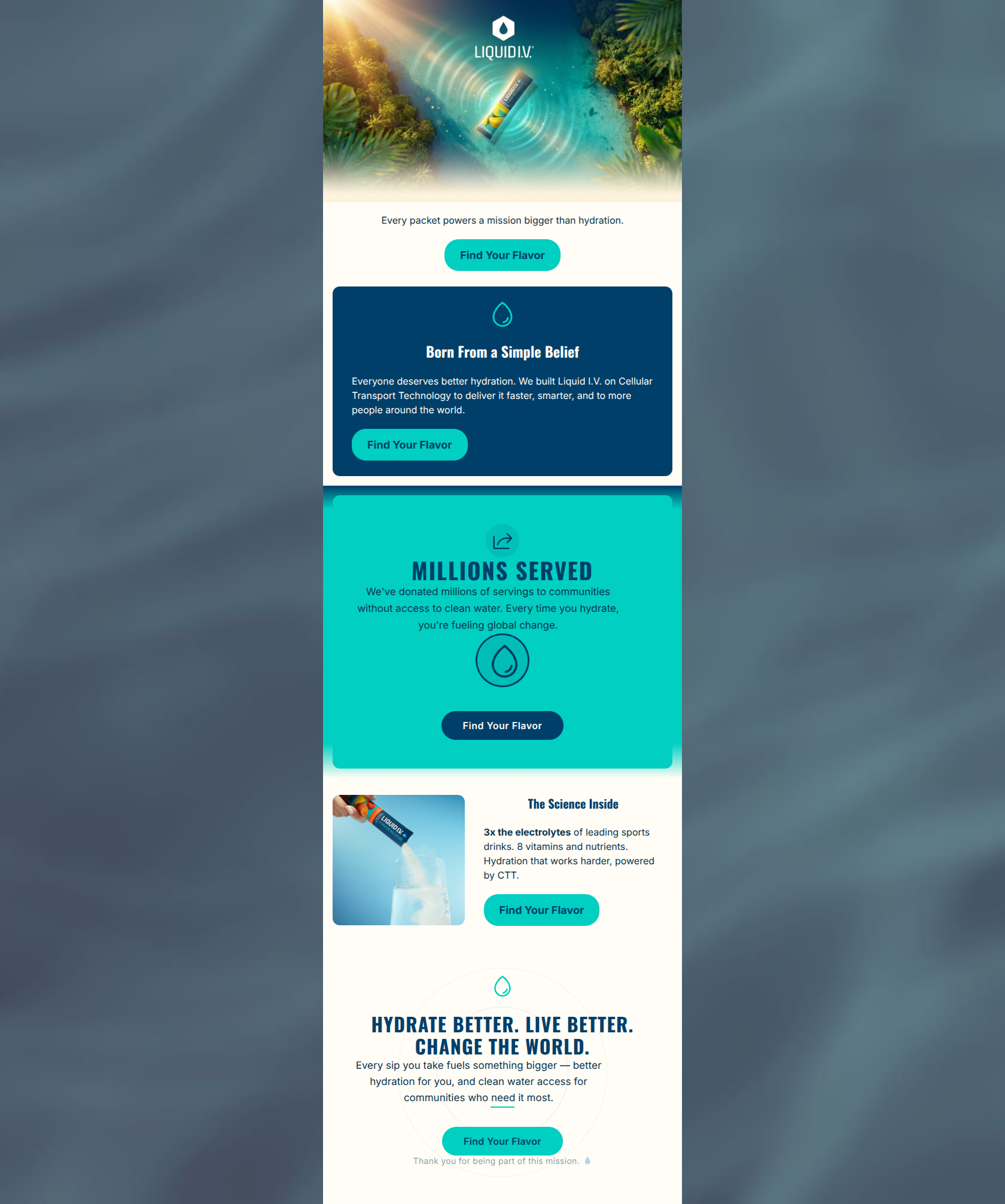
Every packet powers a mission bigger than hydration.
→ Find Your Flavor
Born From a Simple Belief
Everyone deserves better hydration. We built Liquid I.V. on Cellular Transport Technology to deliver it faster, smarter, and to more people around the world.
→ Find Your Flavor
The Science Inside
3x the electrolytes of leading sports drinks. 8 vitamins and nutrients. Hydration that works harder, powered by CTT.
→ Find Your Flavor
Why This Email Works
This email is visually strong and captures the vibrant, purposeful brand identity of Liquid I.V. well. It excels in its disciplined approach to Call-to-Action consistency, driving a single, unambiguous goal. However, as a conversion vehicle, it suffers from an inverted priority structure: it leans too heavily into brand philanthropy at the top while burying the core functional benefits (the 'Science Inside') at the bottom. Without a clear offer or personal value proposition in the hero, it risks losing readers who are looking for a solution to their immediate hydration pain points rather than a charity update.
Hero Impact
60/100- Strong, aspirational lifestyle imagery that matches the brand's vibrant aesthetic.
- Clear, high-contrast CTA immediately visible above the fold.
Content Structure & Flow
70/100- Distinct visual banding (alternating navy, teal, and cream backgrounds) creates clear section breaks.
- The flow gently guides the reader down the page with centralized icons and alternating layouts.
Visual Hierarchy & Layout
82/100- Excellent contrast between the dark navy headings and cream backgrounds.
- The alternating left-right alignment in the lower sections creates a scannable zigzag pattern.
Call-to-Action Strength
98/100- Unambiguous primary action repeated consistently.
- 'Find Your Flavor' is an excellent, low-commitment verb choice that leans into the brand's colorful product lineup.
- High-contrast button styling ensures they pop against all background colors.
Message Clarity & Tone
78/100- Tone aligns perfectly with the brand's energetic and purposeful psychographics.
- The sign-off ('Hydrate better. Live better. Change the world.') is a concise, powerful summation of the brand ethos.
Readability & Scannability
85/100- Effective use of bolding ('3x the electrolytes') to draw the eye to key value propositions.
- Short, punchy sentences reduce cognitive load.
Offer & Value Proposition
55/100- The functional value proposition (CTT technology, 3x electrolytes) is clearly stated in the 'Science Inside' block.
Personalization & Audience Fit
70/100- The emphasis on clean ingredients and global impact aligns well with the stated psychographics of the target audience.
Copy Conciseness & Word Economy
80/100- No large walls of text; copy is broken into easily digestible chunks.
- The 'Science Inside' section is a great example of distilled, benefit-driven copy.
Quick Wins
- Swap the vertical order of the 'Millions Served' section and 'The Science Inside' section so product benefits precede the brand mission.
- Add 'Free Shipping over $40' as microcopy beneath the primary CTAs or in a small banner to provide a concrete conversion incentive.
- Change the hero subtext to include a direct 'You'-centric benefit rather than just a brand statement.

Create Professional Email Designs
Generate beautiful, on-brand email designs in seconds. Just enter your brand URL and let AI do the rest.