Health & Wellness Announcement Email Template
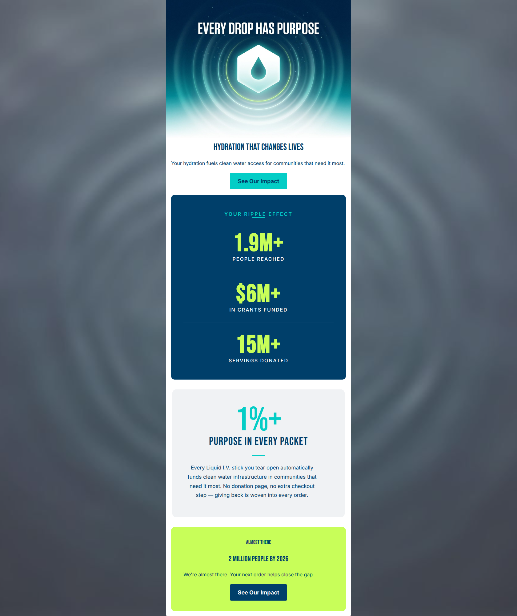
“1.9 million people. Your ripple effect.”
Design Score
84/100This is a strong, highly scannable brand mission email that effectively uses visual hierarchy and word economy to communicate Liquid I.V.'s global impact. The inverted pyramid structure guides the reader perfectly from the overarching mission down to the concrete numbers. The primary weakness lies in a mismatched call-to-action at the bottom of the email, where the copy prompts a purchase but the button directs to an informational page. Fixing this, along with adding more human-centric imagery, would elevate this from a good communication piece to a stronger conversion driver.
Create Your Own
Generate professional email designs like this one in seconds with Kopi AI.
Email Details
- Subject Line
- 1.9 million people. Your ripple effect.
- Brand
- Liquid IV [eval 2026-03-26]
- Industry
- Health & Wellness
- Email Type
- Announcement
- Created
- March 26, 2026
Brand Colors
Email Copy
Hydration That Changes Lives
Your hydration fuels clean water access for communities that need it most.
→ See Our Impact
Almost There
2 Million People by 2026
We're almost there. Your next order helps close the gap.
→ See Our Impact
Why This Email Works
This is a strong, highly scannable brand mission email that effectively uses visual hierarchy and word economy to communicate Liquid I.V.'s global impact. The inverted pyramid structure guides the reader perfectly from the overarching mission down to the concrete numbers. The primary weakness lies in a mismatched call-to-action at the bottom of the email, where the copy prompts a purchase but the button directs to an informational page. Fixing this, along with adding more human-centric imagery, would elevate this from a good communication piece to a stronger conversion driver.
1. Hero (top/initial part) Impact
82/100- Headline is punchy and benefit-driven ('Hydration That Changes Lives').
- Subcopy immediately makes the reader the hero ('Your hydration fuels...').
- Clear, contrasting CTA button placed above the fold.
2. Content Structure & Flow
90/100- Excellent use of distinct, modular blocks to separate different parts of the narrative.
- The 'proof' (numbers) is placed immediately after the 'promise' (hero), building trust early.
3. Visual Hierarchy & Layout
88/100- Brilliant use of oversized typography for the statistics, making the email instantly scannable.
- The contrasting card background colors (navy, gray, neon) effectively reset the reader's attention as they scroll.
4. Call-to-Action Strength
68/100- CTAs have high contrast against their respective backgrounds.
- Buttons are visually distinct and easy to tap.
5. Message Clarity & Tone
92/100- Heavy reliance on 'Your' rather than 'We/Our' in the opening sections.
- Complex ideas (percentage of revenue funding infrastructure) are distilled into simple, everyday language.
6. Readability & Scannability
85/100- Oversized numerals do the heavy lifting for communication.
- Generous whitespace around text elements prevents clutter.
7. Offer & Value Proposition
85/100- The 'No extra step' copy perfectly addresses the common friction point of charitable giving at checkout.
- The value is framed as a partnership between the brand and the consumer.
8. Personalization & Audience Fit
75/100- Aesthetic and tone are perfectly aligned with the brand's energetic, high-performance identity.
9. Copy Conciseness & Word Economy
94/100- The '1%+' block explains the entire mechanism of the philanthropic model in just 32 words.
- Data labels ('People Reached', 'In Grants Funded') are distilled to their absolute minimum.
Quick Wins
- Change the CTA in the bottom neon block from 'See Our Impact' to 'Shop & Support' to align with the 'Your next order helps close the gap' copy.
- Left-align the three-line paragraph in the soft gray '1%+' section to improve reading ease.

Create Professional Email Designs
Generate beautiful, on-brand email designs in seconds. Just enter your brand URL and let AI do the rest.