Health & Wellness Announcement Email Template
“Why we exist.”
Design Score
90/100This is an exceptionally strong, purpose-driven email that perfectly translates Liquid I.V.'s social mission into a compelling reason to purchase. By stripping away product features and focusing entirely on the emotional and ethical impact of a purchase, it speaks directly to the brand's psychographic profile of conscious consumers. The visual hierarchy is striking, the copy is aggressively distilled, and the strict adherence to a single, repeated CTA creates a clear conversion path. This is a masterclass in 'less is more' marketing.
Create Your Own
Generate professional email designs like this one in seconds with Kopi AI.
Email Details
- Subject Line
- Why we exist.
- Brand
- Liquid IV [eval-prod 2026-05-22]
- Industry
- Health & Wellness
- Email Type
- Announcement
- Created
- May 22, 2026
Brand Colors
Email Copy
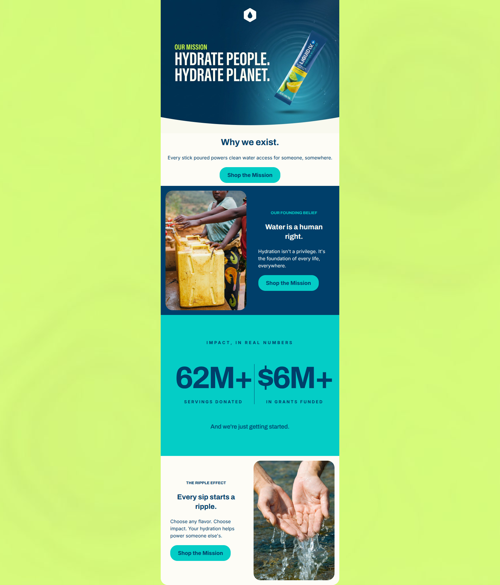
Why we exist.
Every stick poured powers clean water access for someone, somewhere.
→ Shop the Mission
OUR FOUNDING BELIEF
Water is a human right.
Hydration isn't a privilege. It's the foundation of every life, everywhere.
→ Shop the Mission
THE RIPPLE EFFECT
Every sip starts a ripple.
Choose any flavor. Choose impact. Your hydration helps power someone else's.
→ Shop the Mission
Why This Email Works
This is an exceptionally strong, purpose-driven email that perfectly translates Liquid I.V.'s social mission into a compelling reason to purchase. By stripping away product features and focusing entirely on the emotional and ethical impact of a purchase, it speaks directly to the brand's psychographic profile of conscious consumers. The visual hierarchy is striking, the copy is aggressively distilled, and the strict adherence to a single, repeated CTA creates a clear conversion path. This is a masterclass in 'less is more' marketing.
Hero (top/initial part) Impact
88/100- Striking hero image that blends the product with the core mission statement.
- Clear, immediate establishment of the email's premise without burying the lead.
- Immediate introduction of the primary CTA above the fold.
Content Structure & Flow
92/100- Excellent use of the bold, central 'Impact in Real Numbers' section as a visual anchor and proof point to break up the standard two-column blocks.
- Rhythmic alternation of imagery and copy to maintain scanning momentum.
- Logical narrative arc that builds from philosophy to concrete impact to final action.
Visual Hierarchy & Layout
90/100- The central data section uses scale perfectly to highlight the '62M+' and '$6M+' figures.
- Strong use of the navy background in the second section to create visual separation from the cream canvas.
- Generous padding throughout prevents the heavy topics from feeling cluttered or overwhelming.
Call-to-Action Strength
95/100- Strict adherence to a single primary action, repeated across key scroll depths.
- High-contrast CTA colors (cyan on navy, cyan on cream) ensure the buttons are unmistakable.
- The CTA copy bridges the gap between commerce ('Shop') and the emotional driver ('the Mission').
Message Clarity & Tone
94/100- Bold, uncompromising stance on the brand's core values.
- Successfully frames a product purchase as an act of global citizenship.
- Avoids generic corporate social responsibility jargon in favor of direct, human-centric language.
Readability & Scannability
96/100- Virtually no long paragraphs; high reliance on impactful headlines.
- Excellent use of sub-kickers ('OUR FOUNDING BELIEF', 'THE RIPPLE EFFECT') to frame the reading experience.
- High text-to-background contrast across all modules.
Offer & Value Proposition
85/100- Clearly defines the 1-to-1 impact model ('Every stick poured powers clean water').
- Elevates the product from a mere functional beverage to a catalyst for global change.
- Makes the user the hero of the transaction.
Personalization & Audience Fit
92/100- Aligns perfectly with the audience's desire for clean, purposeful consumption.
- The 'work hard, play hard, care deeply' ethos is well represented.
Copy Conciseness & Word Economy
98/100- Ruthless editing; nothing is longer than it needs to be.
- High impact-to-word ratio.
- Absence of filler adjectives ('amazing', 'incredible'), relying instead on the weight of the facts.
Quick Wins
- The bright cyan CTA buttons on the light cream background may visually blend slightly on lower-contrast monitors. Consider adding a subtle 1px dark navy border to the buttons in the cream sections to guarantee they look like clickable elements.
- In the final 'Ripple Effect' block, consider updating the image to feature the product pack alongside the lifestyle element (e.g., a stick pack resting on a rock near the water) to visually tether the abstract impact back to the physical product being sold.

Create Professional Email Designs
Generate beautiful, on-brand email designs in seconds. Just enter your brand URL and let AI do the rest.