Fashion & Apparel Promotional Email Template
“Why pre-loved is the new luxury”
Design Score
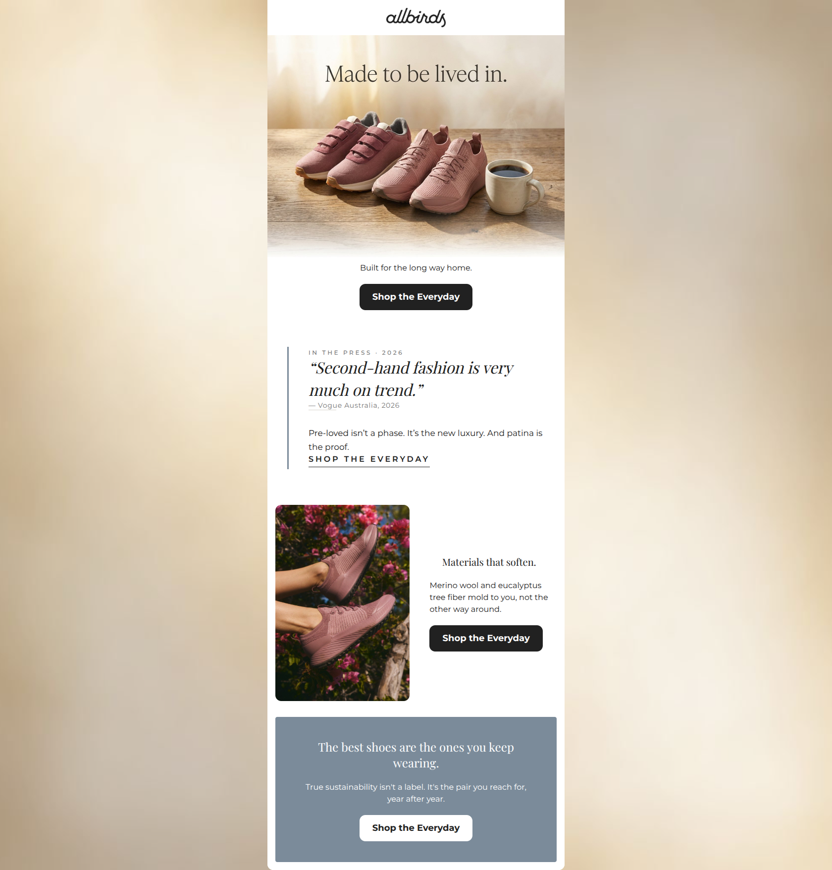
83/100This is a visually stunning, highly scannable email that nails the 'warm minimalism' of the Allbirds brand. The visual hierarchy is strong, and the strict repetition of the 'Shop the Everyday' CTA is a textbook example of driving users toward a single conversion goal. However, the message clarity stumbles slightly in the middle section. By utilizing a quote about 'second-hand fashion' while promoting a collection of new shoes, the email introduces unnecessary cognitive friction. While the thematic intent (durability and patina) is understandable, the literal interpretation risks confusing the reader. Overall, it's a very strong email that could push into top-tier territory by tightening the narrative thread.
Create Your Own
Generate professional email designs like this one in seconds with Kopi AI.
Email Details
- Subject Line
- Why pre-loved is the new luxury
- Brand
- Kopi Agent Eval [2026-05-22]
- Industry
- Fashion & Apparel
- Email Type
- Promotional
- Created
- May 26, 2026
Brand Colors
Email Copy
Built for the long way home.
→ Shop the Everyday
Materials that soften.
Merino wool and eucalyptus tree fiber mold to you, not the other way around.
→ Shop the Everyday
The best shoes are the ones you keep wearing.
True sustainability isn't a label. It's the pair you reach for, year after year.
→ Shop the Everyday
Why This Email Works
This is a visually stunning, highly scannable email that nails the 'warm minimalism' of the Allbirds brand. The visual hierarchy is strong, and the strict repetition of the 'Shop the Everyday' CTA is a textbook example of driving users toward a single conversion goal. However, the message clarity stumbles slightly in the middle section. By utilizing a quote about 'second-hand fashion' while promoting a collection of new shoes, the email introduces unnecessary cognitive friction. While the thematic intent (durability and patina) is understandable, the literal interpretation risks confusing the reader. Overall, it's a very strong email that could push into top-tier territory by tightening the narrative thread.
1. Hero (top/initial part) Impact
85/100- Beautiful, brand-authentic imagery utilizing warm, natural light.
- The 'Made to be lived in' headline is immediately visible and sets a clear value proposition.
- Clear, high-contrast primary CTA placed above the fold.
2. Content Structure & Flow
78/100- Distinct, well-padded sections make the email feel uncluttered.
- Smooth visual transitions between centered content, asymmetrical layouts, and full-width color blocks.
3. Visual Hierarchy & Layout
90/100- The Z-pattern layout in the 'Materials that soften' section breaks up the center-alignment perfectly and keeps the reader engaged.
- The final slate blue block acts as a strong visual anchor, framing the bottom of the email.
- Great balance of text vs. image.
4. Call-to-Action Strength
95/100- The exact same primary destination and button copy ('Shop the Everyday') is repeated three times, eliminating any guesswork for the reader.
- Buttons feature excellent color contrast (dark charcoal on white, white on slate blue).
- Clear, action-oriented verb.
5. Message Clarity & Tone
70/100- The copy 'mold to you, not the other way around' is a brilliant, customer-centric way to describe a product feature.
- The tone feels conversational and authentic, avoiding hard-sell tactics.
6. Readability & Scannability
88/100- Excellent word economy; paragraphs are kept to single sentences.
- Headings ('Materials that soften') immediately convey the value of the section below them.
7. Offer & Value Proposition
75/100- The value prop is clearly tied to a benefit ('shoes you keep wearing') rather than just a list of features.
- Sustainability is framed as a practical benefit (longevity) rather than just a moral imperative.
8. Personalization & Audience Fit
78/100- The visual aesthetic perfectly targets the millennial/Gen-Z preference for 'warm minimalism'.
- The messaging respects the audience's intelligence, avoiding greenwashing cliches.
9. Copy Conciseness & Word Economy
92/100- Headings do the heavy lifting, allowing the body copy to be brief and impactful.
- No throat-clearing intro paragraphs ('We are excited to announce...'). It gets straight to the point.
Quick Wins
- Swap the Vogue 'second-hand' quote for a quote highlighting the shoe's durability, comfort, or material innovation to avoid confusing the offer.
- Add a subtle visual indicator (like an arrow ->) to the inline 'SHOP THE EVERYDAY' text link to make it more obviously clickable to scanners.
- Ensure the hero subcopy tightly aligns with the visual (e.g., 'Comfort for the long haul' instead of 'the long way home' if showing a static coffee table scene).



Create Professional Email Designs
Generate beautiful, on-brand email designs in seconds. Just enter your brand URL and let AI do the rest.