SaaS & Software Promotional Email Template
“What your Digital HQ actually looks like”
Design Score
79/100This is a solid, highly scannable promotional email that successfully balances 'corporate trust' with 'entrepreneurial energy'. It leverages brand colors exceptionally well to draw attention to CTAs and creates a strong sense of ownership with the 'Digital HQ' framing. However, the email suffers from a cluttered hero graphic, low-contrast text in the feature checklist, and a disjointed user journey in the second half where the copy pivots to a soft upsell while the CTA button remains generically focused on exploration.
Create Your Own
Generate professional email designs like this one in seconds with Kopi AI.
Email Details
- Subject Line
- What your Digital HQ actually looks like
- Brand
- Income Stream Pro
- Industry
- SaaS & Software
- Email Type
- Promotional
- Created
- March 31, 2026
Brand Colors
Email Copy
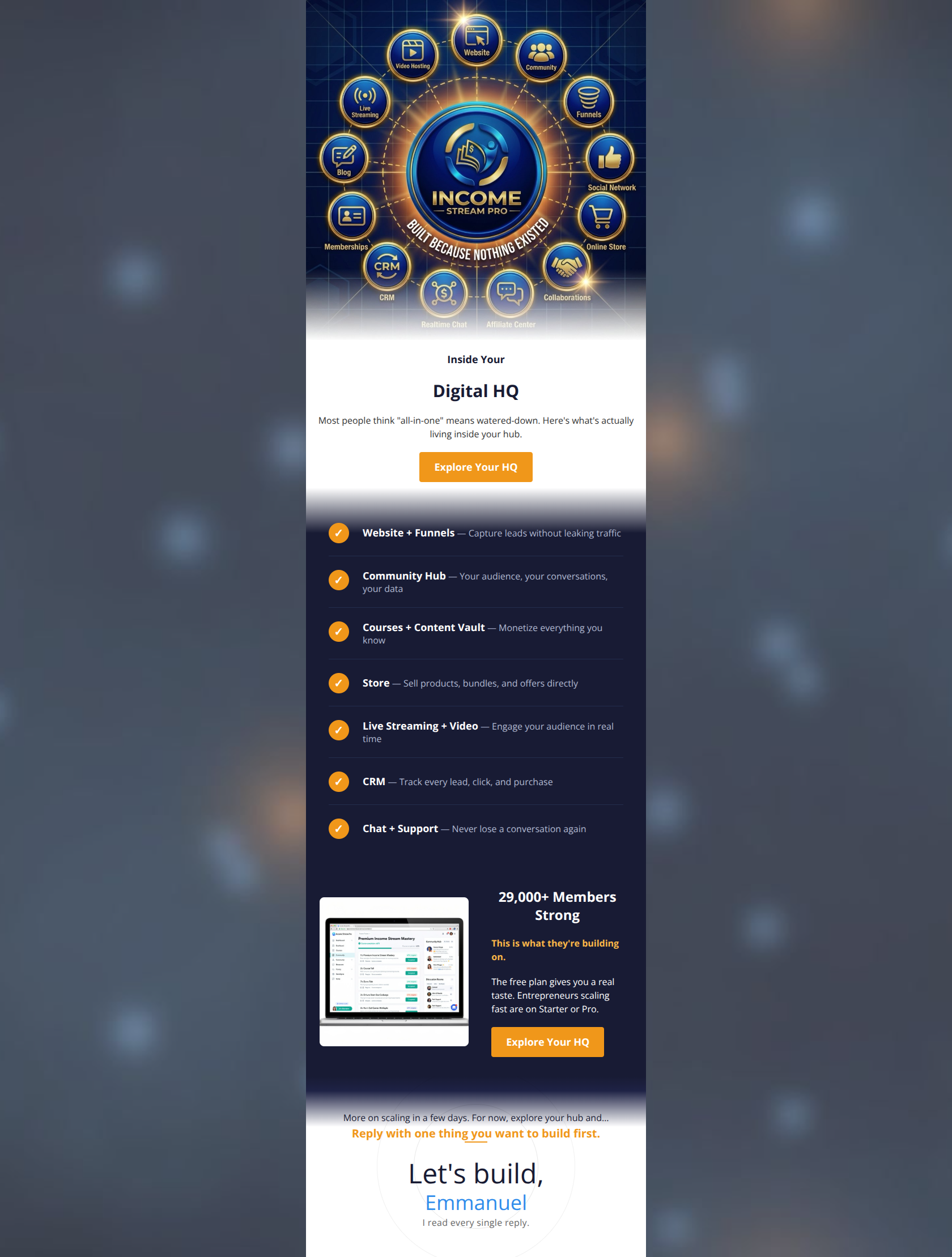
Inside Your
Digital HQ
Most people think "all-in-one" means watered-down. Here's what's actually living inside your hub.
→ Explore Your HQ
29,000+ Members Strong
This is what they're building on.
The free plan gives you a real taste. Entrepreneurs scaling fast are on Starter or Pro.
→ Explore Your HQ
Why This Email Works
This is a solid, highly scannable promotional email that successfully balances 'corporate trust' with 'entrepreneurial energy'. It leverages brand colors exceptionally well to draw attention to CTAs and creates a strong sense of ownership with the 'Digital HQ' framing. However, the email suffers from a cluttered hero graphic, low-contrast text in the feature checklist, and a disjointed user journey in the second half where the copy pivots to a soft upsell while the CTA button remains generically focused on exploration.
Hero (top/initial part) Impact
75/100- Directly tackles the 'watered-down' objection common to all-in-one platforms.
- Creates immediate ownership by using 'Your Digital HQ' instead of 'Our Platform'.
Content Structure & Flow
82/100- Excellent use of a vertical checklist to break down a complex platform into digestible chunks.
- Strong visual separation of sections using alternating white and dark navy backgrounds.
Visual Hierarchy & Layout
76/100- Vivid orange checkmarks and buttons pop perfectly against the dark navy background.
- Bold white titles in the checklist establish a flawless scan path down the middle of the email.
Call-to-Action Strength
70/100- High-contrast button colors guarantee the CTAs are never missed.
- The secondary text-based CTA ('Reply with one thing you want to build first') is a brilliant engagement tactic.
Message Clarity & Tone
85/100- Excellent benefit-driven descriptions (e.g., 'Capture leads without leaking traffic').
- The sign-off from 'Emmanuel' adds a crucial human touch to a software-heavy email.
Readability & Scannability
74/100- Paragraphs are kept extremely short.
- Formatting utilizes bolding effectively to draw the eye to key metrics ('29,000+ Members Strong').
Offer & Value Proposition
82/100- Clearly breaks down exactly what 'all-in-one' means, removing ambiguity.
- Positions the platform as an ecosystem ('Digital HQ') rather than just a tool.
Personalization & Audience Fit
88/100- The prompt to reply builds a direct relationship and signals that the brand actually cares about the user's specific goals.
- The language consistently centers the user ('Your audience', 'Your data', 'Monetize everything you know').
Copy Conciseness & Word Economy
90/100- No walls of text; relies entirely on punchy headers and one-line descriptions.
- High information density without feeling overwhelming.
Quick Wins
- Brighten the grey descriptive text in the 7-item checklist to improve contrast against the navy background.
- Change the second CTA button from 'Explore Your HQ' to 'View Pro Plans' (or similar) to match the 'Starter or Pro' copy directly above it.
- Remove 'For now, explore your hub and...' from the footer to make the reply prompt more direct.


Create Professional Email Designs
Generate beautiful, on-brand email designs in seconds. Just enter your brand URL and let AI do the rest.