Media & Entertainment Promotional Email Template
“What the smartest dads are reading right now”
Design Score
81/100This is a structurally sound, highly scannable promotional email that successfully leverages a seasonal hook (Father's Day). It excels in word economy and readability, utilizing strong contrast and short, punchy copy. However, it falls short of fully representing QQ.com's brand identity; the layout feels a bit sparse for a platform that prides itself on 'high-density' information, and the tone leans slightly too conversational for an 'authoritative, objective' digital utility. Furthermore, a minor disconnect between the module image links and the primary CTA buttons introduces unnecessary friction.
Create Your Own
Generate professional email designs like this one in seconds with Kopi AI.
Email Details
- Subject Line
- What the smartest dads are reading right now
- Brand
- QQ.com / Tencent
- Industry
- Media & Entertainment
- Email Type
- Promotional
- Created
- June 15, 2026
Brand Colors
Email Copy
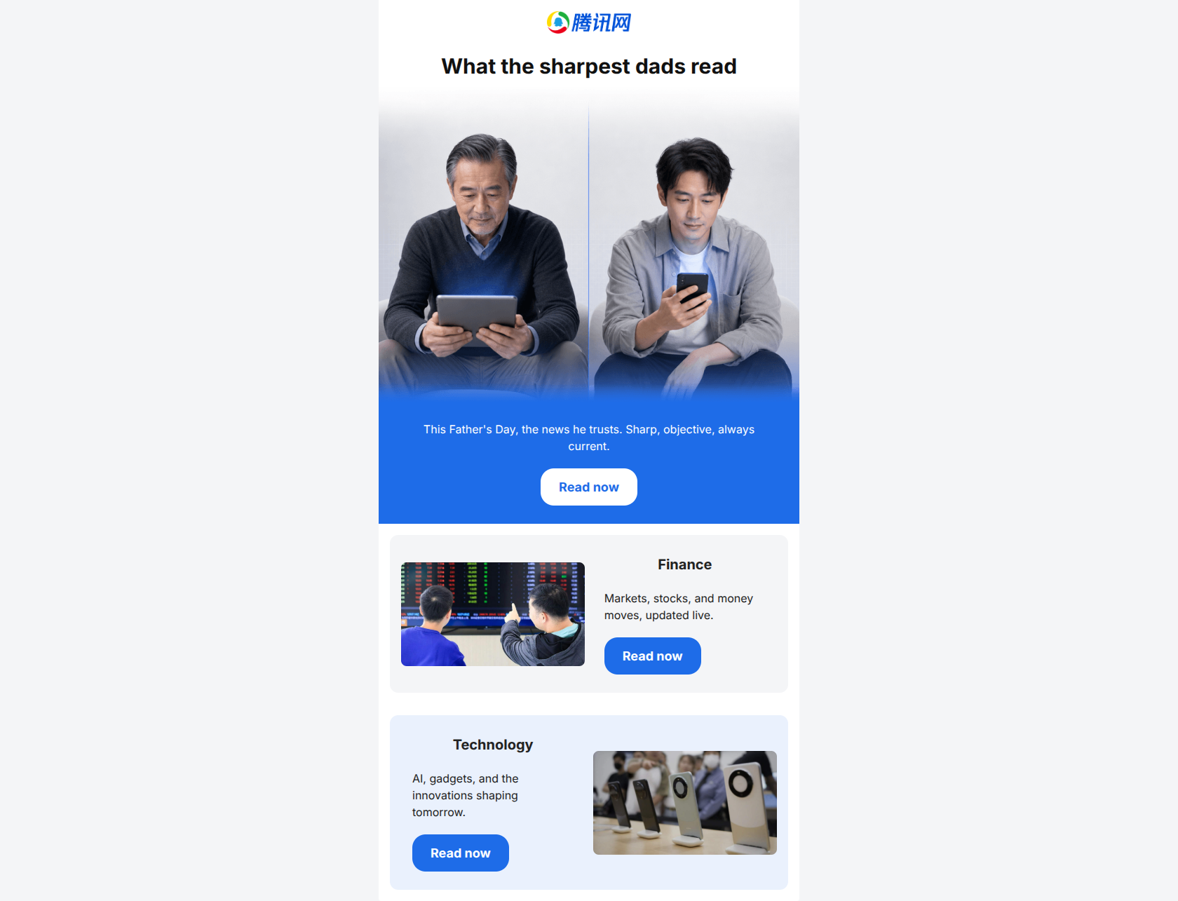
What the sharpest dads read
This Father's Day, the news he trusts. Sharp, objective, always current.
→ Read now
Finance
Markets, stocks, and money moves, updated live.
→ Read now
Technology
AI, gadgets, and the innovations shaping tomorrow.
→ Read now
Why This Email Works
This is a structurally sound, highly scannable promotional email that successfully leverages a seasonal hook (Father's Day). It excels in word economy and readability, utilizing strong contrast and short, punchy copy. However, it falls short of fully representing QQ.com's brand identity; the layout feels a bit sparse for a platform that prides itself on 'high-density' information, and the tone leans slightly too conversational for an 'authoritative, objective' digital utility. Furthermore, a minor disconnect between the module image links and the primary CTA buttons introduces unnecessary friction.
Hero (top/initial part) Impact
75/100- High-quality, relevant imagery that immediately targets the intended seasonal audience.
- Clear transition into the value proposition within the blue secondary band.
Content Structure & Flow
82/100- Logical top-to-bottom flow that makes scanning effortless.
- Effective use of a Z-pattern to keep the reader's eye moving.
Visual Hierarchy & Layout
78/100- The primary CTA band is impossible to miss and holds the highest visual weight.
- Good use of whitespace (margin/padding) to separate distinct ideas.
Call-to-Action Strength
85/100- Excellent repetition of the primary action.
- High contrast buttons that pass the 'squint test' with ease.
Message Clarity & Tone
78/100- The sub-headline clearly articulates the core value proposition.
- The copy completely avoids unnecessary hyperbole or filler adjectives.
Readability & Scannability
95/100- Flawless execution of scannable formatting.
- No dense paragraphs or 'walls of text'.
Offer & Value Proposition
75/100- Connects a habitual behavior (reading news) to a timely event (Father's Day).
Personalization & Audience Fit
78/100- Appropriate thematic selection for the seasonal hook.
Copy Conciseness & Word Economy
95/100- Distilled, intentional messaging.
- Zero filler phrases or repetitive messaging across sections.
Quick Wins
- Align the href attributes of the module images to match the primary CTA button hrefs, ensuring a predictable user experience.
- Rewrite the H1 to sound more like a factual, authoritative utility rather than a lifestyle blog.

Create Professional Email Designs
Generate beautiful, on-brand email designs in seconds. Just enter your brand URL and let AI do the rest.