Fashion & Apparel Welcome Email Template
“Welcome. We have nothing to hide.”

Design Score
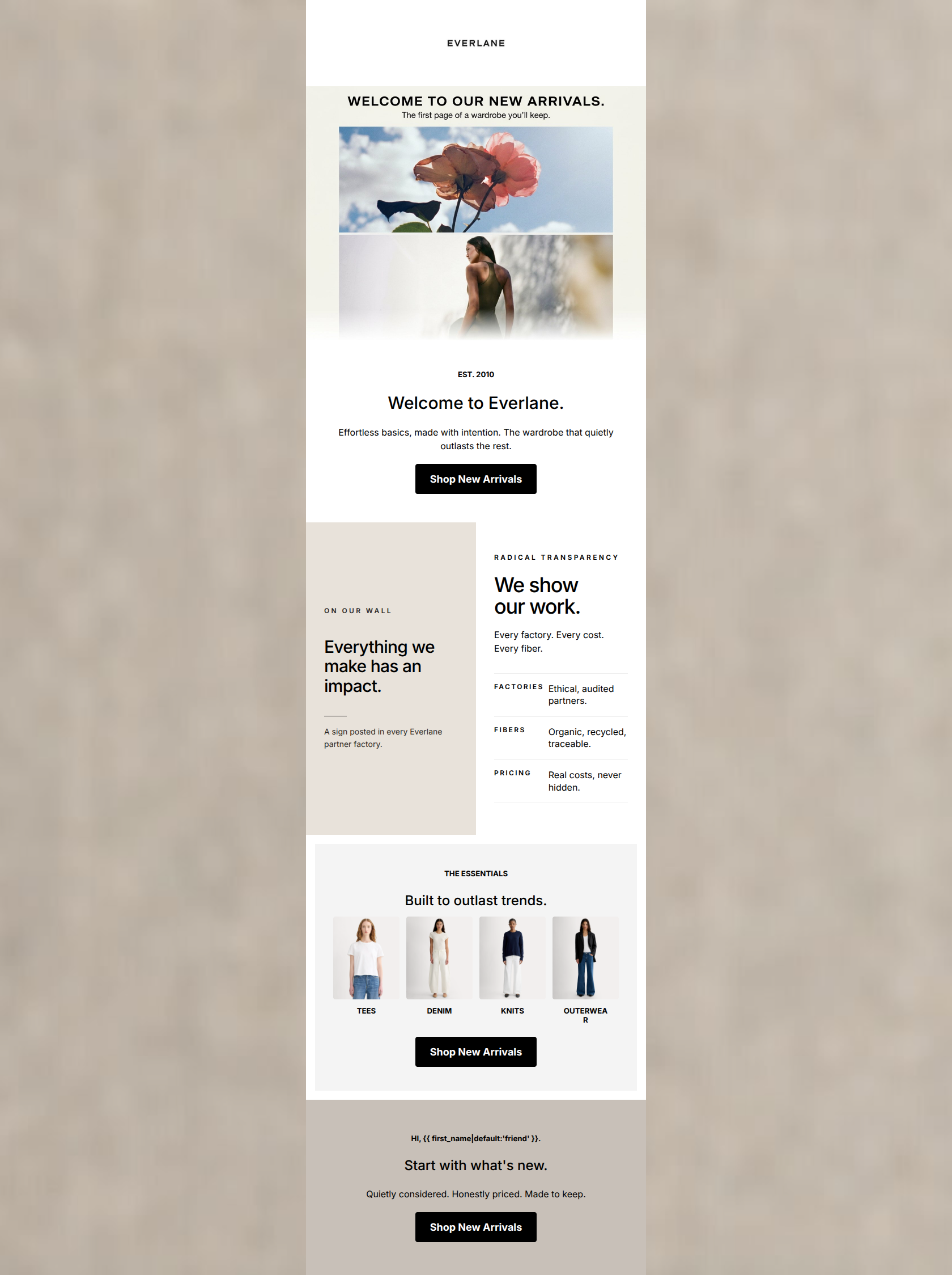
72/100This welcome email nails the Everlane visual aesthetic and brand tone—it is clean, minimalist, and highly scannable. However, it functions more as a brand poster than a conversion engine. The hero section wastes prime real estate with a massive logo and an unearned CTA, and the bottom section creates friction by offering specific product categories but forcing users through a generic 'Shop Best Sellers' bottleneck. It looks premium, but the click-routing logic leaves money on the table.
Create Your Own
Generate professional email designs like this one in seconds with Kopi AI.
Email Details
- Subject Line
- Welcome. We have nothing to hide.
- Brand
- Everlane [eval 2026-03-26]
- Industry
- Fashion & Apparel
- Email Type
- Welcome
- Created
- March 26, 2026
Brand Colors
Email Copy
→ Shop Best Sellers
Hi, friend.
Welcome to a brand with nothing to hide.
Find Your Fit
Women's
Modern basics, built to last.
Men's
Clean lines. Honest prices.
ReNew
Made from recycled materials.
→ Shop Best Sellers
Why This Email Works
This welcome email nails the Everlane visual aesthetic and brand tone—it is clean, minimalist, and highly scannable. However, it functions more as a brand poster than a conversion engine. The hero section wastes prime real estate with a massive logo and an unearned CTA, and the bottom section creates friction by offering specific product categories but forcing users through a generic 'Shop Best Sellers' bottleneck. It looks premium, but the click-routing logic leaves money on the table.
Hero (top/initial part) Impact
55/100- Brand identity is immediately recognizable.
- Button contrast is high.
Content Structure & Flow
72/100- Clear demarcation between the brand story and the product offerings.
- Excellent use of background color blocking to separate sections.
Visual Hierarchy & Layout
82/100- Perfect execution of the brand's stark, uncluttered aesthetic.
- Excellent use of negative space to reduce cognitive load.
- High-quality editorial photography.
Call-to-Action Strength
60/100- CTAs use strong, high-contrast colors (black on light backgrounds).
- Generous tap targets with ample padding.
Message Clarity & Tone
85/100- Strong, memorable brand positioning statement ('nothing to hide').
- The triptych copy is an excellent distillation of complex supply chain concepts into digestible consumer benefits.
Readability & Scannability
88/100- Excellent use of icons to anchor text blocks.
- Short, punchy paragraphs that respect the reader's time.
- Clear typographic hierarchy between headings and body copy.
Offer & Value Proposition
75/100- The brand's unique selling proposition is front and center and clearly explained.
- Focuses on long-term value ('built to last') over cheap thrills.
Personalization & Audience Fit
78/100- Visuals and tone deeply resonate with the intended audience's desire for elevated simplicity.
- Seamless fallback logic in the personalization tag.
Copy Conciseness & Word Economy
90/100- Zero filler phrasing.
- Impactful, active language ('Visited, vetted, and published').
Quick Wins
- Darken the 'RADICAL TRANSPARENCY' subhead text to ensure it is easily readable.
- Add a bold headline (e.g., 'Glad You're Here.') directly above the top 'Shop Best Sellers' button.
- Ensure the product flat-lay images in the 'Find Your Fit' section are hyperlinked to their respective category pages.


Create Professional Email Designs
Generate beautiful, on-brand email designs in seconds. Just enter your brand URL and let AI do the rest.