Travel & Hospitality Welcome Email Template
“Welcome to XO Travel! Your journey starts here ☀️”
Design Score
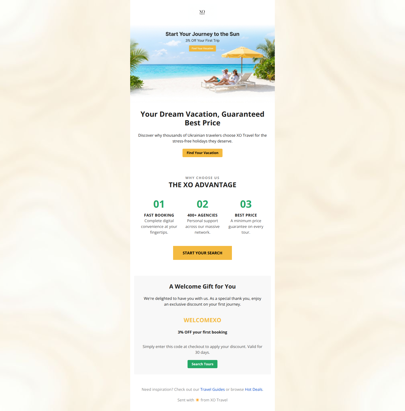
75/100This is a competent welcome email that clearly communicates the brand identity and core value propositions, but it suffers from redundancy and low-contrast design choices. The biggest strength is the clean, brand-aligned visual consistency, while the biggest weakness is the 'fake button' in the hero image and the poor accessibility of the yellow text used for the discount code.
Create Your Own
Generate professional email designs like this one in seconds with Kopi AI.
Email Details
- Subject Line
- Welcome to XO Travel! Your journey starts here ☀️
- Brand
- XO Travel
- Industry
- Travel & Hospitality
- Email Type
- Welcome
- Created
- February 24, 2026
Brand Colors
Email Copy
Your Dream Vacation, Guaranteed Best Price
Discover why thousands of Ukrainian travelers choose XO Travel for the stress-free holidays they deserve.
→ Find Your Vacation
A Welcome Gift for You
We're delighted to have you with us. As a special thank you, enjoy an exclusive discount on your first journey.
WELCOMEXO
3% OFF your first booking
Simply enter this code at checkout to apply your discount. Valid for 30 days.
→ Search Tours
Need inspiration? Check out our Travel Guides or browse Hot Deals.
Sent with ☀️ from XO Travel
Why This Email Works
This is a competent welcome email that clearly communicates the brand identity and core value propositions, but it suffers from redundancy and low-contrast design choices. The biggest strength is the clean, brand-aligned visual consistency, while the biggest weakness is the 'fake button' in the hero image and the poor accessibility of the yellow text used for the discount code.
Hero (top/initial part) Impact
72/100- High-quality, aspirational imagery that fits the 'sunny' brand aesthetic.
- Brand logo is clearly positioned at the top.
Content Structure & Flow
78/100- Clear demarcation between sections using whitespace and background colors.
- Logical progression from emotional appeal (hero) to rational proof (value props).
Visual Hierarchy & Layout
75/100- Good use of whitespace to separate content blocks.
- Distinct card style for the offer helps it stand out from the rest of the body.
Call-to-Action Strength
70/100- Buttons have good contrast (Black text on Yellow background).
- The buttons are large and easily tappable.
Message Clarity & Tone
85/100- Tone is consistently optimistic and approachable.
- Value propositions are clearly articulated in the triptych.
Readability & Scannability
82/100- Short, punchy paragraphs.
- Use of a numbered list layout for the 'Advantages' section makes scanning easy.
Offer & Value Proposition
75/100- The discount code is explicitly stated.
- The 'Minimum Price Guarantee' addresses a key customer objection.
Personalization & Audience Fit
50/100- The content fits the mass-market, budget-conscious traveler profile well.
Quick Wins
- Change the text color of 'WELCOMEXO' to #202020 (Black) to pass contrast accessibility standards.
- Remove the button graphic and text from the Hero image file to stop users from clicking a non-responsive image.
- Change the Hero H1 to explicitly mention the discount: 'Welcome! Here is 3% Off Your First Trip.'
- Change the primary CTA text from 'Find Your Vacation' to 'Search Tours & Save 3%'.
Create Professional Email Designs
Generate beautiful, on-brand email designs in seconds. Just enter your brand URL and let AI do the rest.