Fashion & Apparel Welcome Email Template
“Welcome to the world of Kith.”
Design Score
80/100This is a strong, brand-aligned welcome email that effectively communicates Kith's minimalist aesthetic and premium positioning. The primary weakness is the placement of the 'Welcome Offer' incentive; by positioning the discount code in a separate band *below* the primary CTA (or subtly inside the image), you risk users clicking through before realizing they have a discount, or missing the incentive entirely.
Create Your Own
Generate professional email designs like this one in seconds with Kopi AI.
Email Details
- Subject Line
- Welcome to the world of Kith.
- Brand
- Kith
- Industry
- Fashion & Apparel
- Email Type
- Welcome
- Created
- January 21, 2026
Brand Colors
Email Copy
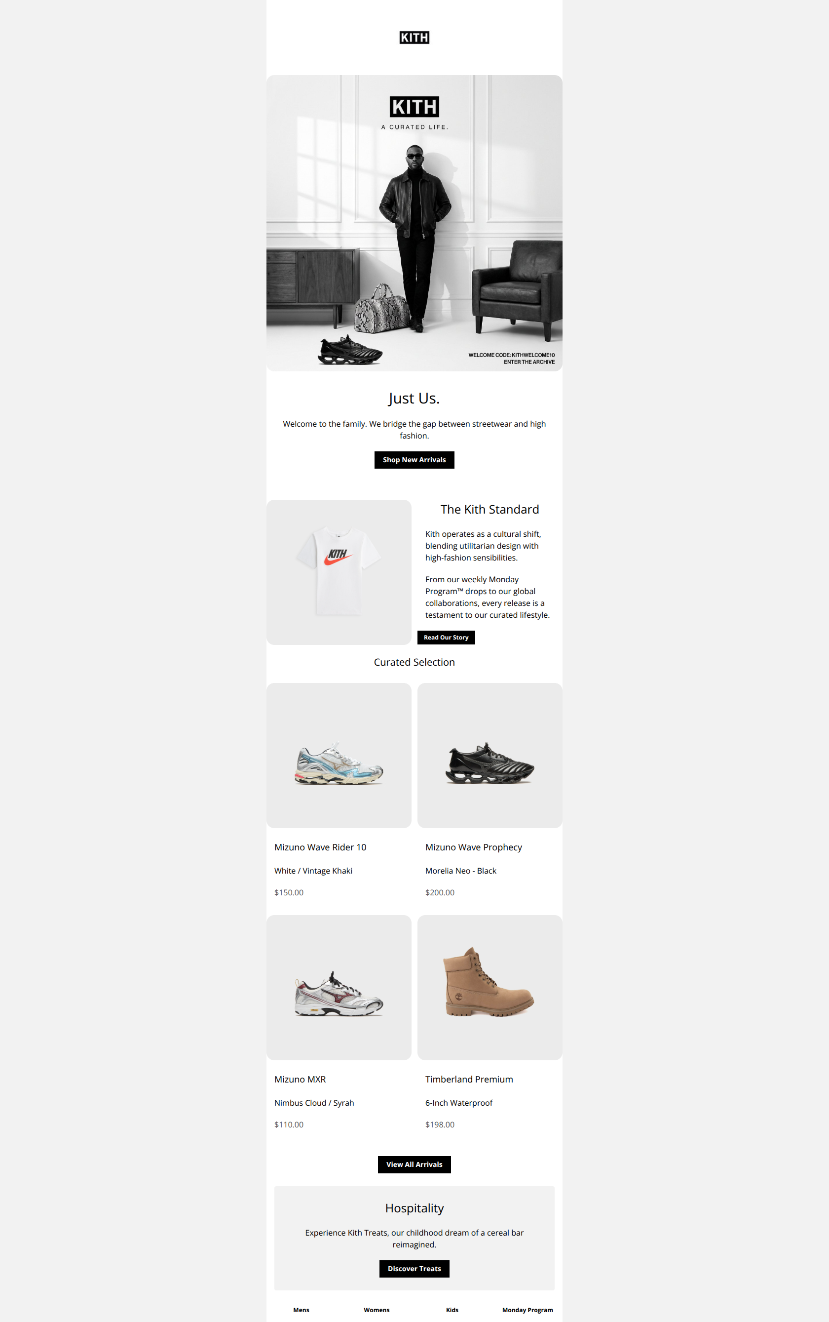
Just Us.
Welcome to the family. We bridge the gap between streetwear and high fashion.
→ Shop New Arrivals
Exclusive Welcome Offer: Use code KITHWELCOME10 at checkout.
The Kith Standard
Kith operates as a cultural shift, blending utilitarian design with high-fashion sensibilities.
From our weekly Monday Program™ drops to our global collaborations, every release is a testament to our curated lifestyle.
→ Read Our Story
Curated Selection
Mizuno Wave Rider 10
White / Vintage Khaki
$150.00
Mizuno Wave Prophecy
Morelia Neo - Black
$200.00
Mizuno MXR
Nimbus Cloud / Syrah
$110.00
Timberland Premium
6-Inch Waterproof
$198.00
→ View All Arrivals
Hospitality
Experience Kith Treats, our childhood dream of a cereal bar reimagined.
→ Discover Treats
→ Mens
→ Womens
→ Kids
→ Monday Program
Why This Email Works
This is a strong, brand-aligned welcome email that effectively communicates Kith's minimalist aesthetic and premium positioning. The primary weakness is the placement of the 'Welcome Offer' incentive; by positioning the discount code in a separate band *below* the primary CTA (or subtly inside the image), you risk users clicking through before realizing they have a discount, or missing the incentive entirely.
Hero Impact
80/100- High-quality photography that instantly conveys brand atmosphere.
- Minimalist layout focuses attention on the key message.
Content Structure & Flow
85/100- Clear demarcation between the brand story and the shopping grid.
- Good use of white space to prevent the content from feeling crowded.
Visual Hierarchy & Layout
85/100- Typography is clean, sized well, and highly legible.
- Product images are given ample room to breathe, reinforcing the luxury feel.
Call-to-Action Strength
75/100- Primary CTAs use the high-contrast black background effectively.
- Button copy is legible and isolated from clutter.
Message Clarity & Tone
90/100- Copy is punchy and respectful of the user's time.
- Brand voice is consistent from headline to footer.
Readability & Scannability
90/100- Short line lengths prevent eye fatigue.
- Generous line-height makes the body text elegant and readable.
Offer & Value Proposition
70/100- The offer itself (10%) is clear and standard.
- The code is simple and easy to type.
Personalization & Audience Fit
50/100- The 'Monday Program' and 'Treats' references appeal specifically to the brand's 'cult' following.
Quick Wins
- Move the 'Exclusive Welcome Offer' text block to sit *immediately above* the primary 'Shop New Arrivals' button in the Hero.
- Add a visible 'Shop Now' text link or arrow under each product in the 2x2 grid to cue clickability.
- Darken the grey price text (#555555) to ensure it is clearly legible on all screens.
- Hyperlink the 'Just Us' heading to the New Arrivals collection.




Create Professional Email Designs
Generate beautiful, on-brand email designs in seconds. Just enter your brand URL and let AI do the rest.