Fitness Welcome Email Template
“Welcome to the Team. Take 25% Off.”
Design Score
68/100This email succeeds in visual branding, nailing the 'gym-industrial' aesthetic with high-contrast colors and gritty imagery. However, it suffers from significant conversion flaws: the primary offer (25% off) is buried at the very bottom, the product selection (a flag and unflavored whey) is puzzling for a welcome email, and there is a glaring typo ('ARTIFICAL') that undermines the premium positioning.
Create Your Own
Generate professional email designs like this one in seconds with Kopi AI.
Email Details
- Subject Line
- Welcome to the Team. Take 25% Off.
- Brand
- Ascent Protein
- Industry
- Fitness
- Email Type
- Welcome
- Created
- February 5, 2026
Brand Colors
Email Copy
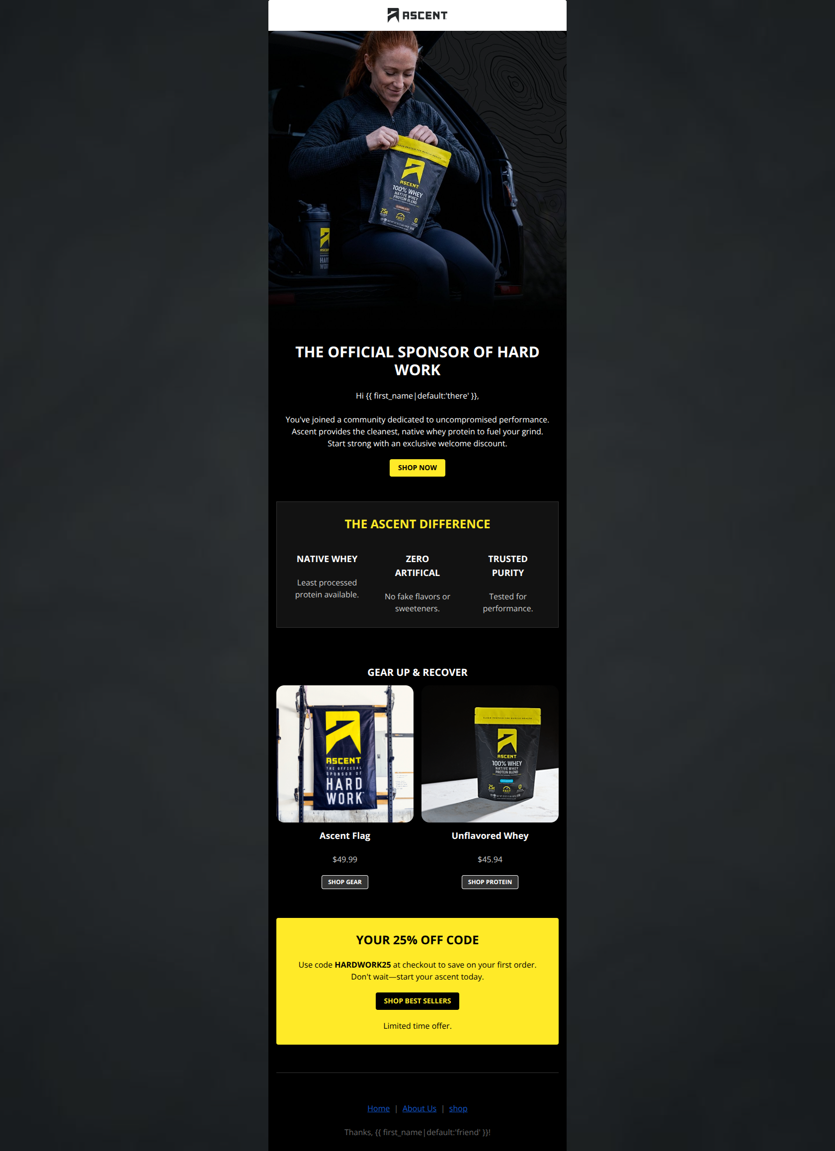
THE OFFICIAL SPONSOR OF HARD WORK
Hi there, You've joined a community dedicated to uncompromised performance. Ascent provides the cleanest, native whey protein to fuel your grind. Start strong with an exclusive welcome discount.
→ SHOP NOW
THE ASCENT DIFFERENCE
NATIVE WHEY
Least processed protein available.
ZERO ARTIFICAL
No fake flavors or sweeteners.
TRUSTED PURITY
Tested for performance.
GEAR UP & RECOVER
Ascent Flag
$49.99
→ SHOP GEAR
Unflavored Whey
$45.94
→ SHOP PROTEIN
YOUR 25% OFF CODE
Use code HARDWORK25 at checkout to save on your first order. Don't wait—start your ascent today.
→ SHOP BEST SELLERS
Limited time offer.
Home | About Us | shop Thanks, friend!
Why This Email Works
This email succeeds in visual branding, nailing the 'gym-industrial' aesthetic with high-contrast colors and gritty imagery. However, it suffers from significant conversion flaws: the primary offer (25% off) is buried at the very bottom, the product selection (a flag and unflavored whey) is puzzling for a welcome email, and there is a glaring typo ('ARTIFICAL') that undermines the premium positioning.
Hero (top/initial part) Impact
72/100- Strong, gritty photography aligns perfectly with the 'hard work' brand identity.
- High-contrast black and yellow palette immediately signals the brand voice.
Content Structure & Flow
65/100- Clear section breaks using background colors (Black -> Dark Grey -> Yellow) guide the eye effectively.
Visual Hierarchy & Layout
75/100- The yellow 'Offer' block at the bottom pops aggressively against the dark theme, ensuring the code isn't missed—if the user scrolls that far.
Call-to-Action Strength
70/100- The primary yellow button color (#FFEA28) offers excellent contrast against the black background.
Message Clarity & Tone
55/100- The voice is consistently authoritative and motivational ('Fuel your grind', 'Don't wait').
Readability & Scannability
85/100- Short paragraphs and clear headings make the email very skimmable.
- Font sizes are generous and legible on mobile and desktop.
Offer & Value Proposition
60/100- The three-pillar value prop (Native Whey, Zero Artificial, Trusted Purity) succinctly explains *why* the product is premium.
Personalization & Audience Fit
50/100- The 'Hard Work' framing perfectly targets the psychographics of the CrossFit/high-intensity athlete.
Quick Wins
- **CORRECT TYPO:** Fix 'ZERO ARTIFICAL' to 'ZERO ARTIFICIAL' in the value props section immediately.
- **Lift the Offer:** Add 'Get 25% Off' to the Hero Headline or Subhead so users don't have to scroll to the bottom to find the incentive.
- **Button Label:** Change the Hero CTA from 'SHOP NOW' to 'SHOP BEST SELLERS' or 'GET STARTED'.




Create Professional Email Designs
Generate beautiful, on-brand email designs in seconds. Just enter your brand URL and let AI do the rest.