Outdoor & Sports Welcome Email Template
“Welcome to the Fire. Here's 10% Off.”
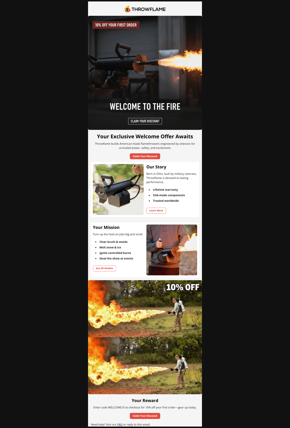
Design Score
72/100Strong, on-brand welcome email with striking visuals and clear proof points. The discount is under-leveraged above the fold and the content repeats a large promo image, slightly diluting focus. Tightening the hero, surfacing the code earlier, and adding trust/social proof and use‑case pathways will lift conversion.
Create Your Own
Generate professional email designs like this one in seconds with Kopi AI.
Email Details
- Subject Line
- Welcome to the Fire. Here's 10% Off.
- Brand
- Throwflame
- Industry
- Outdoor & Sports
- Email Type
- Welcome
- Created
- November 6, 2025
Brand Colors
Email Copy
Here's 10% OFF
Throwflame builds American-made flamethrowers engineered by veterans for unrivaled power, safety, and excitement.
→ Claim Your Discount
Our Story
Born in Ohio, built by military veterans, Throwflame is devoted to lasting performance.
- Lifetime warranty
- USA-made components
- Trusted worldwide
→ Learn More
Your Mission
Turn up the heat on jobs big and small.
- Clear brush & weeds
- Melt snow & ice
- Ignite controlled burns
- Steal the show at events
→ See All Models
Your Reward
Enter code WELCOME10 at checkout for 10% off your first order—gear up today.
→ Claim Your Discount
Need help? Visit our FAQ or reply to this email.
Why This Email Works
Strong, on-brand welcome email with striking visuals and clear proof points. The discount is under-leveraged above the fold and the content repeats a large promo image, slightly diluting focus. Tightening the hero, surfacing the code earlier, and adding trust/social proof and use‑case pathways will lift conversion.
Hero (top/initial part) Impact
78/100- High-impact action imagery aligns with the brand’s power/performance positioning.
- Clear primary CTA (“Claim Your Discount”) immediately available near the hero.
Content Structure & Flow
74/100- Concise sections with clear subheads (“Our Story,” “Your Mission”) and bullets aid comprehension.
- CTAs at each section provide clear next steps.
Visual Hierarchy & Layout
70/100- Distinct sections and adequate spacing make the content easy to skim.
- Imagery strongly communicates performance and use context.
Call-to-Action Strength
72/100- Multiple CTAs throughout keep momentum.
- CTAs are short, legible, and visually distinct.
Message Clarity & Tone
76/100- Concise, confident tone that fits the brand.
- Clear value statements: “Lifetime warranty,” “USA-made components.”
Readability & Scannability
85/100- Effective use of bullets and two-column cards enhances legibility.
- Consistent typographic hierarchy across sections.
Offer & Value Proposition
68/100- Clear code (“WELCOME10”) and “first order” qualifier clarify eligibility.
- Offer framing aligns with a welcome/first-purchase incentive.
Personalization & Audience Fit
55/100- Use-case bullets (“Clear brush,” “Melt snow & ice,” etc.) widen relevance early.
- Tone fits both hobbyist and professional applications without alienating either.
Quick Wins
- Change hero headline to explicitly state the offer and show the code: “Get 10% Off Your First Order — Use WELCOME10.”
- Remove the duplicated large promo image in the discount section to tighten the email and keep focus on the CTA.
- Add a trust-badge row under the hero: Free Shipping, Lifetime Warranty, Made in USA (live text or small icons).
- Add a one-line legality reassurance with link to FAQ near the hero or offer block.
- Update the bottom CTA label to reference the code (e.g., “Shop with WELCOME10”).




Create Professional Email Designs
Generate beautiful, on-brand email designs in seconds. Just enter your brand URL and let AI do the rest.