Fashion & Apparel Welcome Email Template
“Welcome to Radical Transparency”
Design Score
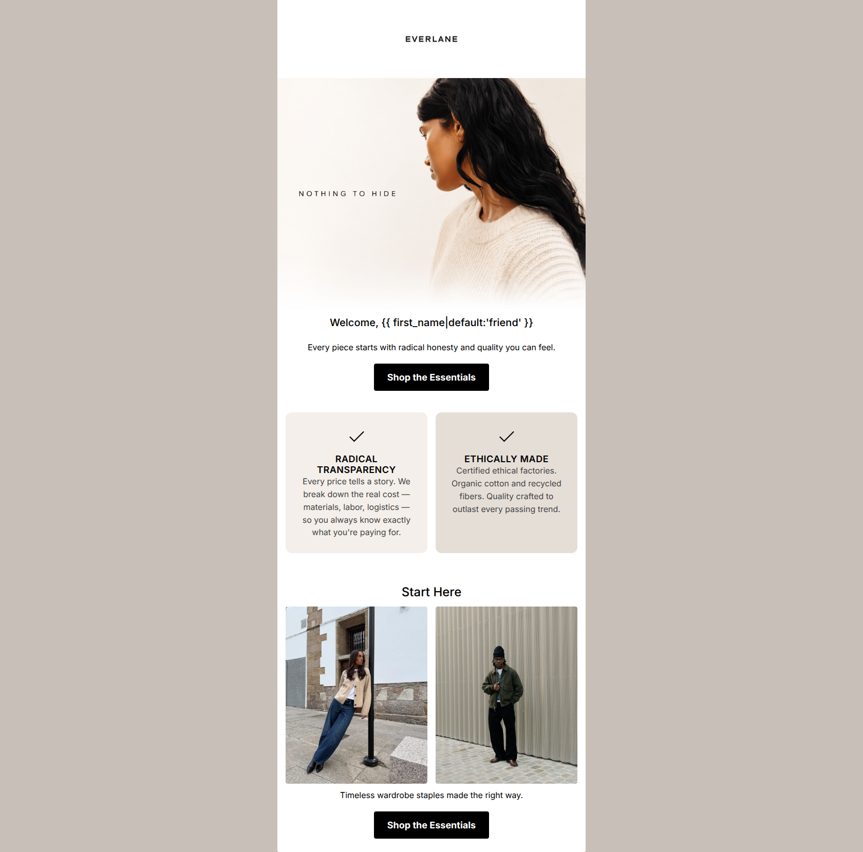
81/100This is a visually clean, on-brand welcome email that effectively communicates Everlane's core value propositions of 'Radical Transparency' and ethical manufacturing. The aesthetic is elevated, perfectly matching the brand's minimalist positioning, and the copy is incredibly tight. However, the email suffers from a significant structural conflict at the bottom: it visually presents a choice between women's and men's clothing through side-by-side images, but the primary CTA button positioned underneath drives exclusively to women's best sellers. This creates a confusing user experience for male shoppers and dilutes the clarity of the primary action.
Create Your Own
Generate professional email designs like this one in seconds with Kopi AI.
Email Details
- Subject Line
- Welcome to Radical Transparency
- Brand
- Everlane [eval 2026-03-25]
- Industry
- Fashion & Apparel
- Email Type
- Welcome
- Created
- April 24, 2026
Brand Colors
Email Copy
Welcome, friend
Every piece starts with radical honesty and quality you can feel.
→ Shop the Essentials
Start Here
Timeless wardrobe staples made the right way.
→ Shop the Essentials
Why This Email Works
This is a visually clean, on-brand welcome email that effectively communicates Everlane's core value propositions of 'Radical Transparency' and ethical manufacturing. The aesthetic is elevated, perfectly matching the brand's minimalist positioning, and the copy is incredibly tight. However, the email suffers from a significant structural conflict at the bottom: it visually presents a choice between women's and men's clothing through side-by-side images, but the primary CTA button positioned underneath drives exclusively to women's best sellers. This creates a confusing user experience for male shoppers and dilutes the clarity of the primary action.
Hero (top/initial part) Impact
85/100- Strong, cohesive visual aesthetic that immediately reads as 'Everlane'.
- The 'Nothing to hide' subtle overlay effectively sets the tone for the transparency value proposition.
- Clear, high-contrast primary CTA immediately visible without excessive scrolling.
Content Structure & Flow
75/100- Excellent use of distinct sections to separate brand ethos (the two cards) from shopping actions.
- Logical progression from 'why choose us' to 'what to buy'.
Visual Hierarchy & Layout
72/100- The custom value prop cards use a subtle background color shift to draw the eye without feeling heavy.
- Excellent use of white space around headings and text blocks to reduce cognitive load.
- Photography is well-cropped and consistent in lighting and tone.
Call-to-Action Strength
75/100- Consistent primary CTA text ('Shop the Essentials') reinforces the desired action.
- High-contrast black buttons are impossible to miss against the light background.
- Appropriate number of CTAs (two) for the length of the email.
Message Clarity & Tone
92/100- Avoids marketing fluff and uses honest, straightforward language.
- The copy in the value prop cards succinctly explains complex ideas (supply chain transparency) in a few words.
Readability & Scannability
95/100- Use of icons (eye, leaf) in the middle section serves as great visual anchors for scanning.
- Short sentence lengths prevent 'wall of text' fatigue.
- Clear hierarchy in typography (H2s clearly larger than body copy).
Offer & Value Proposition
85/100- Clearly articulates 'Radical Transparency' and 'Ethically Made' as primary reasons to buy.
- Positions the brand as a premium but accessible alternative to fast fashion.
Personalization & Audience Fit
75/100- The imagery reflects the modern, urban aesthetic of the target demographic.
- The messaging directly addresses customer pain points regarding fast fashion and opaque pricing.
Copy Conciseness & Word Economy
90/100- No repetition of concepts; the hero handles quality, the middle handles ethics/pricing.
- Action-oriented language that respects the reader's time.
Quick Wins
- Remove 'Welcome, {{ first_name }}' and start immediately with the 'Every piece starts with...' copy to reduce throat-clearing.
- Swap the right-side men's image for another women's image (e.g., shoes or accessories) so that the visual context matches the primary CTA destination (womens-best-sellers).




Create Professional Email Designs
Generate beautiful, on-brand email designs in seconds. Just enter your brand URL and let AI do the rest.