Fashion & Apparel Welcome Email Template
“Welcome to Radical Transparency”
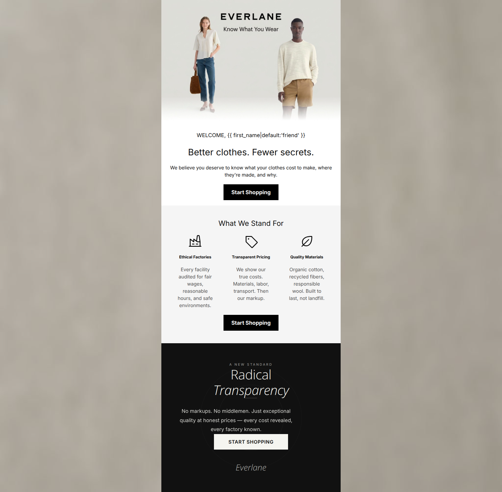
Design Score
82/100This is a visually striking and brand-aligned welcome email that effectively establishes Everlane's core value proposition of 'Radical Transparency.' The aesthetic is spot-on, and the primary call-to-action is correctly prioritized and repeated. However, the email suffers from content redundancy, with the bottom dark block merely restating the values already established in the three-column layout. By consolidating this messaging, space could be freed up to feature actual products, creating a stronger bridge between the brand ethos and the shopping experience.
Create Your Own
Generate professional email designs like this one in seconds with Kopi AI.
Email Details
- Subject Line
- Welcome to Radical Transparency
- Brand
- Everlane [eval-prod 2026-05-07]
- Industry
- Fashion & Apparel
- Email Type
- Welcome
- Created
- May 7, 2026
Brand Colors
Email Copy
WELCOME, friend
Better clothes. Fewer secrets.
We believe you deserve to know what your clothes cost to make, where they're made, and why.
→ Start Shopping
What We Stand For
Ethical Factories
Every facility audited for fair wages, reasonable hours, and safe environments.
Transparent Pricing
We show our true costs. Materials, labor, transport. Then our markup.
Quality Materials
Organic cotton, recycled fibers, responsible wool. Built to last, not landfill.
→ Start Shopping
Why This Email Works
This is a visually striking and brand-aligned welcome email that effectively establishes Everlane's core value proposition of 'Radical Transparency.' The aesthetic is spot-on, and the primary call-to-action is correctly prioritized and repeated. However, the email suffers from content redundancy, with the bottom dark block merely restating the values already established in the three-column layout. By consolidating this messaging, space could be freed up to feature actual products, creating a stronger bridge between the brand ethos and the shopping experience.
Hero (top/initial part) Impact
85/100- Excellent minimalist photography that aligns perfectly with the brand.
- Strong, benefit-driven headline.
- Clear, high-contrast CTA placed above the fold.
Content Structure & Flow
75/100- Logical initial flow from headline to subheadline to CTA.
- Clean, distinct horizontal sections make scrolling easy.
Visual Hierarchy & Layout
88/100- Exceptional use of whitespace.
- Three-column layout breaks up text effectively.
- CTAs visually dominate their respective sections.
Call-to-Action Strength
95/100- Perfect repetition of the primary action.
- Excellent color contrast makes buttons unmissable.
- Consistent destination eliminates decision fatigue.
Message Clarity & Tone
82/100- Nails the 'wise, approachable' brand voice.
- Clearly articulates the brand's unique differentiator.
- Avoids marketing fluff and hyperbole.
Readability & Scannability
85/100- Excellent use of icons to anchor bullet points.
- High contrast text throughout the majority of the email.
- Short, digestible paragraphs.
Offer & Value Proposition
80/100- Strong, distinct brand value proposition clearly stated.
- Directly addresses audience concerns regarding ethics and quality.
Personalization & Audience Fit
78/100- Messaging is laser-focused on the target psychographics.
- Aesthetic appeals to the audience's preference for minimalism.
Copy Conciseness & Word Economy
72/100- Individual text blocks avoid throat-clearing and get straight to the point.
- Bullet points are concise and impactful.
Quick Wins
- Update the CTA button copy from 'Start Shopping' to 'Shop New Arrivals' to accurately reflect the destination URL and improve click-through expectations.
- Remove the 'WELCOME, {{ first_name }}' line to clean up the hero section and let the main headline stand out.




Create Professional Email Designs
Generate beautiful, on-brand email designs in seconds. Just enter your brand URL and let AI do the rest.